Eye makeup by eye colour: brown, green and blue eyes

A professional guide to choosing palette, contrast and intensity from the visible iris, with practical colour directions for brown, green, blue, grey and hazel eyes.

Irene TomasiIrene Tomasi5 September 2026 14 min read
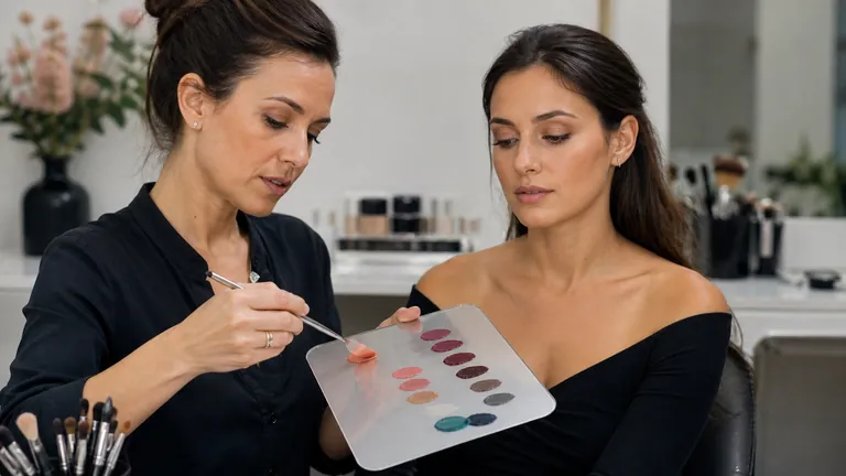
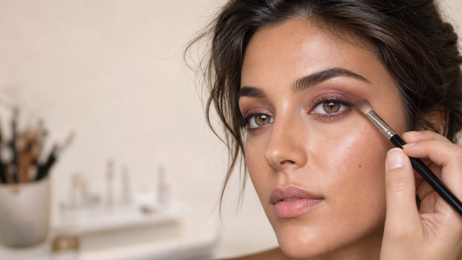
Makeup artist applies copper and plum shadow with a clean brush around the hazel eyes of an adult model in neutral studio light
On this page
  1. 1 Keep iris colour, eye shape and blending as separate decisions
  2. 2 Observe the iris before naming it
  3. 3 Choose one objective: harmonise, intensify or define
  4. 4 Choose eye makeup for brown eyes by depth and visible flecks
  5. 5 Bring out green eyes without turning purple into a rule
  6. 6 Use warm contrast and controlled depth for blue eyes
  7. 7 Let value, saturation and finish do more work than the shade name
  8. 8 Balance iris colour with skin, brows, hair and lips
  9. 9 Follow a seven-step professional palette protocol
  10. 10 Practise three mini-projects without changing eye shape
  11. 11 Avoid rigid eye-colour formulas and other common mistakes
  12. 12 Protect the eye area and treat decorative contact lenses as medical devices
  13. 13 Frequently asked questions about makeup for brown, green and blue eyes
  14. 13.1 What eyeshadow colours suit brown eyes?
  15. 13.2 Which colours make green eyes stand out?
  16. 13.3 Which eyeshadows bring out blue eyes?
  17. 13.4 Should hazel eyes follow brown-eye or green-eye advice?
  18. 13.5 Can eyeshadow be the same colour as the iris?
  19. 13.6 Does skin undertone ban certain eye colours?
  20. 13.7 Can eyeshadow colour change perceived eye shape?
  21. 13.8 Are matte, satin or metallic shadows best for eye colour?
  22. 13.9 What if eye colour seems different in every light?
  23. 13.10 Is a separate palette needed for every eye colour?
  24. 13.11 Does black eyeliner make every iris brighter?
  25. 13.12 Can copper work on brown as well as blue eyes?
  26. 13.13 Are decorative contact lenses a makeup accessory?
  27. 13.14 When should eye makeup stop?
  28. 14 Official sources and scope
  29. 15 Compare iris palettes without changing placement

Choosing eye makeup by eye colour does not mean assigning one compulsory shade to an iris label. It means observing the real iris—including its rim, flecks, lightness and mixed colour—and deciding whether the look should harmonise, increase contrast or create neutral definition. Brown, green and blue are not three uniform boxes. Each iris changes in relation to light, clothing, skin, hair and the intensity of the makeup around it.

Short answer: observe the makeup-free iris in neutral light, define whether the goal is harmony, contrast or definition, then test two plausible colour families and one neutral control near the face. Select value and saturation before finish, adapt placement to the eyelid and check the whole face with the eyes open. The best palette supports the person; it does not prove a colour-wheel rule.

This is one comprehensive iris-colour guide rather than separate thin articles for brown, green and blue eyes. It does not own placement for hooded, small, close-set or prominent eyes; that belongs to corrective eye makeup by eye shape. It does not replace general colour theory for makeup, which owns hue, value, saturation, temperature and whole-face relationships. Here those concepts answer a narrower question: which colour families to test around a brown, green, blue, grey or mixed iris, and how intense they should be.

Keep iris colour, eye shape and blending as separate decisions

Three questions, three focused guides

Palette, placement and gesture solve different problems

Iris

Choose harmony, contrast or definition

Anatomy

Map light, depth and direction

Gesture

Control load, pressure and edges

Read the visible iris to choose colour, read the eyelid to place it and diagnose brushwork separately when an edge becomes patchy.

Iris colour guides palette; anatomy guides position, direction and width. Copper may increase contrast around a blue iris, but the artist still decides whether it belongs on the mobile lid, lash line or outer accent according to visible space and the brief. A chromatically effective palette can become unreadable when its placement ignores the eyelid. A thoughtful map can look flat when every shadow has the same value.

Blending is a third problem. Brush load, pressure and edge cleanliness belong to the guide on eyeshadow blending without patchiness. In practice, decide the colour relationship first, adapt the map to the eye second and control gesture third. When the result fails, this separation tells you whether to change palette, placement or technique rather than replacing everything together.

Question

Primary variable

Dedicated guide

Which colour family should I test?

Iris hue, value and intended contrast

This eye-colour guide

Where should light and depth go?

Eyelid anatomy and intended direction

Corrective eye-shape guide

Why is the edge patchy or dirty?

Product load, pressure and base

Eyeshadow blending guide

Observe the iris before naming it

Observe makeup-free eyes in neutral, diffuse light without filters, beauty mode or strongly coloured lamps. Look at the dominant hue, outer limbal ring, gold or green flecks and the light-dark relationship between iris, pupil and sclera. Then step back. At conversation distance, tiny variations merge and the perceived eye colour may differ from a magnified photograph.

Describe before classifying. Hazel may have an amber centre and green outer ring. Green can be low-saturation grey-green. Blue can shift towards grey, aqua or deep navy. You do not need a perfect label. Identify the dominant component you want to foreground, then note secondary flecks that can become a bridge into the palette.

Record the observation in practical language: medium-light grey-green iris, low saturation, gold flecks, defined dark rim. This description is more useful than green eyes because it explains why dusty mauve, antique gold and charcoal might be tested at different values.

Choose one objective: harmonise, intensify or define

Harmonising repeats directions already present in the iris or uses neighbouring neutrals, usually producing a softer relationship. Intensifying introduces controlled colour distance so the iris becomes more noticeable. Defining works mainly through value and edge—taupe, brown, charcoal, grey or navy—without making chromatic contrast the headline. None is inherently better. Occasion, preference, lighting, clothing and the rest of the face decide.

A colour wheel proposes relationships, not recipes. Opposed hues can increase contrast, yet quantity, depth and saturation determine whether the result looks integrated or disconnected. Muted copper and bright orange share a broad direction but do not create the same look around blue eyes. Test small amounts near the face before purchasing or committing to an entire palette.

Choose eye makeup for brown eyes by depth and visible flecks

Families to test, never prescriptions

The visible iris and intended effect matter more than its label

Brown

Bronze, plum, navy or petrol

Green or hazel

Mauve, copper, antique gold

Blue or grey

Terracotta, taupe, navy

Control

A neutral with clear value contrast

Use these colour families as controlled starting points, then compare their value and saturation on the face under neutral light.

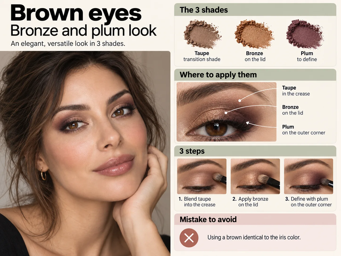
Brown eyes range from honey and amber to deep espresso and can contain gold, green, red or near-black components. For harmony, test bronze, copper, muted gold, caramel, warm taupe and browns with enough value difference from the iris. When eye and shadow share nearly the same value, they can merge; a lighter highlight, deeper lash line or modest saturation difference restores separation.

For more contrast, test plum, aubergine, burgundy, navy, petrol or teal in a version that connects with the skin and the look. A navy lash-line accent can clarify warm brown; plum may foreground gold or green flecks. Contrast does not require a saturated full lid. A softened pencil, narrow liner, outer accent or controlled reflective point can change the relationship with much less colour mass.

For very deep brown eyes, black can define but may not create separation. Bronze, medium taupe, deep blue or plum can make the iris boundary more legible. With light brown or amber eyes, a nearly identical shadow can mute internal variation; use greater depth close to the lashes and a lighter tone that picks up the flecks. Keep finish appropriate to the brief rather than assuming shimmer is always more flattering.

Bring out green eyes without turning purple into a rule

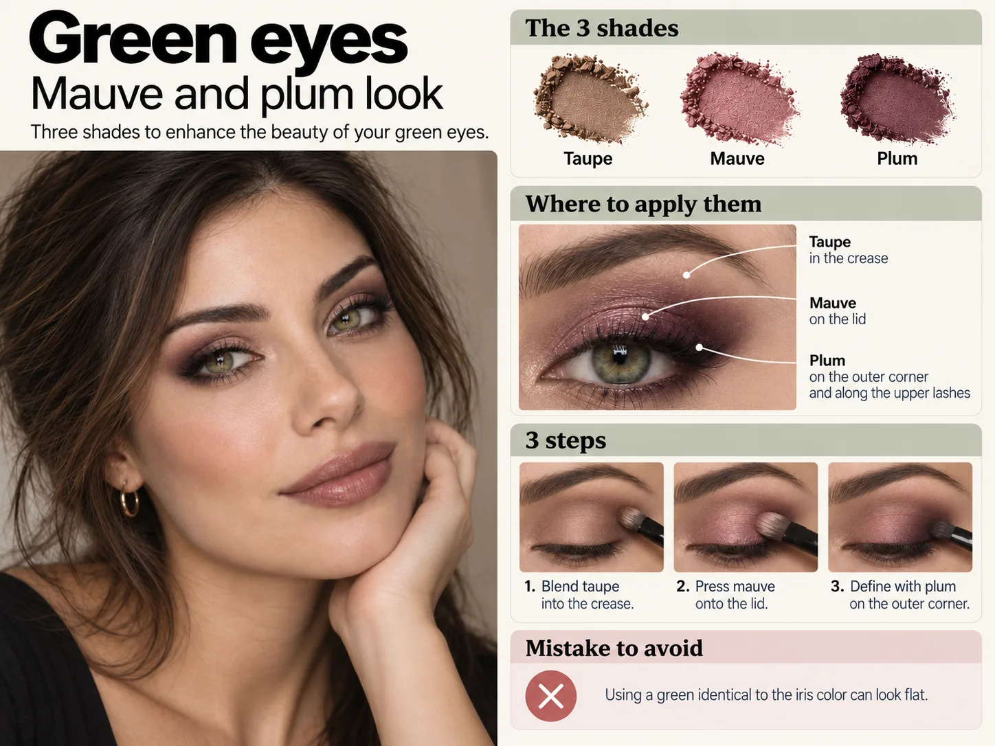
Plum, mauve, burgundy and some red-violet directions can increase contrast with green, but they are not a prescription. Highly saturated red-violet near periocular redness can dominate the face. Begin with muted versions, place a taupe bridge or keep the accent close to the lashes. Copper, terracotta and rose bronze offer warm contrast that can be easier to modulate.

To harmonise green with golden flecks, test antique gold, muted olive or bronze. For grey-green eyes, taupe, dusty mauve and charcoal can preserve subtlety. Green identical to the iris may compete with it, while a deeper, greyer or bluer green can work as a frame. Inspect the relationship with brow colour and the natural contrast of the whole face.

Hazel eyes do not need a separate article. Choose which component should lead. Plum and burgundy can make the green portion more visible; copper and bronze echo an amber centre; petrol or teal increases distance from the warm component. The perceived balance can change between daylight and artificial light, so check both when the makeup is for an event.

Use warm contrast and controlled depth for blue eyes

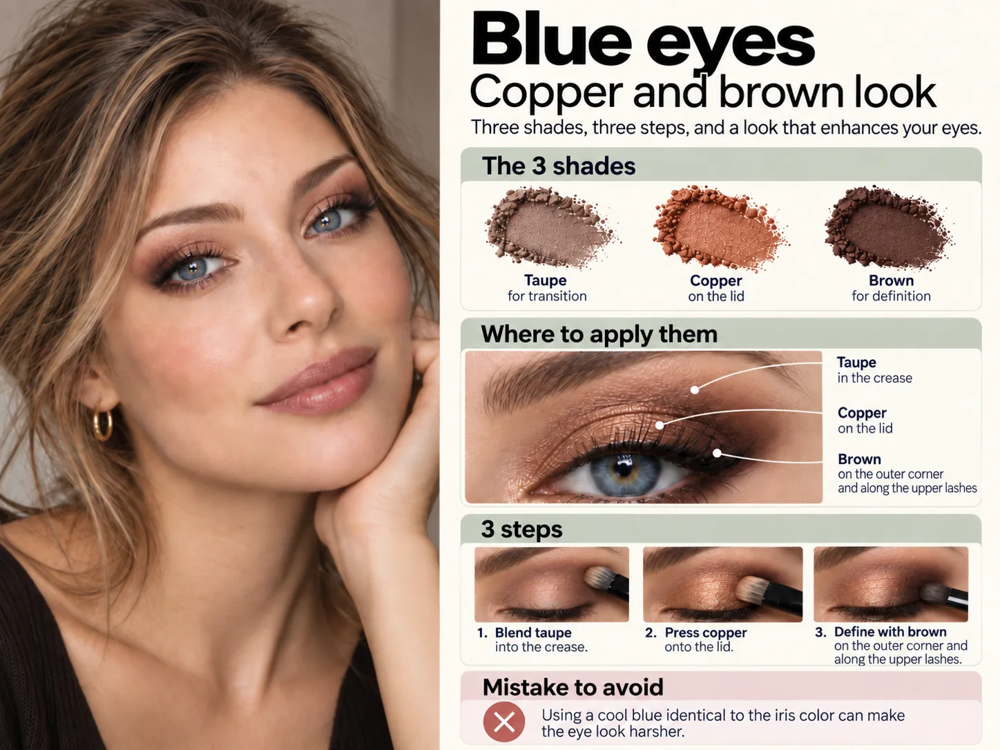
Copper, bronze, peach, apricot, terracotta and warm brown often create effective contrast with blue. For everyday makeup, choose lower saturation and hold depth close to the lashes. For a stronger look, increase copper or terracotta gradually while preserving a transition into the skin. The aim is not to make the eyelid look orange; it is to create a relationship that makes the blue iris clearer.

Taupe, mushroom, warm grey and champagne create a more neutral frame. Navy and deep blue can define without the severity of full black, while bright blue identical to the iris can compete with it. If blue is desired, change its value or temperature: navy liner, deep blue-grey or a petrol accent may be more effective than a full lid in the same bright blue.

Grey-blue eyes change readily with surroundings. Terracotta and bronze can foreground blue; mauve, taupe and charcoal can align with grey; muted teal can echo green components. Make the final decision on the face and under the expected light, not from a promotional photograph of a palette.

Clean professional palettes with copper, plum, burgundy, taupe and navy shadows arranged for brown, green and blue iris comparisons
Compare colour families, depth and finish before deciding which relationship supports the visible iris

Let value, saturation and finish do more work than the shade name

A shade name is not enough

Value creates structure, saturation sets chromatic force and finish directs light

Value

Keeps iris, lashes and lid legible

Saturation

Controls how strongly colour leads

Finish

Places or restrains reflected light

Distance

Confirms the whole-face hierarchy

Choose the light-dark relationship first. Then mute or intensify the colour and place matte, satin or metallic finish only where it supports the focal point.

Value describes perceived lightness. The iris, lash line and shadow need enough value separation to remain legible: a medium shadow on a medium iris can disappear, while a deeper border or lighter point creates structure. Saturation describes how vivid or muted colour appears. Lower-saturation palettes are often easier to integrate; a vivid accent needs a clear hierarchy and disciplined edges.

Finish changes perception. Metallic shadow reflects light and can bring the centre of the lid forward. Matte texture organises shape and depth. Satin can create a softer transition. Glitter cannot rescue a palette without structure. First establish the light-dark relationship, then decide where reflected light should attract attention. For camera work, use the photographic makeup and flashback guide to test white balance, exposure and reflective finish.

Variable

Question

Typical correction

Hue family

Harmony, contrast or neutral definition?

Change the chromatic relationship

Value

Does iris, lash line or lid disappear?

Add a lighter or deeper structural step

Saturation

Is the shadow dominating the face?

Mute it or reduce its area

Finish

Where should light attract attention?

Place matte, satin or metallic by function

Balance iris colour with skin, brows, hair and lips

Iris colour is one variable in a whole face. Plum may emphasise green eyes but compete with strong lips and saturated blush. Copper may clarify blue eyes but merge with hair, brows and complexion when every element has similar value. Decide the hierarchy: which area is the focal point, which colours support it and where a neutral pause is needed.

Skin undertone does not ban eye colours. It helps select the version—warmer, cooler, pinker, more golden, greyer or more muted. The guide to skin undertone and foundation matching separates surface colour, depth and chromatic direction. Use that reasoning to adapt a copper, blue, violet or green, not to eliminate the family before testing.

Professional makeup palette is compared beside the full face so eye colour, skin, brows and lips can be judged together
The iris palette succeeds only when it belongs within the colour hierarchy of the whole face

Follow a seven-step professional palette protocol

Observe, choose, compare, verify

A repeatable decision sequence replaces rigid eye-colour formulas

1

Observe hue, flecks, rim and value

2

Choose harmony, contrast or definition

3

Compare value and saturation

4

Map, photograph and record

Record the iris, define the objective, compare two families and a neutral control, then verify the mapped result with eyes open in the intended light.
  1. Observe the makeup-free iris under neutral light and record dominant hue, rim, flecks and overall value.

  2. Define one objective: harmonise, intensify or create neutral definition.

  3. Select two plausible colour families and one neutral control rather than opening every palette.

  4. Compare small samples near the face and choose value and saturation before finish.

  5. Adapt placement to the eye shape and build the blend with small controlled quantities.

  6. Check the whole face at normal distance, with the eyes open and in the expected lighting.

  7. Photograph without filters and record colours, quantities and result so the design can be repeated or corrected.

Apply the protocol through the BeautyLearn makeup courses, including the corrective makeup course, the beginner makeup course and the professional makeup products course. English-market course availability remains separate from the Italian catalogue.

Practise three mini-projects without changing eye shape

For an harmonious project, repeat one direction visible in the iris, use greater depth near the lashes and reserve reflective finish for the focal point. For a contrast project, select a more distant family but mute it and reduce its area before increasing saturation. For a neutral project, use taupe, brown, grey or navy with distinct values and let structure make the eye readable.

Repeat the three projects on the same person in separate sessions, or on comparable face charts, while keeping placement constant. Compare which relationship clarifies the iris, which integrates with the face and which matches the client preference. Success is not measured by colour quantity. A precise liner or outer accent may do more than a fully saturated lid.

Avoid rigid eye-colour formulas and other common mistakes

  • Applying the same prescription to every iris called brown, green or blue.

  • Treating a complementary relationship as an obligation to use highly saturated colour.

  • Choosing a palette before deciding whether the objective is harmony, contrast or definition.

  • Ignoring value and relying only on shade names such as copper, purple, blue or taupe.

  • Copying placement from a photograph despite a different eyelid anatomy.

  • Adding more pigment when the actual problem is a dirty edge or unstable base.

  • Judging only under warm light, through a screen or with beauty filters active.

  • Using a product not intended for the eye area because its colour looks suitable.

Protect the eye area and treat decorative contact lenses as medical devices

Use cosmetics intended for the eye area, read labels and warnings, wash hands, keep tools clean and do not share applicators. Stop for burning, itching, pain, significant tearing or irritation; persistent symptoms need healthcare assessment. EU Regulation (EC) No 1223/2009 sets conditions and restrictions for cosmetic substances and colourants, including eye-area limitations. A decorative shade does not make every formula eye-safe.

Do not introduce decorative contact lenses to manufacture the iris colour required by a look or demonstration. FDA explains that decorative lenses are medical devices and require an eye examination, a valid prescription and proper fitting in the United States; unsafe use can cause scratches, infection and serious damage. Build the palette around the client real iris. If prescribed lenses are already worn, follow the instructions of the eye-care professional who supplied them.

Frequently asked questions about makeup for brown, green and blue eyes

What eyeshadow colours suit brown eyes?

Bronze, copper and muted gold can harmonise; plum, burgundy, navy and petrol can increase contrast; taupe and differentiated browns can define neutrally. Choose by iris depth, visible flecks and the intended effect.

Which colours make green eyes stand out?

Muted plum, mauve, burgundy, copper and terracotta can increase contrast. Antique gold, bronze, quiet olive or taupe can harmonise. Begin with restrained saturation and check the whole face.

Which eyeshadows bring out blue eyes?

Copper, bronze, peach, terracotta and warm brown often create contrast. Taupe, mushroom and champagne are more neutral; navy or deep blue-grey can define without full black.

Should hazel eyes follow brown-eye or green-eye advice?

Choose the component to foreground. Plum may emphasise green, bronze may repeat amber and petrol may contrast with warmth. Test under both natural and event lighting rather than forcing one category.

Can eyeshadow be the same colour as the iris?

Yes, when value, temperature or saturation creates separation. A deeper green can frame green eyes, navy can frame blue and bronze can echo brown without becoming identical.

Does skin undertone ban certain eye colours?

No. Undertone helps choose a warmer, cooler, pinker, more golden or more muted version. It does not create a prohibited list. Whole-face contrast and personal preference still matter.

Can eyeshadow colour change perceived eye shape?

Perception changes mainly through placement and value. Deep colour near lashes defines; light reflective colour advances; a broad dark mass reduces visible space. Use the separate eye-shape guide for anatomy.

Are matte, satin or metallic shadows best for eye colour?

Each has a function. Matte organises depth, satin softens transitions and metallic attracts light. Build value structure first, then place finish at the intended focal point.

What if eye colour seems different in every light?

Observe in diffuse daylight and the expected event light. Record the stable dominant colour and changing flecks. Test the final look in both rather than trusting a filtered phone image.

Is a separate palette needed for every eye colour?

No. A professional selection of neutrals, copper, bronze, plum, burgundy, taupe, charcoal and navy can build many relationships by changing quantity, value and placement.

Does black eyeliner make every iris brighter?

Not necessarily. Black defines strongly but can overpower a light or low-contrast eye. Brown, charcoal, plum or navy may provide enough depth while keeping the iris more visible.

Can copper work on brown as well as blue eyes?

Yes, for different reasons. Copper can echo warmth in brown eyes and contrast with blue. Its depth, saturation and placement determine whether it harmonises or becomes a focal accent.

Are decorative contact lenses a makeup accessory?

No. Decorative contact lenses are medical devices in the United States and unsafe use can injure the eye. They require appropriate examination, prescription, fitting and care instructions.

When should eye makeup stop?

Stop for burning, itching, pain, marked tearing, swelling or irritation. Do not continue on an infected or inflamed eye area, and seek healthcare assessment when symptoms persist or are significant.

Official sources and scope

Substantive review: 5 September 2026. This educational guide is written by Irene Tomasi, a makeup artist with 10 years of professional experience. Colour suggestions are testing directions, not rules or guarantees. Follow product instructions, eye-area restrictions and local regulations. Continue with the English makeup guide library.

Compare iris palettes without changing placement

Continue with the face-chart one-variable method.

For the broader distinction between colour matching in makeup and a personal palette, read what personal colour analysis is and what it really assesses before applying colour relationships to a product or look.

To separate the variables behind a personal palette, continue with undertone, value, chroma and contrast in personal colour analysis and test balanced drape pairs before combining the evidence.

To translate a personal palette into complexion, cheek, eye and lip decisions, use personal colour analysis and make-up by season. It separates foundation matching, colour correction, iris, placement and cosmetic safety from the broad seasonal colour direction.

Continue learning