Colour theory for makeup helps predict how hue, intensity and light–dark structure change the balance of a face. It is not a colour wheel to memorise and it does not produce universal pairings. It is a working language: describe what you see, form a hypothesis, apply a controlled amount and verify the result on the real person. Skin, lighting, texture, opacity, surrounding colours and product quantity all change what the eye perceives.
Quick answer: separate hue, value and saturation before deciding whether a colour is warm or cool; judge it in neutral light and beside the colours it will actually meet; use complementary relationships as testable hypotheses, not automatic corrections; neutralise only the remaining local discolouration with the smallest suitable amount; and build a clear hierarchy of dominant colour, support and accent.
This guide owns the general language of colour and its application across a makeup design. It complements but does not replace skin undertone and foundation matching, whose intent is choosing base depth and undertone. Foundation formula and finish belong to the foundation texture guide. Practise product behaviour through the professional makeup products course, the beginner makeup course or the wider online makeup course catalogue.
Before the colour wheel: light, context and perception
Colour is never perceived alone. The same blush may appear warmer beside a plum lip, pinker beside orange shadow and duller under yellow room light. Its background matters too: a metal palette, white tissue and skin create different comparisons. A hand swatch or phone image is therefore an initial reference, not a reliable prediction of the finished face.
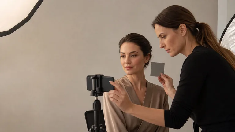
Begin in even, reasonably neutral light, then check the result in the environment where it will be worn. Do not compensate immediately for a lamp’s colour cast by adding pigment; the makeup may look balanced at that mirror and incorrect near a window. Disable beauty filters and compare camera output with live observation because automatic white balance, exposure and processing can alter hue, saturation and contrast.
Hue, value and saturation: three operational dimensions
Three dimensions, three different questions
Describing colour prevents random correction
Hue
Which colour family?
Value
How light or dark?
Saturation
How vivid or muted?
Hue describes the perceived colour family: red, orange, yellow, green, blue, violet and the transitions between them. Makeup products rarely present a pure hue. A lipstick may be orange-red, a blush dusty rose-beige and an eyeshadow brown with plum direction. Describe that direction before relying on a commercial shade name. Two products called nude may belong to very different colour families.
Value describes how light or dark a colour appears. It is often the first variable that determines readability. An eyeshadow with a useful hue but a value too close to the skin may disappear; a very dark pencil may dominate a shape even when its hue harmonises. Squinting or briefly reviewing a greyscale image can help isolate light–dark structure, but neither replaces live colour assessment.
Saturation describes how intense or muted a colour appears. Bright coral and dusty terracotta may share an orange direction but differ greatly in saturation. Real skin, discolouration and cosmetics are not flat patches: transparency, reflection, texture and the base beneath them alter chroma. To lower intensity, choose compatible products and very small quantities rather than automatically adding black, white or an opposite colour.
Warm, cool and neutral are relative comparisons
Temperature is relative. Coral red may look warm next to raspberry and cooler beside vivid orange. Brown can lean red, yellow, grey or violet. Warm and cool are useful orientation words, but they do not predict a result alone. State what you are comparing and examine value and saturation at the same time.
Neutral does not mean colourless. In makeup it often describes a balanced or muted mixture, yet beige and brown still have direction. Do not automatically assign a cool palette to every cool undertone or forbid warm colour on olive skin. Contrast, repetition, quantity, preference and context shape coherence as much as temperature does.
The colour wheel is a map, not a recipe
A colour wheel organises relationships between families. Neighbouring areas suggest gradual transitions. Opposing areas indicate stronger contrast and, in an appropriate mixture, possible neutralisation. A printed wheel does not describe product opacity, pigment concentration, finish, undertone or behaviour on skin. Use it to develop a hypothesis and prepare a controlled swatch rather than skipping the test.
Primary and secondary colour models are useful teaching tools, but cosmetics do not behave like ideal paint. A blue and yellow product can yield an unexpected green or a grey mixture depending on pigments and bases. Not every cosmetic is designed to be mixed or used on every area. Product purpose, label and manufacturer instructions take priority over a visually appealing colour experiment.
Complementary colours and controlled neutralisation
Opposites guide a hypothesis, not the dose
The complementary direction starts a test; depth and amount decide the result
Red ↔ green
Compare intensity and depth
Blue ↔ orange
Separate blue, grey and brown
Yellow ↔ violet
Use minimal targeted amounts
Red and green, blue and orange, and yellow and violet occupy broadly opposing regions in familiar colour models. In makeup, neutralisation works only when the correcting product is suitable in depth, intensity, formula and amount. A light pink-red area does not need the same green as a deeper red-violet area. Blue-grey, brown and violet under-eye colour also require different hypotheses. Identify the visible direction in neutral light first.
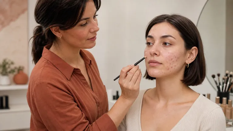
Place the smallest amount only on the relevant zone, thin its boundary and reassess before adding concealer or base. A visible corrector is often too saturated, too light, too dark or simply too abundant. Neutralisation should reduce the competing colour, not create a new patch. The corrective makeup and visagism guide connects local colour decisions to whole-face proportion without turning differences into faults.
Do not use eyeshadow, lipstick or creative pigment as a corrector merely because it has the desired hue. Formula, intended site and safety come first. Colour additives and their allowed uses vary by product category and market. Check the actual label and applicable requirements before applying any formula near the eyes or lips.
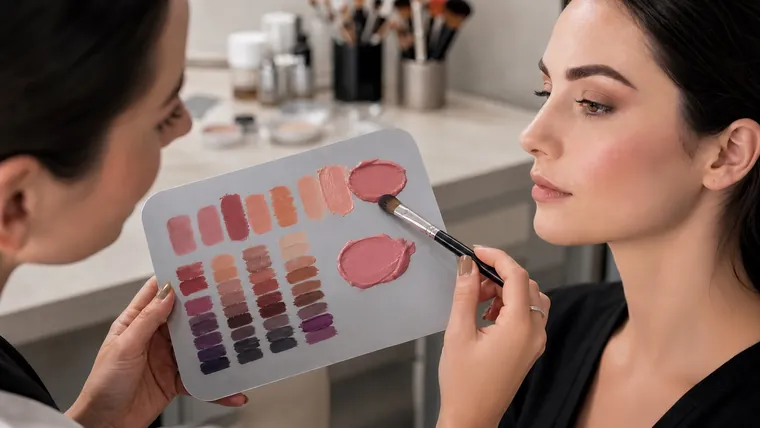
Corrector, concealer and foundation have different jobs
A colour corrector changes the perception of local discolouration. Concealer adds coverage and evens a smaller area. Foundation creates broader complexion continuity. All three are not mandatory. If a thin base already produces sufficient uniformity, adding green, peach and concealer creates thickness without useful improvement.
Choose foundation through a depth and undertone process rather than using it to erase isolated redness. When the colour is appropriate but the surface fails, examine formula and preparation through the foundation texture and finish guide and skin preparation before makeup. Separating colour, formula and surface prevents random correction.
Colour harmony across eyes, cheeks and lips
Harmony is relationship, not uniformity
Choose a hierarchy and distribute contrast
Dominant
The family that leads the look
Support
Connects skin and focal colour
Accent
Creates the focal point
Review
Read the whole face
A monochromatic structure varies value and saturation within one family. An analogous scheme uses neighbouring families. Complementary contrast creates a stronger opposition. A triadic scheme distributes three directions. These are compositional structures, not rules tied to eye colour. An eyeshadow opposite the iris may make it more noticeable, but lid shape, value placement, intensity and technique remain decisive.
For eyes, choose the job first: lash definition, depth, optical expansion or an accent. Then distribute value and saturation. The corrective eye makeup guide owns shape and placement; the eyeshadow blending guide owns pressure and edge control. This page organises colour relationships after those decisions are understood.
Cheeks and lips need a conversation rather than an exact match. Repeat a temperature, saturation level or accent where useful. A quiet blush can support an intense lip; two highly saturated areas need deliberate hierarchy. For lip outline, proportion and wear, use the corrective lip makeup guide rather than turning colour harmony into a liner technique.
Value contrast makes a makeup look readable
Value contrast decides where attention falls. A lid built from very similar values may feel refined but become difficult to read in a photograph. A large difference between skin, shadow and liner can become graphic. There is no universally correct level. Distance, light, occasion, style and the person’s preference determine how much contrast is useful.
Day makeup can use restrained transitions without becoming beige. Evening makeup can increase depth, reflection or focal contrast without darkening every area. Review from normal distance and in the intended light. A close-up rewards detail; the real service must still read as a complete face.
Mute saturation without producing muddy colour
Muting means lowering intensity while retaining a readable direction. A product already formulated as muted is often more controllable than an improvised mixture. When mixing is permitted, use tiny amounts on a palette, record ratios and verify compatibility. Too much complementary colour quickly produces brown or grey; black and white also change value, opacity and formula behaviour.
Colour looks muddy when its intention is lost through contaminated edges, an unclean brush, too many overlapping pigments, a sticky base or repeated corrections. Change or clean the brush, limit colour families and build from less to more where the formula permits. The separate blending method helps distinguish a mechanical edge problem from a colour-selection problem.
Mix cosmetics without losing safety or repeatability
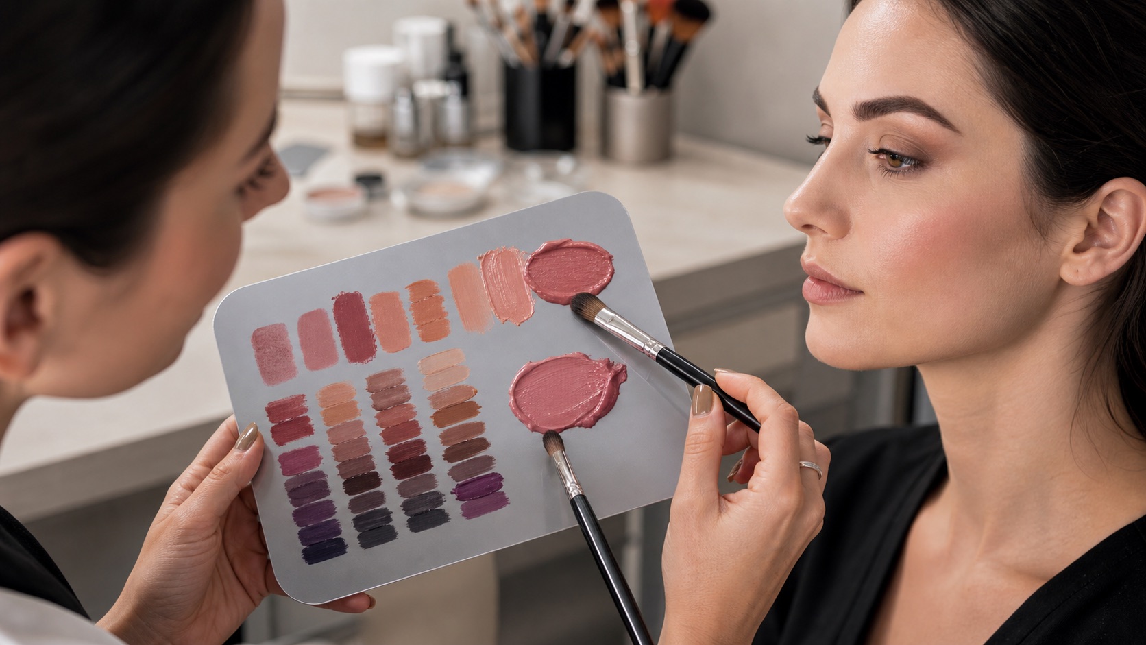
Not everything with colour can be mixed. Prefer products with the same intended function and explicit compatibility where available. Remove product with a clean spatula onto a sanitised palette, do not contaminate packages and never return a mixture. Record product, approximate ratio, area and result. Do not use a mixture that changes unexpectedly in odour, texture, separation or comfort.
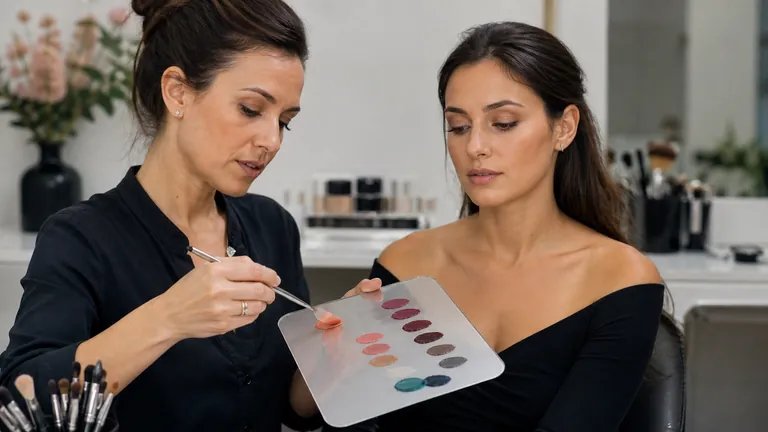
For a custom shade, begin with two compatible products in a simple documented ratio. The ratio is a record, not a universal formula. Check in neutral light, let the mixture settle and photograph without filters. The professional makeup products course connects pigment, vehicle, texture and intended site to actual product behaviour.
Test colour across different complexions instead of generalising
The same shade changes with skin depth and colour. A low-saturation blush can disappear on deeper skin; a pale base may leave an ashy cast; opaque foundation can erase colour that should help the design. Do not reduce people to a few recipes for light, medium and dark skin. Expand the swatches you can test and evaluate pigmentation, transparency, contrast and individual preference.
With consent, build an educational archive using colour-faithful images, swatches, light conditions, product names and amounts. Avoid filters that smooth skin or shift colour. Comparison should help recognise principles, not label the person. Select evidence for a professional makeup artist portfolio only when the image use is authorised and technically accurate.
A twelve-step makeup colour protocol
From context to a documented colour plan
Change one variable at a time
Context and observation
Colour hierarchy
Layers and verification
Image and record
Define context, light, preferences and desired intensity.
Observe skin, eyes, hair and clothing without assigning an immediate category.
Separate decisions about hue, value and saturation.
Choose a hierarchy: dominant colour, support and accent.
Prepare skin and verify foundation colour in neutral light.
Neutralise only discolouration that remains visible and only where needed.
Test accent colour on a palette or limited area before saturating the look.
Build value and intensity in thin layers, comparing both sides often.
Review close up, at normal distance and in movement.
Check the intended light and change one variable at a time.
Photograph without filters and compare the screen with the live result.
Record products, mixtures, light, result and one improvement priority.
Common makeup colour-theory mistakes
The first mistake is trying to correct hue by changing value: foundation that is too pink does not become right merely because a darker shade is chosen. The second is compensating for room lighting. The third is using an overly saturated complementary corrector and covering it with several layers. The fourth is choosing colour from its shade name or packaging without testing it on skin.
Other failures include using every colour in a palette, confusing harmony with low contrast, contaminating colours with brushes, matching quantities rather than visible effects and judging only from a photograph. Ask which dimension is wrong: family, value, saturation, temperature, placement, edge or texture. Change one and inspect again.
Practical exercises for training colour judgement
Exercise one: choose six products and arrange swatches first by hue, then value, then saturation. Exercise two: create light, medium and deep versions of one family using only compatible formulas. Exercise three: compare an analogous transition with a complementary accent while holding value as steady as possible. Exercise four: photograph one swatch in neutral, warm and natural light and record the perceived change.
Exercise five: build a dominant–support–accent hierarchy on a face chart. Exercise six: on a consenting adult, create two looks from one palette with different value contrast. Exercise seven: compare a minimal neutralisation with foundation alone. Exercise eight: repeat one look using recorded quantities and clean tools. Deliberate comparison teaches more than memorising a wheel without product evidence.
Frequently asked questions about colour theory in makeup
What is colour theory in makeup?
It describes hue, value, saturation, relative temperature and colour relationships so choices can be tested across base, correction and accents. It is not a list of mandatory pairings.
Are colour theory and skin undertone the same?
No. Undertone supports base-colour selection. Colour theory also covers value, intensity, contrast, neutralisation and harmony across the entire makeup design.
Which colours are complementary in makeup?
Common conceptual pairs include red–green, blue–orange and yellow–violet. Real cosmetics have their own depth, saturation, opacity and pigment mixture, so the pair starts a test rather than dictating a product.
How are redness and under-eye discolouration neutralised?
Identify visible colour, depth and intensity in neutral light. Use the smallest suitable corrector only where needed and reassess before adding base. Not all redness needs green and not every under-eye area is blue.
What is the difference between hue, value and saturation?
Hue is colour family, value is apparent lightness or darkness and saturation is intensity or mutedness. Similar hues can create very different results when their value and saturation differ.
How do I choose a harmonious face palette?
Set a hierarchy of dominant colour, support and accent. Repeat a temperature, value relationship or saturation level where useful, then review the whole face in its intended context.
Does eye colour decide which eyeshadow to wear?
No. It can suggest contrast, but lid shape, value, placement, occasion and preference matter equally. Both analogous and complementary choices can work when intentionally distributed.
How can a colour be made less vivid?
The most controllable option is an already muted product. Where mixing is permitted, add tiny recorded amounts of a compatible neutral or opposing direction and test before applying.
Can eyeshadow, foundation and lipstick be mixed?
Only when formula, intended site and directions support it. Decant hygienically, do not contaminate packaging and never use a product on an unapproved area simply because its colour looks useful.
Why does colour look different on skin than in its packaging?
Packaging does not show transparency, the underlying skin, amount, reflection, texture or surrounding colours. Swatch with the intended tool, let it settle and inspect in relevant light.
How can muddy makeup colour be avoided?
Use clean brushes, control product load, limit unnecessary overlaps and stop repeated rubbing. Diagnose whether the problem is colour mixture, edge, sticky base or excessive layers.
Does warm or cool lighting change makeup colour?
Yes. Begin in reasonably neutral light and then verify in the destination light. Do not compensate with pigment before comparing against daylight or another reliable source.
How can makeup colour theory be studied practically?
Sort swatches by hue, value and saturation; document compatible mixture ratios; compare lighting; and isolate one colour relationship per exercise. Skill comes from repeatable comparisons.
Sources and next steps
For colour terminology and controlled representation, review the NIST resource on colour imaging standards and guidelines. For product restrictions and intended uses in the United States, see the FDA Color Additives and Cosmetics fact sheet and using cosmetics safely. Continue through the English makeup guide library or current makeup courses.
Editorial review: 5 September 2026. This educational article does not certify product compatibility, prescribe colours by ethnicity or undertone, diagnose skin conditions or replace manufacturer directions. It deliberately owns the general theory of hue, value, saturation, contrast and harmony; foundation matching, formula choice, colour-corrector technique and seasonal colour analysis remain separate search intents.
To combine complexion, brows, eyes, cheeks and lips into one efficient service, continue with the professional day-makeup guide. It connects product decisions to intensity, natural-light checks and realistic wear.
To turn colour, blending and correction into a complete look for changed light, continue with the professional evening-makeup guide. It organises focal hierarchy, reflection, flash checks and realistic long wear.
For a controlled comparison of depth, warmth and cheek colour, continue with the contour, bronzer and blush guide. It covers colour, film order, anatomical placement and troubleshooting without one-size-fits-all maps.
Apply value and temperature to smokey eyes
Use a bridge value and a coherent temperature transition in the professional smokey-eye guide.
Use colour dimensions without ethnic shortcuts
Apply hue, value and saturation to foundation, corrector and blush with makeup for deep skin tones.
Preserve colour relationships in the photograph
A correct colour decision needs a true-colour makeup photography workflow.
Neutralise visible redness without masking the whole face
Apply colour theory through the rosacea and sensitive-skin guide.
Turn value contrast into a readable crease
Apply colour relationships through the cut crease transition guide.
Apply complementary colour to local correction
Continue with colour correctors for dark circles and discolouration.
Apply colour relationships to the iris
Continue with eye makeup for brown, green and blue eyes.
Apply colour theory within the limits of intact healed skin
Use the specialist cosmetic camouflage guide.
Turn colour relationships into a documented design
Continue with the makeup face-chart planning guide.
For the broader distinction between colour matching in makeup and a personal palette, read what personal colour analysis is and what it really assesses before applying colour relationships to a product or look.
To separate the variables behind a personal palette, continue with undertone, value, chroma and contrast in personal colour analysis and test balanced drape pairs before combining the evidence.
When you are ready to turn colour dimensions into a repeatable method, use the professional personal colour analysis draping test for controlled light, client preparation, A–B–A sequencing, observation records and error checks.
To compare seasonal frameworks without turning granularity into a league table, read how four-, twelve- and sixteen-season systems differ. The guide separates taxonomy size from evidence quality, crosswalks and practical usefulness.
See how the dimensions become a practical seasonal palette in the guide to Winter colour analysis, sub-seasons and colour combinations. It separates controlled observations from physical stereotypes and universal colour bans.
Explore a cooler, softer seasonal direction in the guide to Summer colour analysis, sub-seasons and palette building. It distinguishes tested colour relationships from physical stereotypes and pastel-only rules.
Explore a warmer, richer seasonal direction in the guide to Autumn colour analysis, sub-seasons and palette building. It separates tested colour relationships from complexion, hair and earth-tone stereotypes.
Explore a warmer, lighter and clearer seasonal direction in the guide to Spring colour analysis, sub-seasons and palette building. It separates tested colour relationships from hair, eye, complexion and neon stereotypes.
To translate a personal palette into complexion, cheek, eye and lip decisions, use personal colour analysis and make-up by season. It separates foundation matching, colour correction, iris, placement and cosmetic safety from the broad seasonal colour direction.