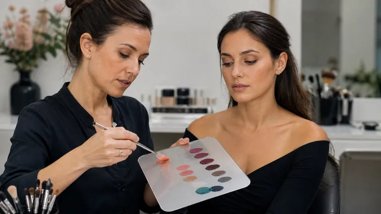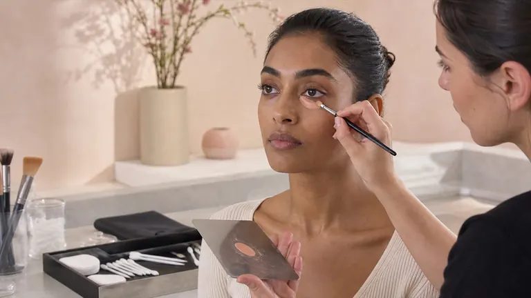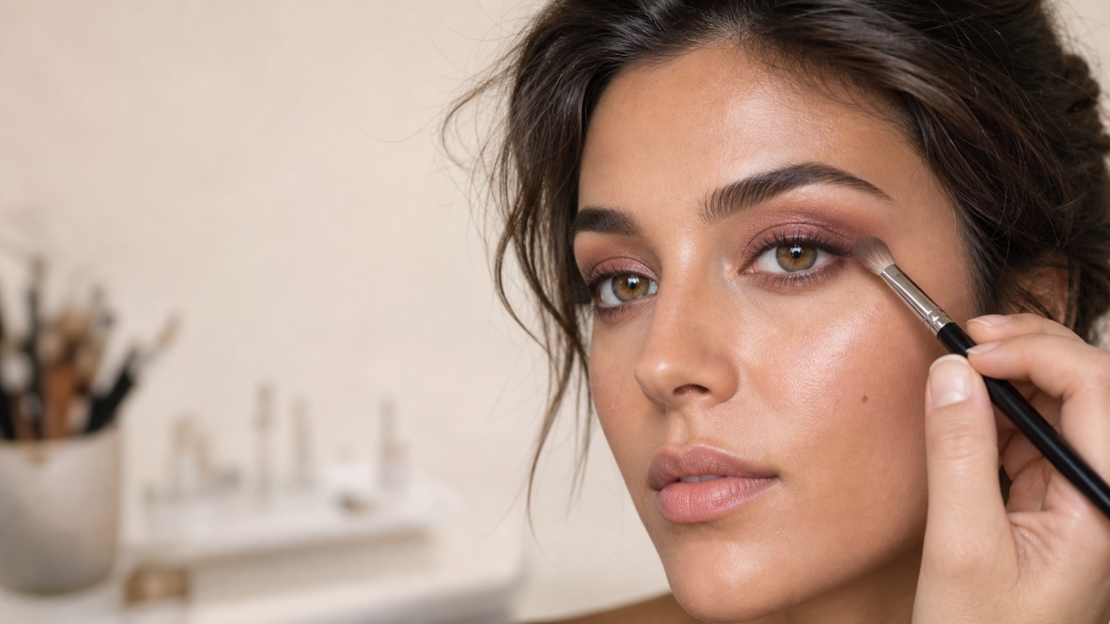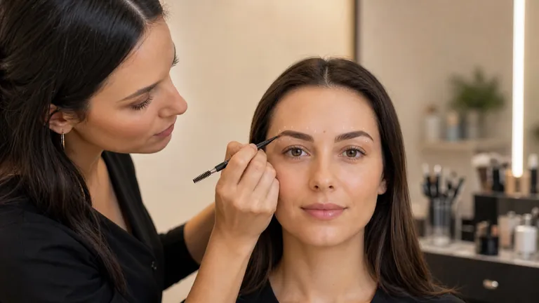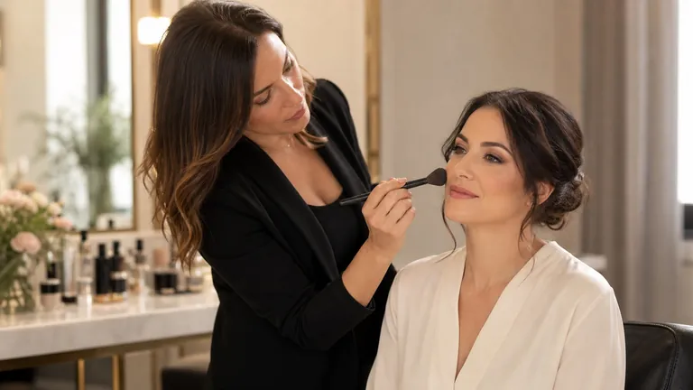
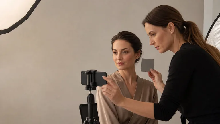
A strong makeup photograph documents the work without turning it into a different result. Skin, transitions, symmetry, texture and colour should remain readable under controlled light, consistent perspective and measured processing. A professional camera is not the first requirement. A repeatable setup and the ability to recognise distortion, mixed light and automatic beauty processing matter more.
Quick workflow: confirm the permitted image use; clean the lens; remove competing coloured light; use a broad diffused source; align face and camera; avoid a wide lens close to the face; lock focus, exposure and white balance where possible; capture a fixed view sequence; correct the photograph without rewriting skin or makeup; export a lightweight sRGB copy and preserve the original.
This guide owns the capture workflow: lighting, distance, framing, colour reference, editing and export after the look is complete. The makeup artist portfolio guide owns selection and presentation. The camera-ready makeup guide explains how makeup itself behaves under flash and high-resolution capture. Keeping those intents separate prevents three articles from competing for the same search.
The page was technically reviewed against the cited standards on 5 September 2026. Device processing, camera apps, lamps and platforms change, so test the actual chain and preserve references. Build the underlying colour and application skill through the English makeup course catalogue.
A faithful photograph begins before the camera is switched on
Prepare a small stable set. Clean lens and screen, simplify the background and check that hair, collar and jewellery do not hide important edges. Let fresh setting spray or luminous product settle; a wet surface can create highlights that do not represent the finished texture. Keep a neutral card, mirror, clean tissue, cotton buds and shot list within reach.
Define purpose before photographing an identifiable face. A private technical reference, website portfolio, organic social post and advertisement are different uses. The makeup client-record, photo and privacy guide separates them. Willingness to face the camera is not blanket permission for paid promotion, partner reposts or indefinite reuse.
Purpose: technical evidence, portfolio, service explanation or campaign production.
Destination: private archive, website, organic social, advertising, print or team delivery.
Standard: repeat background, distance, orientation, sequence, aspect ratio and neutral processing.
Reference: make a neutral frame before creative posing or changing the light.
Control four properties of the light
Light quality is a four-variable decision
The lamp name alone does not predict the photograph
Size
Controls the softness of transitions
Diffusion
Changes highlight and shadow edges
Direction
Describes volume and placement
Distance
Changes softness and fall-off
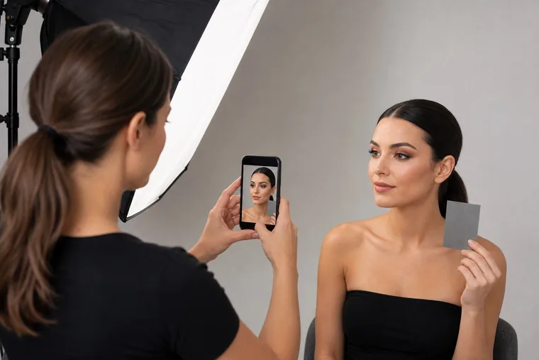
Light quality depends on apparent size, diffusion, direction and distance, not simply the lamp name. A broad source close to the subject creates softer transitions; a small distant source makes pores, relief and hard-edged shadows more visible. Neither is always correct. A beauty portrait may favour softness, while training documentation must reveal texture and precision without exaggerating them.
Place the key slightly above eye level and roughly thirty to forty-five degrees from camera, then add a white reflector if the opposite side loses useful information. For highly comparable records, move the source nearer the camera axis while retaining enough direction to show form. Read the shadows around eyes, nose, cheekbones and jaw: they should describe the face rather than imitate application errors.
Do not mix a cool window, warm room lamp and coloured background light. White balance can correct a global cast but cannot easily repair one blue cheek and one orange cheek. When using a window, turn off incompatible light and watch changes in the sky. With artificial light, reduce daylight and keep lamp position, output and diffusion constant.
Setup | Strength | Control |
|---|---|---|
Diffused window | Natural and accessible | Sky, time and mixed sources |
Diffused LED | Repeatable output and position | Colour rendering, flicker and distance |
Broad frontal light | Even comparison | Do not erase volume and texture |
Side light | Reveals structure and finish | Avoid excessive or uneven shadow |
Set white balance from the real source
Automatic white balance can change between frames when a bright garment, backdrop or lipstick enters the composition. That makes before-and-after views, two sides of the face and work across a series difficult to compare. If the app or camera permits it, measure and lock white balance. Otherwise include a neutral grey reference at the start and use it while correcting the series.
A Kelvin number is not a creative filter and cannot guarantee accuracy by itself; it needs to describe the source. Lamps with the same stated temperature may reproduce reds, pinks, browns and skin differently. Test known colours and, for critical work, use an appropriate chart and managed workflow. The colour theory for makeup guide helps distinguish a photographic cast from a deliberate colour relationship.
Expose for skin texture and highlight detail
Expose the face without clipping forehead, cheekbone, nose and glossy product. When these areas become featureless white, texture and finish cannot be recovered. Reduce exposure or soften the light rather than expecting editing to recreate missing information. Check the shadow side too: aggressive recovery can increase noise and shift colour.
The histogram is a clue, not a target shape. Dark hair and a black background naturally push values left. Watch clipping in the areas that prove the work and keep exposures stable across the sequence. On a phone, focus on the nearer eye, lock focus and exposure where supported, lower the exposure until highlights retain structure and disable skin smoothing, beauty filters and preset colour looks. Compare the live finish with the criteria in the foundation texture and coverage guide before deciding whether a difference comes from application or capture.
Distance matters more than phone versus camera
Perspective changes before the device quality does
A close wide viewpoint enlarges the centre of the face
Too close
Centre enlarged and edges recede
Step back
Facial proportions become more natural
Height
Keep frontal capture near eye level
Lens
Use normal or short telephoto view
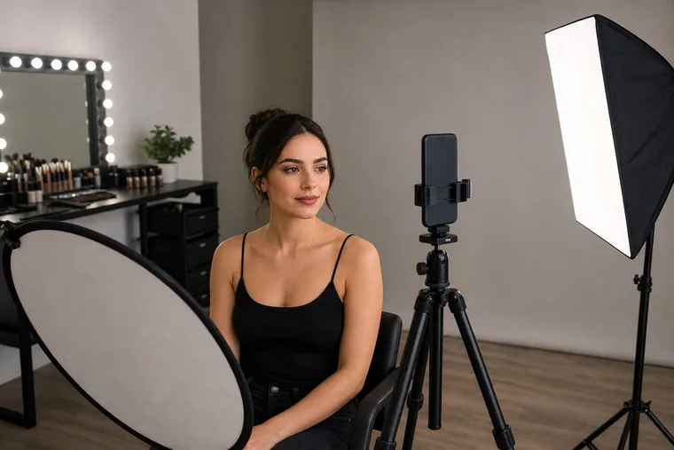
A current phone can document makeup extremely well when light is sufficient, the lens is clean and computational processing is controlled. A camera offers more choice of lens, RAW capture, exposure and depth of field, yet it cannot fix the wrong viewpoint. The common error is moving a wide lens close to the face: nose and centre grow, ears recede and eyes or brows can appear falsely asymmetrical.
Step back and use a normal or short-telephoto field of view, or a true 2× phone camera when light is sufficient. Avoid heavy digital zoom. Keep the sensor parallel to the plane being documented and camera height close to eye level for the frontal frame. For details, respect minimum focusing distance or use controlled macro mode without distorting the outline.
Capture a complete, comparable view sequence
One look needs a fixed evidence sequence
Overall balance, volume and detail require different views
Frontal for balance and symmetry
Two three-quarter views for volume
Eyes open and closed for placement
Lips and final portrait for finish
A hero portrait alone rarely proves the work. Use a fixed sequence: neutral frontal view, right and left three-quarter, eyes open, eyes closed or lowered, lip detail and optional profile or final portrait. Record the same order for training, assessment and portfolio candidates. It reduces overshooting and reveals when one side is missing or a detail lacks focus.
View | What it demonstrates | Common error |
|---|---|---|
Frontal | Overall balance and symmetry | Camera or head tilted |
Two three-quarter views | Volume, cheek and complexion transition | Different angle on each side |
Eyes open and closed | Placement, edge and transition | Focus on lashes but not lid |
Lip detail | Outline, texture and colour | Specular highlight clips the finish |
Use posing and micro-angles without falsifying the result
Ask for a relaxed jaw, long neck and neutral expression for documentation. Tiny turns can reveal eyeliner, contour and lip edge; large turns can hide asymmetry or enlarge the nearer eye. Shoot the neutral record first, then add expressive editorial poses. Keep the camera rather than the client doing most of the movement so angles remain controlled.
Check catchlights, lid visibility, nose shadow and lip plane as the head turns. The best angle is not always the most flattering angle if the purpose is technical proof. Separate evidence frames from campaign frames in both selection and captioning so the viewer understands what is being shown.
Background, clothes and nearby surfaces change perceived colour
A saturated wall, garment or reflector can bounce colour onto skin. A bright background may also drive automatic exposure down, while a black one can push it up. Use a neutral low-texture setting for technical comparison and keep it far enough behind the subject to avoid unwanted shadow. Watch coloured mirrors, curtains and tablet screens outside the frame.
For creative work, colour is allowed to shape the image; preserve a neutral reference first. If clothing belongs to the intended look, photograph it deliberately and note that the surrounding palette influences perception. Do not neutralise only the skin while leaving supposedly white objects visibly tinted.
Keep colour accurate from reference to export
True colour is a complete image chain
A reference only works when every later step preserves it
Source: coherent light and neutral card
Capture: locked exposure and balance
Edit: neutral master before creative grade
Export: embedded sRGB web copy
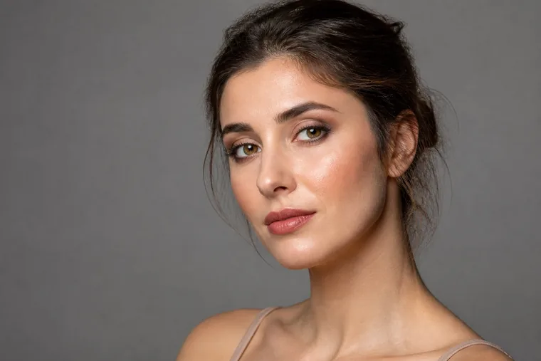
Colour passes through the lamp, subject, lens, sensor, camera processing, editing software, profile, export and viewing display. Control the variables you own rather than correcting by memory. Start from the neutral card, compare known product and skin references, apply white-balance and exposure adjustments consistently, then inspect problem colours such as reds, magentas and deep complexions at useful magnification.
For web delivery, an embedded sRGB profile is the most interoperable starting point. Keep the original and editing master in their intended working space and export a separate copy. Compare the exported file with the master and test on another ordinary display; do not repeatedly edit compressed social downloads. The deep skin-tone makeup guide explains why depth and undertone must remain distinct rather than being lifted into grey.
Edit the photograph, not a replacement makeup result
Correct global exposure, white balance, crop, horizon and modest lens effects. Remove temporary dust or a sensor spot when it does not change the demonstrated work. Do not erase texture, reshape facial proportions, rebuild liner, move brows, recolour foundation, remove every line or create symmetry that was not achieved. Those actions turn documentation into illustration.
Create a neutral base version before any creative grade. Apply adjustments as a synchronised series, then inspect each frame for local exceptions. Keep edit history or master files and label heavily retouched campaign images. Ethical limits protect the client, learners and the credibility of the portfolio.
A credible before and after uses identical conditions
Repeat light, camera, focal length, distance, height, background, crop, expression, hair position, white balance and processing. Obtain the relevant permission for both images. A smiling, turned, brightly lit after beside a flat, close, cool before does not isolate the effect of makeup. It sells a change in photographic conditions.
Use respectful language and avoid implying diagnosis or defect. A before image is a person, not a problem. If an unavoidable condition changes, disclose it and do not present the pair as a controlled technical comparison. Store the pair and permissions through the same record reference.
Prepare filenames, alt text and responsive images for the web
Archive the original separately from the published derivative. Use a controlled structure such as year-project-authorised-person-look-view-version, but do not put sensitive information in a public filename. Keep a high-quality portfolio master and a web-sized derivative. Google recommends sharp but optimised images, standard HTML image elements, descriptive filenames and useful contextual alternatives.
Alt text is not a keyword list. Describe what the image contributes, such as luminous bridal makeup on mature skin photographed at three-quarter view under diffused light. If an image merely repeats nearby text it may be decorative; if a chart conveys a process, provide the equivalent information in the page content. The W3C tutorial distinguishes informative, decorative, functional and complex images.
Use a short descriptive filename rather than a camera sequence number.
Size the delivered image for its display instead of loading a full original unnecessarily.
Use a supported format, correct extension, available source and responsive variants.
Write concise contextual alt for informative photographs and empty alt for redundant decoration.
Track permission, photographer credit and licence in the archive rather than memory.
Correct common problems at the source
Problem | Likely cause | Source correction |
|---|---|---|
Orange or green skin | Wrong white balance or mixed light | Use one coherent source and neutral reference |
Harsh texture | Small side light and excessive sharpening | Diffuse, enlarge and reduce sharpening |
Flat makeup | Fully frontal light or high exposure | Move the key slightly and protect contrast |
Distorted nose | Wide lens too close | Step back and use a longer view |
Lip and shadow colours shift | Auto white balance, display or export | Lock balance, check display and embed sRGB |
Blur or noise | Insufficient light and slow exposure | Add light and stabilise camera and subject |
Run a ten-minute post-makeup workflow
Confirm image use, simplify the background and check the settled look.
Clean the lens, choose format, disable filters and use one family of light.
Place key and reflector; inspect reflections, shadows and background separation.
Capture a neutral reference and lock focus, exposure and white balance where possible.
Complete frontal, two three-quarter, eye, lip and required detail views.
Zoom in to check focus, clipping, edges, lashes, texture and colour cast.
Repeat weak frames before changing the setup.
Select for technique and coherence, not quantity or the strongest filter.
Correct the series from the reference and preserve a neutral version.
Export, name, add alt and credits, and archive originals with permissions.
A stable process reduces hesitation and makes the body of work comparable. Use the makeup client acquisition guide to connect credible images to local discovery, enquiries and repeat bookings. Photography does not replace service quality; it makes the evidence easier to read.
Frequently asked questions about photographing makeup
Do I need a professional camera to photograph makeup?
No. A phone with a clean lens, stable light, appropriate distance and controlled processing can document work well. A camera adds control but cannot compensate for mixed light, a close wide lens or inconsistent editing.
Is a ring light or softbox better?
Choose by result. A broad softbox is easy to move and shape; a ring light is close to the lens axis and creates a distinctive catchlight. Compare apparent size, diffusion, colour rendering, flicker and shadow rather than product category.
Which colour temperature should I use?
There is no ideal number independent of the source. Set balance for the real light, avoid mixed sources and include a neutral reference. Kelvin should neutralise the source, not automatically warm the complexion.
How do I stop foundation looking orange in photographs?
Compare the live result first using the skin undertone and foundation-matching method, then inspect mixed light, white balance, colour reflected from walls or clothing, phone filters and export profile. Do not correct only the face when every neutral object shows the same cast.
Why does the face look distorted in close photographs?
The viewpoint is often too close. A wide lens exaggerates the centre of the face. Step back, use a normal or longer field of view and keep camera height controlled. Digital zoom alone does not fix a poor viewpoint.
Can I use portrait mode on a phone?
Yes, but inspect hair, lash and accessory edges. Technical documentation often benefits from a real, tidy background without synthetic blur. Preserve a standard frame without the effect as well.
How should eyeshadow and eyeliner be photographed?
Capture eyes open and closed or lowered, keep the camera parallel to the important plane and focus on the lid edge or nearer lashes. Use enough direction to show transitions without casting a false dark patch.
How can lipstick colour remain accurate?
Use stable neutral light, a reference, exposure that preserves the highlight and an embedded web profile. Avoid global saturation used to warm skin, because it can shift the lipstick. Include detail and contextual portrait.
Should I shoot RAW?
RAW is useful when available and properly processed, providing more room for exposure and colour work. It also requires workflow and storage. A coherent well-exposed JPEG is better than a poorly managed RAW; keep the best original available.
How much skin retouching is acceptable?
When the photograph demonstrates makeup, do not remove texture or details that change how technique is judged. Correct the image and remove only irrelevant temporary artefacts with restraint. Label substantially retouched creative work separately.
How do I make a credible before and after?
Repeat lighting, viewpoint, focal length, distance, height, background, expression, white balance and editing. Secure permission for both images. If conditions change, do not present the pair as a controlled comparison.
Which colour profile should I use for web and social?
Embedded sRGB is the most interoperable starting point for web delivery. Preserve the original and master in their intended working space, compare the export and avoid repeatedly editing a compressed social-media download.
How many images does one look need?
A concise complete set is better than dozens of duplicates: frontal, two three-quarter views, eyes open and closed, lip detail and a final portrait where useful. Publish only images that add technical or editorial value.
What should the alt text say?
Briefly describe the subject, technique or information the image contributes in context. Do not repeat the title or stack keywords. Make the content of complex diagrams available in nearby text as well.
Can I publish a photo when the client agreed to be photographed?
Not automatically. Capture, private storage, portfolio, social, advertising and third-party delivery are different purposes. Explain intended channels before capture and preserve evidence of the applicable permission and photographer rights.
How often should I test the photography setup?
Test after changing lamp, phone, camera, app, monitor or location and whenever colour begins to vary between sessions. Repeat a standard series on known colours and update documented settings, profiles and checklist.
Official and technical references
Google Search Central — Google Images SEO best practices: standard image elements, responsive delivery, speed, descriptive context and alt text.
W3C Web Accessibility Initiative — Images Tutorial: alternatives for informative, decorative, functional and complex images.
International Color Consortium — using the v4 sRGB ICC profile: sRGB profiles and colour-managed transforms.
Editorial review: 5 September 2026. Results vary across devices, apps and platforms. Test the real setup, retain originals, references, permissions and licences, and distinguish neutral documentation from a substantially altered creative image.
Integrate capture light without cluttering the service station
Connect camera and lighting needs to the professional makeup workstation guide.
Document chart and result under controlled colour
Continue with the face-chart capture and comparison method.
For the broader distinction between colour matching in makeup and a personal palette, read what personal colour analysis is and what it really assesses before applying colour relationships to a product or look.
To separate the variables behind a personal palette, continue with undertone, value, chroma and contrast in personal colour analysis and test balanced drape pairs before combining the evidence.
When you are ready to turn colour dimensions into a repeatable method, use the professional personal colour analysis draping test for controlled light, client preparation, A–B–A sequencing, observation records and error checks.