We use necessary cookies and the Meta Pixel to measure campaigns and improve our offers. You can change your optional-cookie preferences at any time. Read our Terms and conditions.
DIY color analysis mistakes: veins, jewelry, tanning, and photos
DIY color analysis can give you conflicting answers in the same afternoon: your veins look green under a lamp, you prefer gold in the mirror, and silver looks better in a selfie. Each test mixes color with other variables, from lighting to the finish of an object. Understanding those differences can help you choose clothes and accessories without mistaking one preference for a reliable season assignment. Winter, Summer, Autumn, and Spring are categories within styling systems, not medical diagnoses.
At a glance
Veins, jewelry, tanning, and photos cannot identify your color season on their own. You can still learn which finish you prefer, how a neckline changes contrast, or which of two colors you would wear more often. Keep the conditions steady and describe the specific effect you see. If the result changes with the light or camera settings, fix the comparison before interpreting it.
Blue or green veins: what are you actually seeing?
A vein's appearance through skin depends on how light is absorbed and scattered, the vessel's depth and diameter, the absorption properties of blood, and visual perception. The study Why do veins appear blue?, by Kienle and colleagues, describes these interactions. A glance at your wrist is not a direct reading of your undertone.
Room lighting and reflected color add more variation. The same vein may look bluish in one setting and greener or less distinct in another. Seeing both blue and green does not establish a neutral undertone, and barely visible veins do not prevent you from comparing clothing colors. Do not infer a season from how light or dark your skin is or from your ethnicity.
To check whether your surroundings are affecting the view, keep your wrist in the same position and move away a brightly colored object that is reflecting light onto it. A change shows that the surroundings affected what you saw. An unchanged appearance still does not validate the rule that green means warm.
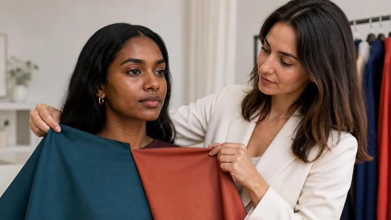
For clothing decisions, compare colors near your face. Two fabrics of similar size, texture, lightness, and intensity make it easier to observe the color difference you intended to test. The guide to undertone, value, chroma, and contrast explains how to separate those properties.
Gold or silver: separate color, finish, and preference
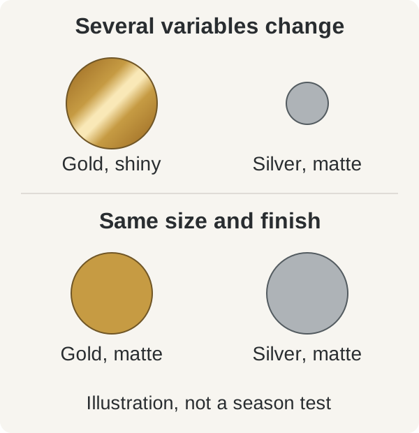
A large polished gold earring and a thin silver chain are different in more than color. Their visible surface area, reflections, shape, and contrast all change. A shiny piece can reflect a bright window, a dark phone, or a colorful shirt. You may prefer one object because it creates less glare, even when you think you are choosing between warm and cool.
Use two pieces with similar shapes and sizes, both polished or both matte. Hold each in turn at the same point beside your face, in the same light, without tilting your head. Notice whether the jewelry draws attention away from your face, casts a reflection onto your cheek, or works with the other colors in your outfit. Record your personal preference separately. Style, familiarity, and sentimental value are good reasons to wear something.
The upper pair changes color, size, and finish. The lower pair keeps shape, size, and finish the same. This illustration isolates the displayed color; it does not reproduce real metal reflections or show a skin response.
Yellow gold, champagne gold, rose gold, copper, and bronze differ from one another, as do bright silver and darker metals. You do not need to buy a collection to test them. If you own two comparable pieces, use them to decide what works with the outfit you plan to wear. If the objects differ in several ways, your conclusion applies to those two pieces as a whole.
“I prefer this matte silver with my blue shirt” is a useful observation. It does not establish that you are Summer or rule out gold. Size, placement, finish, and mixed metals give you several ways to use jewelry you already own. The guide to using a color palette for clothes and accessories develops those choices.
Tanning changes your current appearance
A tan is a pigment response to ultraviolet exposure. It can change how light or dark your skin looks and its contrast with your eyes and hair. How easily you tan or burn concerns your response to the sun. The Fitzpatrick classification was developed for that purpose, not to assign clothing palettes. Fajuyigbe and Young's review of skin color and responses to sunlight discusses variation between people and limitations of skin phototyping.
For a summer outfit, try the garment against your skin as it looks now. You might prefer a different neckline, a lighter accessory, or a smaller area of one color. A vacation photo beside a winter photo does not prove that your season changed: the light, makeup, and camera may also be different.
Postpone a comparison if your skin is sunburned, irritated, or so unevenly tanned that it obscures the question you wanted to test. Self-tanner also changes the color you see. If your aim is to observe your skin without it, let it fade evenly; there is no single waiting period that fits everyone. Do not tan deliberately or reduce sun protection to test an undertone.
Photos and selfies: control light, exposure, and white balance
A camera records a scene and processes it. Automatic exposure and white balance can change between shots, while HDR, face retouching, and filters can further alter brightness, contrast, and color. Your screen adds another set of changes. A photo in which your skin looks lighter or more golden does not establish that the fabric caused the effect.
White balance adjusts for the color cast of the light. As Nikon's white balance guide explains, automatic mode interprets the scene. Replacing a fabric that fills much of the frame can change that interpretation. Seo and colleagues' photography study examined controlled lighting and camera settings for color measurement; an ordinary selfie does not reproduce that setup.
To document a comparison, use one setup and take the photos in sequence:
Keep the same diffuse light, background, distance, and camera lens. Avoid mixing window light with a lamp. If a passing cloud changes the light substantially, repeat the pair.
Keep your pose and framing steady, with your face and fabric visible. Change only the sample, showing the same amount of fabric each time.
Lock exposure and white balance separately if your camera app allows both. Apple's iPhone camera instructions describe AE/AF Lock as locking exposure and focus. That label alone does not confirm that white balance is locked.
Keep a matte photographic gray reference in the same position, under the same light as your face and away from direct glare. If its color or brightness changes between shots, recheck the setup.
Turn off filters and face retouching. Keep any available processing settings consistent across the series. Compare original files on the same screen, at a steady brightness, with settings that warm the display turned off. Avoid screenshots and copies downloaded from social media.
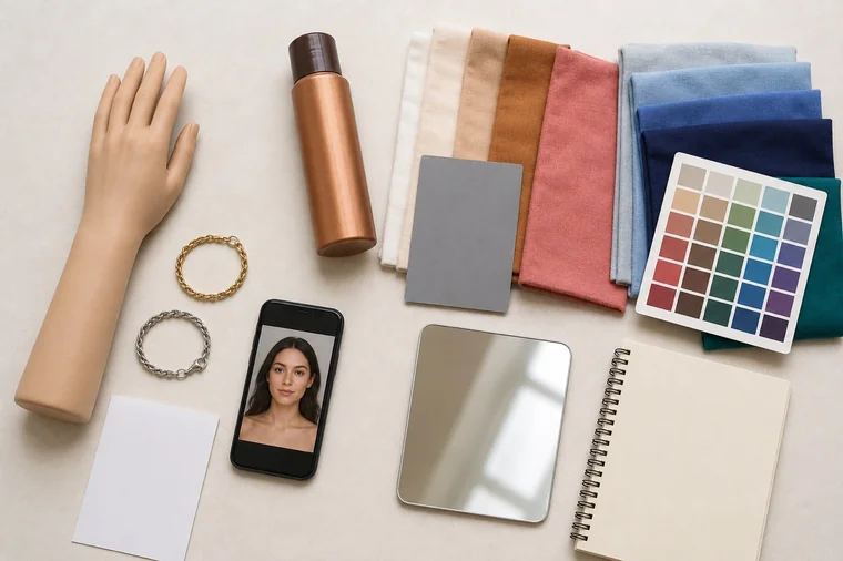
A stable gray reference helps you spot changes, but it does not certify accurate skin color or calibrate your screen. Processing may affect different parts of the image differently. If you cannot keep the settings consistent, use photos to remember which garment you tried and keep the notes you made in the mirror. The guide to online color analysis and the limits of photos and screens explains what a remote comparison can establish.
Jewelry, fabrics, and photos answer different questions. A gray card on the table does not make two photos comparable unless the light, framing, and settings are also consistent.
White paper, eyes, quizzes, and virtual drapes
Printer paper is not necessarily a neutral white reference. The paper itself, lighting, and nearby reflections affect its appearance. Holding it beside your face also changes the context in which you perceive your skin. The CIE definition of perceived color includes the influence of the surroundings and visual adaptation. A matte background with little color can reduce distractions, but it cannot assign a season.
Teeth and the whites of your eyes are not calibration samples. Iris color, hair color, and resemblance to a celebrity describe only part of your appearance. Gray hair may change visible contrast without automatically making a palette cool. Publicity photos, hair dye, makeup, and retouching make celebrity comparisons especially uncertain.
A quiz that combines vein color, tanning, and your favorite metal inherits the limits of those questions. Three matching answers do not become three independent pieces of evidence. An app's confidence percentage also needs documented validation before it can mean accuracy for people like you and photos like yours.
Virtual drapes change pixels around an already photographed face. They do not reproduce the light that real fabric reflects onto skin. You can use them to explore combinations, while keeping any season label provisional. Before uploading a portrait, check who keeps it and how it will be used.
How to get a useful result at home
Start with a specific question, such as “Does this dark sweater draw attention away from my face more than the lighter version?” Use garments with similar material and finish in steady light. If you are comfortable doing so, compare them without colored makeup. Try A, then B, then A again. If the first garment looks different the second time, check your position and lighting, or take a break before recording a result.
Describe what you see in a specific place: the shadow below your chin, reflected color on your cheek, or contrast between your neck and neckline. “It washes me out” is hard to compare unless you explain what you noticed. Lighter-looking skin is not automatically a better result. Decide whether you want a softer combination or a more noticeable contrast, without treating ethnic features as something to remove.
What you observe
What you can conclude
I prefer matte silver to shiny gold.
You chose between two accessories. Match the finish before drawing a conclusion about color.
The shadow under my chin looks less noticeable with the lighter top each time I switch.
That effect repeats for this pair in this light. Try another similar pair before generalizing.
My face and the gray card look yellower in the second photo.
The recorded scene changed. These photos cannot support a conclusion about undertone.
I cannot see a consistent difference.
This comparison does not give you a clear preference. You can choose by taste without assigning a season.
What you observe: I prefer matte silver to shiny gold.
What you can conclude: You chose between two accessories. Match the finish before drawing a conclusion about color.
What you observe: The shadow under my chin looks less noticeable with the lighter top each time I switch.
What you can conclude: That effect repeats for this pair in this light. Try another similar pair before generalizing.
What you observe: My face and the gray card look yellower in the second photo.
What you can conclude: The recorded scene changed. These photos cannot support a conclusion about undertone.
What you observe: I cannot see a consistent difference.
What you can conclude: This comparison does not give you a clear preference. You can choose by taste without assigning a season.
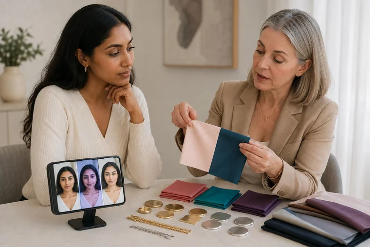
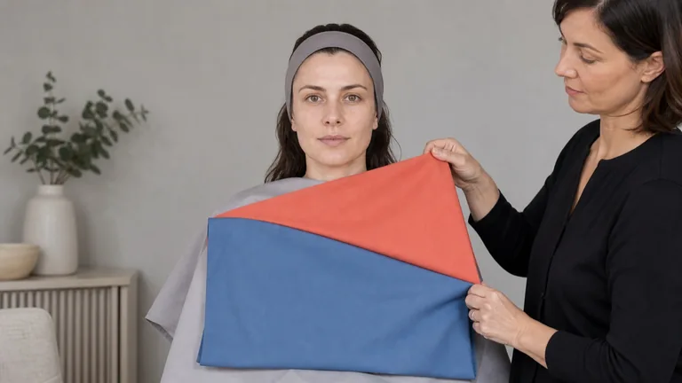
To explore warm and cool, compare several pairs that are close in lightness and intensity. Black versus cream, or bright orange versus pale pink, changes too many properties at once. The fabric draping guide explains how to prepare and order those comparisons.
In this illustrative setup, pale pink and dark teal differ in depth as well as color, so they cannot isolate a warm-versus-cool preference. The phone portraits show differing color casts, not evidence that one fabric changed the woman's skin.
Keep uncertain results alongside clear preferences. Repeated observations from outfits you actually wear can help with shopping even when a season remains unclear. There is no need to buy a full drape kit or replace your wardrobe because one home test suggests a label.
If you want a consultation, ask which observations support the proposed palette and how the consultant handles contradictory results. Ask to see it applied to clothes you already own, including colors you love.
Frequently asked questions
If I like both gold and silver, does that mean I am neutral?
You cannot infer a neutral undertone from that preference. You may like each for different reasons, or the pieces may be too small to create a noticeable effect near your face. Try them with the outfit you plan to wear and choose by style as well as color. A broader comparison is needed before using “neutral” as a color analysis description.
Is an unfiltered photo reliable if I always use the same phone?
Using one phone removes a device change, but its automatic settings can still shift. Check light, exposure, and white balance across the series. If they are inconsistent, keep the photos as outfit reminders and avoid using them to judge subtle shade differences.
Can I do color analysis if I cannot see my veins?
Yes. Visible veins are not a requirement for observing clothing colors near your face. You do not need to replace the wrist test with a guess based on skin tone, ethnicity, eye color, or hair color.
Do I need to replace my jewelry after receiving a palette?
No. Try changing the size, finish, placement, or surrounding colors first. A ring and a large earring have different relationships to your face, and mixed metals may suit the outfit. A palette can help you combine things you own without declaring them unusable.
Perrett and Sprengelmeyer, Clothing Aesthetics: preferences for simulated clothing colors on 12 White women's faces, six fair and six tanned. That sample and task do not establish a seasonal test for everyone.
Compare wedding dress fabrics, then try makeup, hair, jewelry and flowers together. Use real swatches, clear notes and the lighting you expect on the day.
Compare fabrics on olive and deep skin tones with steady light, matched pairs and repeatable observations. Keep useful results when a season remains uncertain.