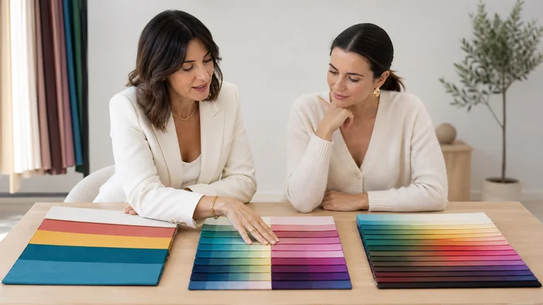
Personal colour analysis and make-up meet when a palette becomes a practical plan for complexion, cheeks, eyes and lips. A seasonal family can suggest colour temperature, depth, clarity and contrast to compare. It cannot select every cosmetic, replace a foundation match, diagnose skin or turn someone’s preferences into mistakes. A useful colour-led look is not a catalogue of permitted shades. It is a controlled translation between palette, real pigmentation, formula, placement, lighting, context and identity.
Quick answer: translate the palette into temperature, value, chroma and contrast; match foundation to the actual face, neck and body; neutralise discolouration according to the colour present; then test cheek, eye and lip families at the depth, opacity and finish the person can wear. Winter, Summer, Autumn and Spring are starting maps, not shopping lists. Verify every product on the person because the same shade name changes with formula, coverage, skin and light.
This guide owns the application of an established or working personal-colour palette to make-up. Start with what personal colour analysis examines if the palette has not yet been explained. Use the dedicated guide to make-up colour theory for hue, neutralisation and mixing, and the guide to eye make-up by iris colour for brown, green and blue eyes. Keeping these intentions separate prevents the season from answering questions that belong to the product, iris or technique.
From personal colour palette to a complete face plan
A textile swatch and a cosmetic do not behave in the same way. Fabric reflects light beside the face. Make-up blends with the skin, may be sheer or opaque, wet or dry, satin or matte, and can change after it settles. A berry lipstick may read warmer over pigmented lips than it does in the tube. A taupe eye shadow may become brown, lilac or grey according to its base and the eyelid. A peach blush used as a veil can be far less saturated than the pan suggests.
Treat the palette as a hypothesis generator. A cool direction invites comparison between rose, mauve, berry and cool taupe and similar warmer options. A bright direction warns against muting every feature with dusty grey-browns. A soft direction favours controlled saturation and blended transitions. A deep direction can sustain darker values without allowing them to erase the face. The final decision is made on the person in suitable light, not by holding a product photograph next to a digital season chart.
Begin with purpose. A quiet work look, editorial colour, bridal make-up, stage work, a person who avoids foundation and someone who loves a statement lip need different hierarchies. Personal colour can make choices more coherent, but it should not remove cultural references, gender expression, sensory needs, accessibility, dress code or the wearer’s favourite colour. The strongest result looks as though it belongs to the person rather than demonstrating that the artist memorised a season.
Separate harmony from correction. Harmony considers relationships between chosen colours and the person. Correction uses colour, opacity and placement for a specific cosmetic objective. Neither requires changing the person’s ethnicity, lightening deep skin or covering every visible difference. Before adding product, agree what the wearer wants to emphasise, reduce, keep visible or avoid.
A six-step method from season to make-up look
Translate before choosing products
Brief, dimensions, complexion, colour tests, whole-face review and record
Define the brief and focal point
Map four colour dimensions
Build the real complexion
Test, review and record
A sequence prevents the common mistake of searching for one universal product list per season. It works for personal use, consultation or professional trial. If the seasonal result came from uncontrolled photographs or a quick quiz, keep it provisional and avoid expensive purchases until it has been tested against the person.
Write the brief: occasion, desired intensity, wear time, texture preferences, sensitivity, accessibility, current products and one focal priority.
Translate the palette into temperature, useful value range, chroma and contrast. Identify the dominant dimension rather than relying only on the season name.
Build complexion on the actual skin: prepare appropriately, match foundation, correct selectively and choose coverage and finish. Do not derive this stage from the season.
Select two or three controlled hypotheses for cheeks, eyes and lips. Compare similar functions while changing one colour variable at a time.
Evaluate the whole face at normal distance, then inspect texture, edges and settling. Check the intended real-world light and a neutral photograph without filters.
Record product, shade, batch where relevant, quantity, placement, mixtures, tools, light and adjustments so the result can be repeated rather than remembered vaguely.
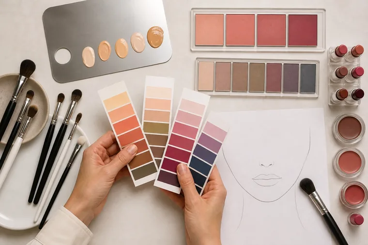
A professional comparison must not be manipulated. If the preferred option is applied with better skin preparation, a softer amount or more flattering light, colour has not been isolated. A well-designed make-up face chart can preserve the plan, yet paper cannot reproduce lip pigmentation, skin translucency or texture. Use it as a record and rehearsal tool, not proof of the result.
Temperature, value, chroma and contrast in make-up
One shade name contains four separate decisions
Change one variable at a time
Temperature
Warm, cool or balanced family
Value
Light, middle and deep range
Chroma
Clear, moderate or softened
Contrast
Distance between focal areas
Seasonal labels become more precise when returned to the four dimensions described in the guide to undertone, value, chroma and contrast. Temperature suggests which colour families to compare. Value controls how light or deep a focal point can become. Chroma controls whether colour is clear or muted. Contrast distributes differences between complexion, brows, eyes, cheeks and lips. These dimensions interact, but they do not perform the same job.
Dimension | Working question | Make-up decision | Useful check |
|---|---|---|---|
Temperature | Does the family lean warm, cool or balanced? | Lip, cheek, eye and metallic direction | Compare similar depth and opacity with a different base |
Value | How light or deep can the focal point become? | Crease, liner, brows and lip depth | Does the face remain present rather than empty or overpowered? |
Chroma | Should colour be clean or softened? | Saturation and greying of cheeks, eyes and lips | Does it connect or look dusty, chalky or electric? |
Contrast | How far apart should light, mid and dark areas be? | Hierarchy across complexion, eyes, brows and lips | Are focal points intentional and proportionate? |
A colour can be correct on one dimension and unsuitable for the planned look on another. A red may be cool but too light and muted. A brown may be warm but too deep. A rose may share temperature while lacking the required clarity. When a shade feels almost right, identify the dimension that is out of range before abandoning the entire family.
Complexion: foundation is not chosen from a season
Foundation is intended to integrate with the skin it covers. There is no Winter, Summer, Autumn or Spring foundation. Two people in the same seasonal family may have entirely different depth, surface colour, undertone expression and formula behaviour. Match the actual face, jaw, neck and visible body in the intended light, then allow the product to settle. The guide to skin undertone and foundation matching provides the dedicated protocol.
A cool personal-colour result does not automatically require a pink-labelled base; a warm result does not justify making the skin orange or yellow. Brand shade names are not standardised, and some formulas oxidise, deepen or change saturation after application. Texture, coverage and finish also alter the colour relationship. Test controlled swatches through settling rather than correcting a mismatch with bronzer or a lighter concealer.
Concealer and colour correction answer the discolouration
Corrector colour responds to the visible discolouration, its depth and the coverage placed over it, not to a season. Peach, orange, yellow, green and lavender are functional directions that require careful amount, placement and formula. Restore the agreed degree of complexion unity first; then evaluate how cheek, eye and lip colours relate. Do not use seasonal harmony to diagnose or erase a skin condition.
Blush, bronzer, contour and highlighter perform different jobs
Blush is often the most direct bridge between palette and complexion. Compare temperature, depth, opacity and placement: cool rose, mauve and berry are not interchangeable, just as peach, apricot, terracotta and brick are not. A sheer layer can make a vivid pan wearable; a very opaque base can make even a related shade look artificial. Review blush beside the lip because two almost-matching colours with opposing bases can fragment the face.
Bronzer suggests warmth or sun and must remain credible on the actual skin. Contour suggests shadow and usually needs a more neutral, depth-appropriate direction. A cool season does not ban every bronzer but can expose excess orange quickly; a warm season does not make copper contour realistic. Highlighter depends on particle size, finish, texture and location as much as champagne, pearl, gold or pink direction.

Eyes: season, iris and eye shape are separate decisions
The season describes a broad relationship across the face. Iris colour supports local analogous or contrasting choices. Eye shape controls placement, direction and proportion. Green eyes within an Autumn direction might be tested with olive, bronze and warm aubergine, while similar green eyes within a Summer direction might support mauve, softened plum and cool taupe. The iris does not assign the season, and the season does not determine technique.
Use the comprehensive guide to eye make-up for brown, green and blue eyes when the question is how to echo or contrast visible iris colour. Analyse lid space, crease, direction and symmetry separately. A perfect seasonal shade placed without regard to the eye’s structure is not a successful eye design.
Black, brown, grey and coloured definition
Black is a very deep graphic neutral, not a universal requirement or prohibition. It may integrate easily into a high-contrast face and become the only visible element on a light or soft face. Compare charcoal, espresso, cocoa, plum, navy and deep teal according to temperature, value and chroma. Mascara can be black, black-brown, brown or coloured. Amount, lash depth, brow strength, occasion and intended focal point decide more than a rigid seasonal chart.
Finish changes the colour hierarchy
Matte, satin, metallic and glitter finishes alter reflection, texture and contrast. A pale metallic increases separation from a deep crease; satin can soften a transition; a matte may photograph with more stable colour. Seasonal language about luminosity must be filtered through lid texture, sensitivity, real light and the brief. A bright season does not require glitter, and a soft season does not forbid every reflective finish.
Lips: colour family, depth, natural pigmentation and finish
Lip colour concentrates a large colour area in a small space, so it can reveal temperature and chroma relationships quickly. It is also strongly altered by natural lip pigmentation. A nude close to skin depth can remove too much contrast; a very pale nude can create a grey or chalky border; a sheer berry and opaque berry create different values. Test on the lips or a representative base, not only on the hand.
Lip pencil and lipstick can share or divide tasks. A slightly deeper pencil can build definition and connect lips with eyes and brows. An even base changes colour fidelity. Gloss adds reflection and can lift a deep shade. When the wearer loves a colour outside the suggested direction, reduce its area, sheer it, mix it, change the outline or balance it elsewhere. Personal colour should expand intentional choices, not confiscate favourite products.
A successful nude does not mean beige. Depending on natural pigmentation and face contrast, the useful family may be rose, peach, mauve, caramel, cocoa or softened berry. Check the edge in natural viewing light. If it reads grey, chalky or excessively orange, move one dimension at a time rather than adding random depth.
Area | Palette can guide | Real-life test must verify |
|---|---|---|
Foundation | It does not determine the shade | Face-neck-body match, settling, formula and light |
Cheeks | Temperature, value and chroma direction | Opacity, placement, base and lip relationship |
Eyes | Colour family and overall contrast | Iris, shape, texture, placement, finish and eye safety |
Lips | Family, depth and clarity | Natural pigmentation, opacity, edge, wear and comfort |
A make-up map for Winter, Summer, Autumn and Spring
Four seasonal families, no four cosmetic uniforms
Every direction must be rebuilt for real skin depth, pigmentation and purpose
Winter
Cooler, deep or clear contrast
Summer
Cool-neutral, softened transitions
Autumn
Warm-neutral, earthy or rich
Spring
Warm-neutral, light or clear
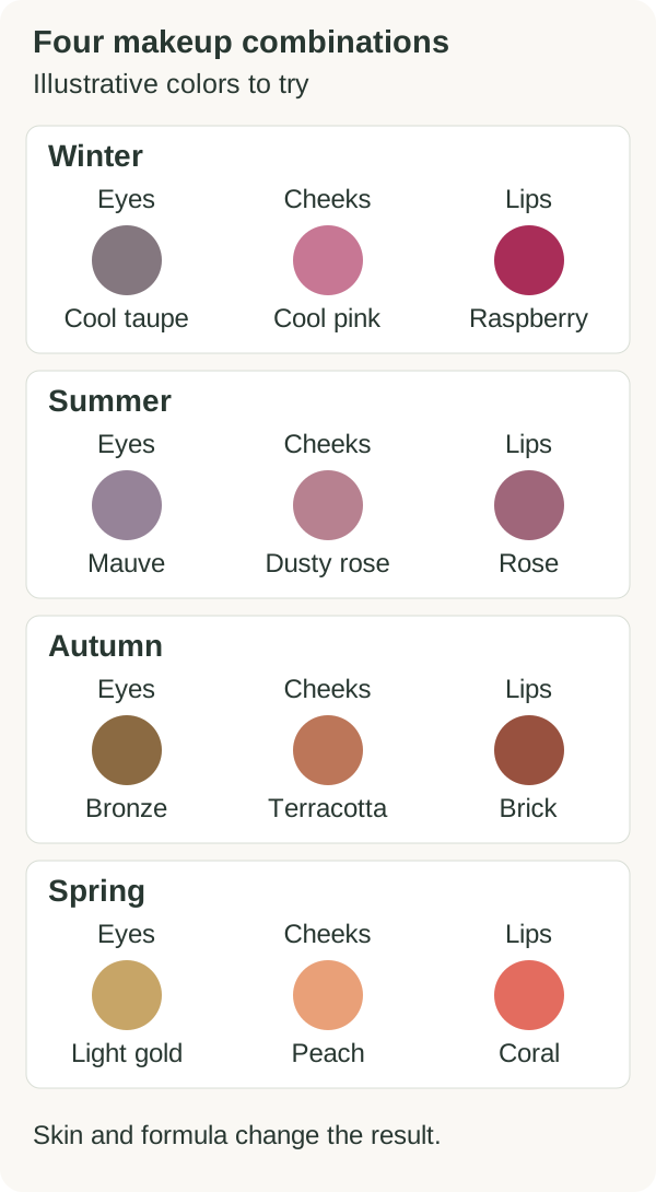
The following directions are families to test, never prescriptions. Each season contains lighter, deeper, softer and clearer people, and systems name subgroups differently. Skin depth, lip pigmentation and formula can change every example. Use the seasonal family as a shortlist, then verify one controlled comparison on the real face.
Winter make-up: cool direction, depth and controlled contrast
Winter palettes often support cooler colour, clearer separation and enough depth to remain visible. Test blue-red, cranberry, wine, cool berry, plum, charcoal, navy, cool cocoa and crisp rose in values suited to the person. High contrast does not require a full black smoky eye and vivid lip together. It can be expressed through one defined line, a clear lip edge or deliberate separation between complexion and focal feature.
Deep Winter may need darker anchors; Bright Winter can sustain cleaner chroma; Cool Winter prioritises temperature. These are working tendencies, not brand shade names. On deep skin, a product marketed as berry may become pale or ashy if its base is too white. On lighter skin, the same pigment may dominate at full opacity. Adjust formula, depth and area before deciding the family fails.
Summer make-up: cool, softened and progressive
Summer palettes often support cool-to-neutral colour with softened chroma and blended transitions. Compare dusty rose, mauve, muted berry, cool pink, soft plum, mushroom, greyed taupe and restrained navy. Soft does not mean colourless or grey foundation. It means the relationship between colours carries less hard separation or pure saturation. Build intensity gradually and keep the wearer’s actual depth present.
Light Summer may need airier values, Soft Summer more muted transitions and Cool Summer clearer cool direction. A dark-skinned Summer does not need pale cosmetics; softness can be created through chroma, edge and finish while depth remains appropriate. A bright-white base in lipstick or blush can create ash even when the hue family is theoretically correct.
Autumn make-up: warmth, depth and material richness
Autumn palettes often support warm or warm-neutral colour, moderated clarity and earthy or rich depth. Test terracotta, brick, warm rose, cinnamon, auburn, olive, moss, bronze, warm plum, cocoa and antique gold at the person’s value. Warmth should not turn foundation orange, and richness does not require heavy coverage. The effect can come from a warm lip and muted eye, a bronze line or a deep cheek used transparently.
Deep Autumn can support stronger dark values, Soft Autumn more muted transitions and Warm Autumn the clearest golden or earthy direction. Orange-labelled products often contain different red, yellow, white and brown balances; compare on skin. Olive complexions may react unpredictably to peach or yellow assumptions, so keep foundation matching separate and evaluate the whole face.
Spring make-up: warmth, light and clean colour
Spring palettes often support warm or warm-neutral direction, cleaner colour and a sense of light. Compare coral, poppy, warm pink, apricot, fresh peach, clear teal, warm green, light bronze and luminous neutrals without forcing every feature to look pastel. Clear colour can be used in a small liner, lip tint or cheek veil. Lightness belongs to value relationships, not to changing skin depth.
Light Spring may use lighter values, Bright Spring stronger clarity and Warm Spring more obvious warmth. On deep skin, a vivid clear shade may be more faithful than a pale version loaded with white. On light skin, clean pigment may need a smaller area. Keep the formula flexible and let the wearer choose whether the effect is fresh, graphic, quiet or dramatic.
Family | Directions to compare | Common mistake |
|---|---|---|
Winter | Cooler families, enough depth, deliberate contrast | Turning contrast into compulsory black or maximum intensity |
Summer | Cool-neutral, softened chroma, graduated edges | Making every product pale, grey or low definition |
Autumn | Warm-neutral, earthy or rich, value-appropriate depth | Using orange foundation or copper as universal warmth |
Spring | Warm-neutral, clearer chroma, lively light relationships | Confusing light with white-based pastel on every skin depth |

Subseasons: follow the dominant dimension, not twelve product lists
Subseason names vary between systems; the guide comparing four-, twelve- and sixteen-season colour analysis explains why more labels do not automatically make a method better. Translate the label into its dominant instruction: cooler, warmer, lighter, deeper, softer or brighter. A Cool Summer and Cool Winter may both reject obvious warmth while differing in depth, clarity and contrast. Soft Summer and Soft Autumn may both need moderated chroma while differing in temperature. Bright Spring and Bright Winter may both use clear colour while balancing warmth and depth differently.
Do not build twelve duplicate product kits. Organise working products by function and measurable appearance: depth, warm-cool direction, chroma, opacity and finish. One adjustable neutral, mixing medium or lip palette can cover several families more accurately than a box labelled for one season. Record how the product behaves on different skin depths rather than treating the pan as the final colour.
When two subseason directions both work, test the dominant difference on a controlled focal area. Compare two lip colours of similar depth and opacity, or two eye neutrals of similar value but different chroma. The aim is not to win an argument about nomenclature. It is to find a repeatable range that makes styling decisions easier.
Dominant direction | Controlled comparison | Avoid |
|---|---|---|
Cooler or warmer | Similar value and opacity, different temperature | Changing depth and base at once |
Lighter or deeper | Related family, controlled value change | Equating lighter with white-based or deeper with black |
Softer or brighter | Related hue and value, different chroma | Using filters, shimmer or opacity to fake saturation |
Lower or higher contrast | Redistribute dark and light areas across the whole face | Judging one isolated swatch |
Inclusive testing across olive and deep skin tones
Warm, cool, neutral and olive observations exist across the full range of skin depths. Do not use depth as a shortcut for season, assign every deep complexion to Autumn or Winter, or assume light eyes and hair are required for Spring or Summer. Personal colour is comparative. The drape response and make-up relationship must be observed on the individual rather than inferred from ethnicity or one feature.
White-based cosmetic formulas can create ash on deeper skin even when their hue name appears related to the palette. Sheer products can disappear or change over natural pigmentation. Very deep shades may read as neutral until enough light reveals their base. Compare undertone, value and opacity separately. The guide to make-up for deep skin tones addresses shade range, pigmentation and correction without replacing personal colour analysis.
Olive is not one temperature or one season. Surface redness, tanning, discolouration, lighting and an unsuitable foundation can all distort the reading. Remove the base before a colour comparison when appropriate, neutralise the environment rather than the person and use matched product tests. If a shade seems grey, determine whether value, white content, chroma or formula is responsible before blaming the seasonal family.
Adapt the palette to day, evening, bridal and photography
A single palette can produce many contrast levels. Day make-up may use one close-value eye neutral, a transparent cheek and a lip related to natural pigmentation. Evening make-up can deepen liner, increase lip opacity or separate light and dark areas while preserving the same temperature and chroma logic. Do not call an evening look more seasonal simply because it is stronger.
Bridal work adds dress, jewellery, flowers, venue light, photography and wear. The dedicated guide to professional bridal make-up covers consultation, trial, hygiene, schedule and durability. Keep colour-led bridal planning as its own event brief rather than forcing every dress, metal and flower decision into this general make-up map, and place the wearer’s identity and cultural context above a theoretical seasonal rule.
Photography can shift white balance, saturation, texture and contrast. Test the look in person first, then check a neutral photograph under the intended capture conditions. Do not change foundation to satisfy one camera preview. Record lighting and display limitations, particularly when products are selected remotely. A flattering edited image is not a colour reference.
Product testing, hygiene and stop criteria
Colour theory does not override product labelling. Use cosmetics only on the intended area, read ingredients, directions and warnings, check the product’s condition and follow territorial requirements. Keep hands and tools clean, decant safely and use single-use applicators where needed. Do not share eye or lip products through contaminated applicators. The guide to professional make-up hygiene provides the complete workstation workflow.
Stop using a product if irritation, burning, swelling or another unexpected reaction occurs and follow current local reporting and healthcare guidance. Do not apply eye cosmetics when the eye or surrounding skin is inflamed, and do not continue because a particular shade completes a seasonal look. FDA eye-cosmetic guidance also advises against sharing products and recommends clean instruments; its rules are US-specific, while product instructions and local law remain controlling elsewhere.
Track opening, batch, period-after-opening or expiry where applicable, odour, separation and storage. Do not revive dried mascara with water or saliva. Keep testers and client products separate from clean stock. If a product is outside its intended area or its label cannot be verified, exclude it from the professional kit regardless of colour suitability.
Common mistakes when applying personal colour to make-up
Choosing foundation from the season name instead of matching real skin.
Using corrector according to warm or cool identity rather than the discolouration.
Copying fabric swatches into opaque cosmetics without testing formula and pigmentation.
Assigning eye shadow from iris colour while ignoring eye shape and whole-face balance.
Equating Winter with black, Summer with grey, Autumn with orange and Spring with pastel.
Making every element equally strong instead of creating a focal hierarchy.
Ignoring deep and olive skin behaviour, white base and natural lip pigmentation.
Replacing the whole make-up kit immediately after one uncertain result.
Using filters, mixed light or unequal amounts to prove one option looks better.
Letting colour preference override cosmetic label, hygiene or stop criteria.
Final checklist for a coherent make-up look without rigid rules
The palette guides the test; the whole face decides
Keep technique, hygiene, identity and colour evidence in one workflow
Plan
Brief and dominant dimension
Test
Comparable amount and formula
Verify
Whole face, settling and real light
Protect
Hygiene, label and autonomy
Confirm the brief, comfort, context and one main focal point.
Translate the palette into four dimensions and name the dominant one.
Match and prepare complexion independently from the season.
Correct only the colour the wearer wants addressed, with minimal necessary product.
Test cheek, eye and lip families at comparable value, opacity and amount.
Check the whole face at normal distance and in the actual viewing light.
Review the product after settling and in a neutral unfiltered photograph.
Keep favourite out-of-palette colours by changing area, opacity or supporting contrast.
Document the repeatable formula instead of relying on a brand shade name.
Protect hygiene, label instructions, eye safety and the person’s right to stop.
Frequently asked questions about personal colour analysis and make-up
Does every season have fixed make-up colours?
No. Seasonal families suggest temperature, value, chroma and contrast directions to compare. Product formula, opacity, skin depth, lip pigmentation, iris, placement and purpose determine the final result. Use lists as test ideas, never rules.
Can personal colour analysis choose my foundation shade?
Not by season. Foundation must match the actual face, neck and visible body in suitable light after settling. A cool or warm seasonal result does not automatically correspond to a brand’s pink, yellow, neutral or olive label.
Should corrector match my season?
No. Corrector responds to the colour and depth of the discolouration and the coverage placed over it. Use the smallest effective amount, then reassess the complexion. Seasonal harmony becomes relevant to the visible cheek, eye and lip plan.
Can a Winter wear brown eye make-up?
Yes. Brown includes many temperatures, depths and saturation levels. Compare espresso, cool cocoa, aubergine-brown or softened brown according to the person and look. Winter does not require black, and the position and amount matter.
Can an Autumn wear pink lipstick?
Yes. Pink can lean peach, coral, warm rose, terracotta-rose or neutral. Test the base, depth, opacity and natural lip pigmentation. If a cool pink is intentionally preferred, balance it rather than treating the palette as a ban.
Does Summer make-up have to be pale?
No. Summer often benefits from moderated chroma and blended contrast, not universal paleness. Deep skin and deeper Summer subgroups need sufficient value. Mauve, berry, plum and navy can be substantial while still controlled.
Does Spring make-up have to use pastel colours?
No. Spring is often translated through warm-neutral direction and cleaner colour. On many skin depths, vivid coral, teal or warm pink works better than white-based pastel. Control area and opacity according to the wearer.
Is black mascara forbidden for soft or light seasons?
No. Black creates a deep point and may be useful in a small amount. Compare black-brown, brown or coloured options when full black dominates. Lash depth, brow strength, eye design and occasion decide more than the label.
How do I choose a nude lipstick for my season?
Start with natural lip pigmentation and face contrast. Test rose, peach, mauve, caramel, cocoa or softened berry at an appropriate value. A nude should support the face, not disappear into foundation or create a chalky border.
Do blush and lipstick need to match?
They need a readable relationship, not identical colour. Share temperature while changing depth, keep one neutral while the other leads, or create intentional contrast. Problems arise when both are strong and compete without hierarchy.
Are ready-made seasonal make-up palettes reliable?
A label and product photograph cannot guarantee performance. Check intended area, ingredients, depth, pigmentation, formula, opacity, settling and real swatches. A few understood, mixable products may serve more looks than a complete season-labelled kit.
Does the subseason matter more than the main season?
It can make the dominant direction clearer: cooler, warmer, lighter, deeper, softer or brighter. Systems use different names, so interpret the dimensions rather than collecting twelve rigid lists. The real face remains the final comparison.
How should two make-up colours be compared?
Keep preparation, amount, tool, area and light consistent. Compare products with the same function and similar value while changing one colour variable. Observe at normal distance and after settling. Do not use filters or unequal coverage.
How does personal colour work on deep skin?
Through the same comparative dimensions without using depth as a season shortcut. Choose cosmetics with sufficient pigment and appropriate value, watch for white-based ash and test opacity over natural pigmentation. Do not lighten the person to fit a chart.
Is olive skin always warm or Autumn?
No. Olive appearance can coexist with different undertone relationships and seasonal directions. Tanning, redness, surface colour, lighting and foundation can distort observation. Use controlled comparison and keep foundation matching separate.
Can personal colour analysis conceal acne, redness or dark spots?
It can guide cosmetic harmony but does not diagnose or treat skin conditions. Correction and camouflage are separate choices, and covering is not mandatory. Stop when skin is irritated or damaged and seek appropriate healthcare advice for persistent concerns.
Do I need to replace my whole make-up kit after a consultation?
No. Inventory what you own, test amount, mixtures and role, and keep products that work or express you. Replace genuine gaps gradually, beginning with high-use items. Immediate season-based shopping creates waste and prevents useful learning.
Does a colour analysis consultation always include make-up?
No. Some services provide analysis and palette only; others add lip comparisons, a demonstration, face chart, report or shopping support. Check duration, hygiene, product availability, deliverables and extras in the guide to consultation cost and inclusions before booking.
How can a professional learn to combine colour analysis and make-up?
Study colour analysis and make-up technique as distinct competencies, then integrate them through documented comparisons, face charts, product records and several intensity levels of one plan. Practise hygiene and feedback, and keep every result revisable when evidence changes.
Official sources and editorial scope
Cosmetic safety sections use current US Food and Drug Administration guidance on using cosmetics safely and eye cosmetic safety, together with the consolidated English text of the EU Cosmetics Regulation as regional primary sources. Product instructions and the law of the market where a cosmetic is supplied remain controlling.
The make-up and seasonal colour suggestions in this guide are professional testing directions, not medical claims, guarantees or validation of a proprietary seasonal system. BeautyLearn does not link to competing schools or sell a colour as universally required. The wearer’s objective, informed choice and product safety remain central.
Continue from colour direction to professional practice
Review the four seasonal families through the dedicated guides to Winter, Summer, Autumn and Spring. Browse the personal colour analysis guide hub, the English colour-analysis courses and the current complete colour analysis course. For make-up technique, continue through the English make-up course collection without mixing market or language records.
For a realistic hair-colour direction, continue with personal colour analysis and hair colour, tone and contrast. It converts the palette into a visual brief while keeping starting base, chemical decisions, preliminary tests, fibre integrity and maintenance with the qualified colourist.
Apply an established palette to shirts, tailoring, beard, eyewear and accessories with personal colour analysis for men. The guide prioritises face-zone colour, dress code, identity, useful combinations and responsible grooming without creating a separate colour system for men.
For an inclusive method that separates depth, olive appearance, ethnicity and season, continue with personal colour analysis for olive and deep skin tones. The guide audits light, exposure, drape representation, four dimensions, photography, language and bias before assigning a family.
To keep favourite clothes without turning a palette into a ban, use the guide to wearing colours outside your personal palette. It turns distance, visible area, face framing, bridge colours, texture and full-outfit testing into a reuse method.
For wedding-specific coordination of dress white, make-up, hair, jewellery and flowers, continue with the bridal colour analysis guide. It turns the personal palette into an inclusive, real-light brief while keeping every specialist within professional scope.