We use necessary cookies and the Meta Pixel to measure campaigns and improve our offers. You can change your optional-cookie preferences at any time. Read our Terms and conditions.
Bridal color analysis: dress, makeup, hair, jewelry and bouquet
Bridal color analysis can help you bring a wedding dress, makeup, hair, jewelry and bouquet together. Each affects the overall look differently: a dress covers a large area, earrings sit close to the face, and flowers may provide the strongest color. Your seasonal palette can suggest options, but the useful comparison happens with the materials you will wear. Start with your preferences and any choices already made, whether that means an ivory gown, a colorful traditional outfit or a family heirloom.
At a glance
Compare two or three similar fabrics near your face in the same light, then try the dress with its lining, veil, makeup and accessories. White and ivory labels do not identify the same shade across designers. Use seasonal colors as options, keep the pieces you love, and save physical swatches and notes so your bridal salon and other professionals can work from the same choices.
Before the appointment, explain what you want to keep: a dress, a particular metal, a meaningful color or the makeup you usually wear. Share the ceremony location and time, your accessory budget and any outfit changes. A color consultation can happen before shopping if you want one; you do not need a season label to compare two dresses. Ask the salon about any seating, sensory, mobility or headwear needs that would make the fitting easier.
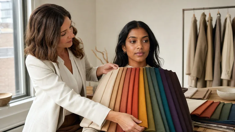
Ask for two or three swatches large enough to cover the upper chest, ideally in the same fabric and finish. Start with two satins in different shades, for example. Ivory satin and white lace change color, texture and transparency together, so they cannot isolate the effect of the shade.
Use the same mirror in even, indirect daylight, away from direct sun and mixed lamps. Cover a brightly colored top. Wear little or no makeup for the first fabric comparison; test the full makeup look later.
Hold one swatch at a time below your face, at the same height and covering a similar area. Compare A, then B, then A again without moving. Notice whether you prefer a sharper or softer contrast between your face and the fabric, and whether either cloth looks noticeably yellow, pink or gray. If the difference does not repeat, record the result as uncertain.
Repeat with the lining, layers and embroidery intended for the dress. Add the actual veil or wrap. A small swatch against your hand cannot show the effect of a full bodice or a veil layered over it.
Try on the shortlisted dresses and look at the whole outfit. Check the neckline, movement and amount of fabric near your face. You may prefer a complete dress even when its swatch was not your favorite; fit, comfort and the meaning of the garment belong in that decision.
Keep the comparison open across light, medium and deep complexions. No complexion or ethnicity belongs automatically to one season. Vein color, photographs and metal preference are also insufficient for assigning a season. A wider color draping session compares several color families; dress shopping answers a narrower question about the clothes you want to wear.
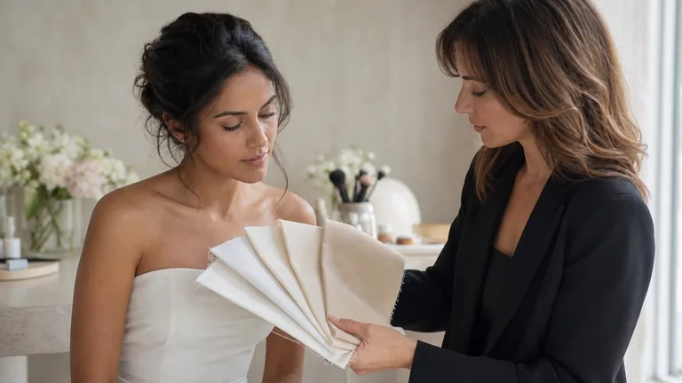
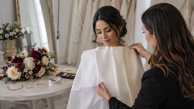
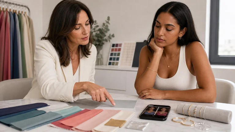
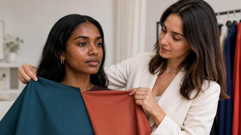
Large swatches let you see fabric close to the face. This styling scene shows several materials together; for an A/B comparison, hold up one at a time and keep the fabric and finish similar.
White, ivory and champagne: check the fabric and lining
White, soft white, ivory, cream, oyster and champagne are shopping labels, not standardized fabric colors. An ivory may look creamy, nearly white or slightly pink beside another designer's ivory. Champagne often describes a beige or golden direction, but the exact color belongs to the particular garment. Ask for the designer, style number, color code and a swatch of the fabric you are ordering.
The names can be surprising. Maggie Sottero describes its All Ivory colorway as its brightest white across the dress layers. That is the manufacturer's description of that colorway, not a rule for every ivory gown. A screen image or a name alone cannot confirm a match with a veil from another brand.
Separate the color's warmth or coolness from how light it is and how much it reflects. Satin can create bright highlights; a matte surface reflects light differently. Lace reveals the fabric underneath, and sheer tulle changes appearance with its lining and number of layers. Compare similar materials first, then evaluate the construction of the actual dress.
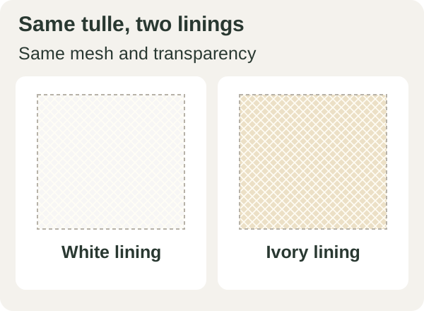
Illustrative diagram: the mesh, size and transparency stay the same; only the lining color changes. Screen colors are not fabric swatches.
For example, white lace over beige can look warmer than the same lace over white. Ask which lining options are available before considering a different dress. Check a veil both open and folded as you will wear it: an embroidered edge near your face may stand out more than the sheer fabric. Save the model and color code with a physical swatch if the salon can provide one.
Wedding color ideas for Winter, Summer, Autumn and Spring
Seasons are categories used in personal styling. In the House of Colour system, Spring and Autumn are warm directions, while Summer and Winter are cool. The combinations here are starting points for a fitting. Your subgroup, the materials and your preferences may lead to a different choice.
Season
Fabrics and details to try
Winter
Compare a crisp white with a neutral soft white. Try a silver-tone accessory and a cool pink or raspberry accent in the lips or flowers, choosing how much contrast you want.
Summer
Compare soft white with an ivory that has little yellow or a slight pink cast. Muted rose, mauve and soft lavender can work as gentle accents; try a satin-finish metal if you prefer less shine.
Autumn
Compare a warm ivory with champagne, noticing how yellow or golden each sample looks. Explore gold, cocoa, terracotta or muted peach in a few details.
Spring
Compare a light ivory with a pale cream. Light gold, peach or coral can provide accents; check whether you like their brightness beside the dress.
Season: Winter
Fabrics and details to try: Compare a crisp white with a neutral soft white. Try a silver-tone accessory and a cool pink or raspberry accent in the lips or flowers, choosing how much contrast you want.
Season: Summer
Fabrics and details to try: Compare soft white with an ivory that has little yellow or a slight pink cast. Muted rose, mauve and soft lavender can work as gentle accents; try a satin-finish metal if you prefer less shine.
Season: Autumn
Fabrics and details to try: Compare a warm ivory with champagne, noticing how yellow or golden each sample looks. Explore gold, cocoa, terracotta or muted peach in a few details.
Season: Spring
Fabrics and details to try: Compare a light ivory with a pale cream. Light gold, peach or coral can provide accents; check whether you like their brightness beside the dress.
If you are Spring or Autumn and love bright white, try the complete dress. A wide neckline puts a different amount of fabric near the face than a high collar. You can repeat the white in other details, add warmer accents or keep the contrast. The same freedom applies to a Winter bride who prefers ivory. There is no need to change your foundation or hair color to compensate for a dress.
To refine a choice, change one property at a time. Compare a pale and a medium pink from the same family for lightness; compare a clear and a grayish pink of similar lightness for intensity. Switching from cool pink to coral also changes warmth. The guide to undertone, value, chroma and contrast explains these differences.
Bridal makeup: test the whole face with the dress
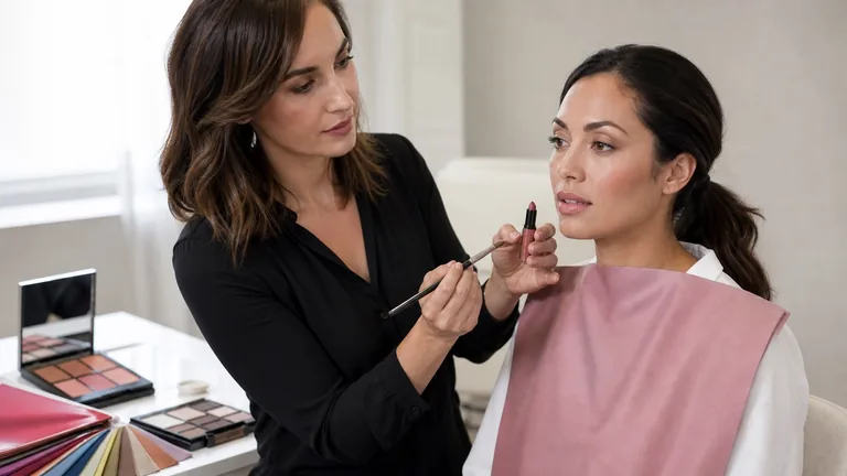
Choose foundation on your actual skin, checking the transition from face to neck and chest. Choose concealer for the area and coverage you want, testing its color and finish on the skin. Neither shade comes from a season label. Seasonal colors can guide blush, lipstick and eye color without making your complexion lighter, pinker or warmer to match the dress. Bring a fabric swatch and a reference for your intended hairstyle to the makeup trial.
Start with a look you already like and adjust one element. For more definition, compare two lipstick depths in the same color family while keeping the eyes and blush unchanged. If a color feels too intense, try a less saturated version or a sheerer application and note which change you prefer. A sheer formula lets more of your natural lip color show through.
With the fabric near your face, check where shine draws attention. Highlighter, pearly shadow and satin may create several bright areas. You can keep shine where you enjoy it and soften it elsewhere. Look from the front and at a three-quarter angle, then assess comfort, wear and touch-ups under conditions similar to the wedding. The bridal makeup trial guide covers application, longevity and the touch-up kit.
For your own products, wash your hands, keep tools and containers clean, and do not share makeup, as the FDA advises. At a professional trial, ask how products and applicators are handled hygienically. Stop using a product that causes irritation; seek medical advice for a reaction instead of covering it with more makeup.
Hair, veils and headpieces
An updo reveals more of the earrings and veil; bangs or loose strands keep more hair color close to the eyes. Try the headpiece in its intended position and check your profile as well as the front. A small clip on the table can become the brightest detail beside your face. Include any head covering and the way it will be layered.
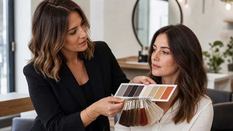
You can keep your current hair color. If you want a change, bring the dress swatch to your hairstylist and describe depth and tone separately. Agree on timing around your hair's condition, previous services and planned trials. The hair color guide can help you describe the effect you want. Your stylist should follow the product's instructions and warnings, including its allergy-test requirements. The FDA's hair dye guidance notes that a reaction can occur even after a skin test shows no reaction.
Jewelry: compare metal, size and finish separately
To compare gold and silver tones, start with pieces of similar size and finish. A large polished gold earring and a tiny silver stud change several things at once; you may be responding to their shape or shine. Wear the earrings with the planned hairstyle and check how they sit beside the neckline, embroidery and hair accessories. Metal preference is a styling choice, not an undertone test.
Keep a family piece or jewelry you have already bought if you love it. You can repeat its metal in another detail, use a mixed-metal accessory or let it be the only accent. Your wedding band, earrings and shoes do not need to match. Hold pearls beside the dress too: their body color and reflections can look different next to a crisp white or a creamy ivory.
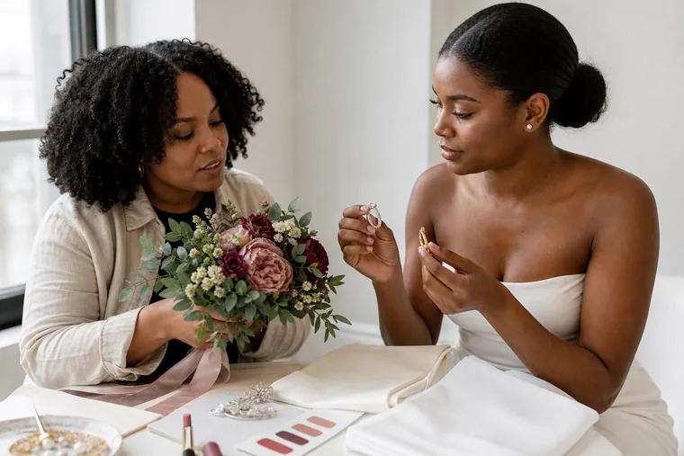
A styling example with jewelry, fabric and flowers. The earrings differ in size and design, so this photograph cannot isolate the effect of metal color.
Bouquet colors and substitutions to discuss with your florist
Decide whether you want flowers close to the dress color or a visible contrast. A pale bouquet and one with burgundy flowers place light and dark areas differently across the outfit. Ask about a sample arrangement or representative stems beside the dress swatch, including greenery and ribbon. An inspiration photo can communicate a direction, but cannot promise the exact shade of the flowers available locally.
Hold the bouquet where you expect to carry it, then closer to your face as it might appear in a portrait. If the brightest flowers pull more attention than you want, try fewer of them or smaller groups spread through the arrangement. You can also make the bouquet the strongest accent and choose a quieter lip color. Lipstick, nails and petals do not need to be identical.
Agree on substitutions before ordering. A request such as 'medium cool pink, a few dark flowers, no peach' gives the florist more to work with than a screen color code alone. Discuss availability for your date and location, the hours the flowers will be out of water, scent preferences and budget. Mention known allergies and record which color relationships matter if a flower variety changes.
For a partner or wedding party, consider one repeated accent, related neutrals or a similar balance of light and dark. Each person can keep their own preferences and meaningful clothing. A flower, ribbon or pocket square can connect the group without putting everyone in one seasonal palette.
Lighting and photos: record the trial without relying on the screen
Compare alternatives in the same light first. Then view the chosen outfit in lighting similar to the ceremony and reception, including both day and evening if relevant. Comparing ivory at a window with white under a spotlight changes the light as well as the fabric, making the result hard to interpret.
For comparison photos, keep the camera, distance and position consistent. Turn off filters and beauty modes. If the camera app allows it, keep the same exposure and white balance for the pair of pictures. Nikon explains how white balance responds to lighting; different automatic adjustments can make two fabrics look more alike or more different than they do in person.
Save a face view, a three-quarter view and a full-length photo. Discuss a flash trial with the photographer if flash will be used. A photographic gray card beside the fabric can provide a reference, but it does not guarantee the final color. If a white dress loses all texture in the image, ask the photographer to check exposure and highlight detail. A phone flash will not necessarily reproduce the wedding photographer's lighting.
Use photos to remember proportions and details, and return to the physical fabrics for a precise color choice. Display settings and viewing conditions also affect what you see, as the International Color Consortium explains. A warm screen mode can make white look yellower. Avoid ordering a veil or accessory solely because it appears to match a photo.
When to schedule trials and what to save
Use this as an example planning sequence and adapt it to your appointments and delivery dates. It is not a dress production schedule or a safety timetable for treatments; agree those with the salon and relevant professionals. If time is short, keep the same order of decisions and work with materials that are available.
Suggested stage
What to check and keep
Before ordering the dress and veil
Compare the actual fabrics, lining, layers and finish. Save style numbers and color codes, and ask for physical swatches if available.
About 2 or 3 months before
Plan a full makeup and hair trial once the fabric and main accessories are settled. Bring jewelry and bouquet references; keep photos and the chosen product shades.
About 3 or 4 weeks before
Review the items that have arrived and confirm any adjustments or flower substitutions. If hair color or an accessory near the face has changed, revisit the affected combinations.
During the final week
Gather the agreed accessories and touch-up products. Share the chosen photos and notes, and confirm who brings each item and when everyone needs to be ready.
Suggested stage: Before ordering the dress and veil
What to check and keep: Compare the actual fabrics, lining, layers and finish. Save style numbers and color codes, and ask for physical swatches if available.
Suggested stage: About 2 or 3 months before
What to check and keep: Plan a full makeup and hair trial once the fabric and main accessories are settled. Bring jewelry and bouquet references; keep photos and the chosen product shades.
Suggested stage: About 3 or 4 weeks before
What to check and keep: Review the items that have arrived and confirm any adjustments or flower substitutions. If hair color or an accessory near the face has changed, revisit the affected combinations.
Suggested stage: During the final week
What to check and keep: Gather the agreed accessories and touch-up products. Share the chosen photos and notes, and confirm who brings each item and when everyone needs to be ready.
For each comparison, note the two items, lighting, observation and decision. For example: 'Ivory satin A and soft white satin B, both lined, at the same window. I prefer A with the veil; check again with the earrings.' Add the date and sample codes so you can find the same fabrics later.
After the makeup and hair trial, ask for the selected product names and shades, plus the changes you agreed on. Keep unfiltered photos and notes in one folder on your phone, with the dress swatch available separately. Make clear which look to repeat, which substitutions are acceptable and who will supply touch-up products.
Frequently asked questions
I already bought a dress outside my palette. Do I need to replace it?
No. Start with the dress you chose and try the full outfit before buying more. If you want a different effect near your face, compare veils, earrings or makeup while keeping the rest unchanged. You may also like the dress's contrast exactly as it is. Comfort, personal taste and sentimental value are valid reasons to keep it.
How do I plan for two outfits or colorful traditional clothing?
Bring swatches from both outfits to the makeup and hair trial. First look for makeup you like with both; then decide whether a lipstick, earring or headpiece change is useful. Try traditional clothing and head coverings in their intended positions and layers. The comparison concerns the colors and surfaces you will actually wear, with no requirement to choose white.
Can I choose a white wedding dress online?
Photos help you shortlist shapes and styles but can hide subtle differences between whites. Ask for fabric and lining swatches, the style's color code and advice on checking it against your veil. Confirm the seller's exchange and return terms before ordering, especially for custom or altered items. If samples are unavailable, the exact shade remains uncertain even when two photos look identical.
Compare fabrics on olive and deep skin tones with steady light, matched pairs and repeatable observations. Keep useful results when a season remains uncertain.