Personal colour analysis for olive and deep skin tones: method and common mistakes

A rigorous, inclusive method for analysing olive and deep skin tones through controlled light, balanced drapes, separate colour dimensions and bias-aware interpretation.

BeautyLearn Editorial Team5 September 2026 20 min read
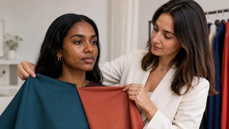
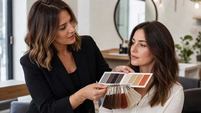
Personal colour consultant compares deep teal and terracotta drapes beside an adult client with a deep skin tone in neutral light
On this page
  1. 1 The first mistake is turning a description into a diagnosis
  2. 2 What olive skin describes—and what it cannot decide
  3. 3 A deep skin tone is a value, not a season
  4. 4 Skin tone, Fitzpatrick type, race and ethnicity are not interchangeable
  5. 5 Lighting must reveal the face, not correct it
  6. 6 Inclusive preparation neutralises context, not identity
  7. 7 Audit the drape set before the client arrives
  8. 8 An eight-step protocol for a fair reading
  9. 9 Test temperature without assuming yellow means warm
  10. 10 Test value and chroma without using white-heavy pastels as defaults
  11. 11 Read contrast across the whole face
  12. 12 Bias control belongs in the client record
  13. 13 Common method failures and their corrections
  14. 14 Official sources and editorial limits
  15. 15 Frequently asked questions about olive and deep skin tones in colour analysis
  16. 15.1 Is olive skin always warm?
  17. 15.2 Does olive skin mean a green undertone?
  18. 15.3 Are deep skin tones always Winter or Autumn?
  19. 15.4 Can a person with deep skin be a Summer?
  20. 15.5 Can a person with deep skin be a Spring?
  21. 15.6 Can Fitzpatrick skin type identify a season?
  22. 15.7 Can ethnicity predict undertone?
  23. 15.8 Why do some pale drapes make deep skin look ashy?
  24. 15.9 How is contrast assessed on deep skin?
  25. 15.10 Is gold versus silver a useful quick test?
  26. 15.11 Are vein-colour tests reliable on olive or deep skin?
  27. 15.12 Does tanning change the season?
  28. 15.13 Can draping be done over foundation or concealer?
  29. 15.14 Do dark marks or pigmentation determine undertone?
  30. 15.15 What makes a drape set inclusive?
  31. 15.16 Can photographs confirm the result?
  32. 15.17 How should an online session approach deep skin tones?
  33. 15.18 How can a consultant avoid colourist language?
  34. 15.19 What if the result remains uncertain?
  35. 15.20 How can students practise without stereotypes?
  36. 15.21 Where can I study the professional method?
  37. 16 A better method does not ask skin to adapt to the kit

Personal colour analysis for olive and deep skin tones uses the same four dimensions and comparison logic used for every person, but a fair consultation may need better equipment and stronger methodological discipline. A mostly pale drape set, a camera that underexposes the face, unrepresentative teaching examples or assumptions based on ethnicity can bias the session before the first comparison. The difficulty is not the skin. It is a protocol that does not provide sufficiently deep, clear, muted, warm and cool alternatives under controlled conditions.

Quick answer: olive skin is not automatically warm, cool, neutral or Autumn, and a deep skin tone is not automatically Winter, Autumn or a deep subseason. Test temperature, value, chroma and contrast separately with comparable fabric pairs, accurate exposure, stable light and whole-face observation. Describe visible effects, state uncertainty and never ask the person's skin to become lighter, pinker or closer to a teaching photograph.

This guide owns an inclusion and error-control intent. It does not replace the foundation guide to what personal colour analysis examines, the explanation of undertone, value, chroma and contrast, the distinctions between four-, twelve- and sixteen-season systems or the full professional draping protocol. It also does not teach foundation or corrective cosmetics; the guide to make-up for deep skin tones owns that application.

The first mistake is turning a description into a diagnosis

Olive, golden, amber, ebony, caramel, medium, brown and deep are descriptive words used differently across communities, cosmetics, imaging and retail. They are not universal coordinates that assign a season. One word may refer to apparent depth, a yellow-green cast, a tan, pigment distribution, lighting or a commercial shade family. Two observers may use the same word for different appearances, and the same person can look more green, grey, red or gold when illumination, exposure and background change.

The CIE has a dedicated technical report on measuring human skin colour because skin structure, anatomical site, instrument, illumination geometry and protocol create variation. A visual consultation is not spectrophotometry and should not imitate laboratory precision with absolute labels. It can adopt the more useful principle: control conditions, repeat comparisons and keep observation separate from inference.

Professional wording sounds like this: under these conditions, this fabric produces this visible relationship compared with its alternative. It does not say that an ethnicity has one undertone, that skin is literally green, or that a person must be warm because they tan. The result concerns how face and tested colours interact. It is not a biological verdict, a health judgement or a ranking of complexions.

Term

May describe

Does not prove

Olive

A perceived yellow-green or grey-green surface relationship

Warmth, coolness, neutrality or Autumn

Deep

Visible light-to-dark value

High contrast, high chroma or one season

Golden

A surface reflection, product shade or lighting effect

A fixed warm undertone

Muted

Reduced chroma in one comparison

Grey-looking skin or low value

What olive skin describes—and what it cannot decide

In everyday language, olive may describe a yellow-green or grey-green appearance across light, medium and deep complexions. There is no single olive skin tone. Some people test relatively warm, others cool or balanced; some support clean colour, others softer mixtures; contrast can be low, medium or high. The descriptor resolves none of the four dimensions on its own.

The common error is treating a surface cast as an immutable undertone. Beige surroundings, warm lamps, green walls, tanning and automatic white balance can increase one component. Redness, shadows, pigmentation and local variation also affect perception. Do not erase these features or diagnose their cause. Observe the whole face, record the current conditions and recognise that surface appearance can vary.

Yellow does not automatically mean warm, green does not automatically mean cool, and grey does not automatically mean muted. Those words compress different axes and often describe an imperfect visual impression. Draping asks whether one controlled colour direction preserves facial volume, continuity and definition better than a comparable alternative. The aim is never to neutralise the person until their skin looks paler or pinker.

A deep skin tone is a value, not a season

Visible skin depth primarily concerns value: the light-to-dark relationship. It cannot determine temperature, chroma or overall contrast alone. People with deep complexions can fall within every seasonal family used by a system and can have different dominant dimensions. Excluding Summer or Spring because online examples show mostly light skin confuses poor representation of the method with a limit in human colour variation.

Contrast is not a synonym for dark skin. Read the distances between skin, eyes, sclera, brows, hair, lips, teeth and facial hair, including their size and distribution. Deep hair and deep skin may create continuity; bright sclera, lips or a smile may create local contrast; grey hair can change the frame over time. No single feature decides the whole pattern.

The drape set must contain genuine deep options in warm and cool, clear and muted directions. Comparing a rich, well-pigmented cloth with a chalky pastel changes value, chroma and often fabric behaviour at once. The pale cloth may create ash because it lacks adequate depth or clarity, not because every colour in its temperature family is unsuitable.

Skin tone, Fitzpatrick type, race and ethnicity are not interchangeable

Do not collapse four different kinds of information

Appearance, UV response, identity and drape response answer different questions

Appearance

Visible depth and colour relationships

Fitzpatrick

Reported burning and tanning response

Ethnicity

Identity, culture and context

Draping

Relative response to controlled colours

Visible depth and an olive cast describe appearance; Fitzpatrick concerns reported UV response; ethnicity is identity and context; colour analysis compares facial response to colour.

The Fitzpatrick classification was developed around reported skin response to ultraviolet exposure, especially burning and tanning. It was not designed to precisely name visible skin colour, establish race or ethnicity, or identify a personal-colour season. A 2024 dermatology review found substantial limitations in current skin-colour classification systems and specifically warned about conflating Fitzpatrick type, race, ethnicity and skin colour.

Ethnicity is a complex social and cultural identity, not a swatch. People within the same community show extensive variation in visible depth, surface pigmentation, colour response and contrast, while different communities overlap. Asking how someone identifies may matter for respectful language and styling context, but it cannot replace draping or authorise anatomical assumptions.

Skin-tone scales can help teams audit representation, imaging systems or research datasets within their validated scope. They do not assign seasons. Labelling skin from a photograph remains vulnerable to illumination, exposure, pixels, display and observer expectations. A scale designed for imaging fairness should not become a commercial shortcut for wardrobe advice.

Framework

Relevant question

Not a substitute for

Personal colour draping

Relative visual response to controlled colour comparisons

Medical or instrumental skin assessment

Fitzpatrick type

Reported tendency to burn and tan in UV context

Visible skin colour or seasonal family

Skin-tone scale

Defined imaging, representation or research task

Undertone or wardrobe advice

Ethnicity

Identity, culture and relevant personal context

A colour measurement or phenotype rule

Lighting must reveal the face, not correct it

Use diffuse, stable light that preserves detail in shadows without clipping highlights. Avoid direct sun, isolated spotlights, strongly reflected ring lights, very yellow or green lamps and coloured walls. Do not underexpose deep skin or brighten it until it resembles a pale reference. Configure the environment so every person's actual depth remains legible.

For documentation, stabilise exposure and white balance after checking a neutral reference where the device permits. Do not let each drape cause the camera to change brightness or temperature, because the software may compensate for the effect under observation. NIST has explicitly identified inadequate lighting and underexposure of dark-skinned subjects, as well as overexposure of fair-skinned subjects, as image-quality problems. A badly captured photograph is not colour evidence.

Judge the live face before the screen. Compression, HDR, portrait processing, local tone mapping and display settings alter hue, chroma, brightness and shadow detail. The guide to online personal colour analysis separates what remote preparation can support from what must remain provisional.

Inclusive preparation neutralises context, not identity

When comfortable and appropriate, ask clients to attend without a covering base, recent self-tan or strongly reflective products, but collect this information without suggesting they are wrong if complete removal is not possible. Cover highly coloured clothing with a neutral cape, move reflective objects and manage hair or head coverings only when they interfere with a comparison the client has agreed to. Respect cultural, religious, medical, sensory and personal needs.

Neutralisation does not mean making everyone visually identical. Do not automatically hide Afro-textured hair, braids, locs, facial hair, hijab or identity-significant elements because a teaching manual did not include them. Agree what to minimise during baseline analysis and what to restore for practical recommendations. A robust protocol adapts without deleting the person's everyday presentation.

Do not promise to explain dark marks, redness, vitiligo, melasma or other variation. A colour consultation neither diagnoses nor treats. Irritation can be associated with pigmentation changes, and visible marks have multiple possible causes. If the client reports pain, itching, lesions, a recent change or concern, stop aesthetic interpretation of that symptom and refer to a qualified healthcare professional.

Audit the drape set before the client arrives

An inclusive set preserves real alternatives

Depth, temperature, chroma and fabric behaviour must remain comparable

Value

Pigmented lights, useful midtones and genuine depths

Temperature

Warm and cool at comparable value

Chroma

Clear and soft without a chalky bias

Material

Comparable weight, opacity and reflection

Audit every direction for light, medium and deep options; warm and cool pairs; clear and soft colour; and consistent opacity and reflection.

Organise the set by temperature, value and chroma, then check that each comparison has a credible counterpart. Are there deep navy, plum, teal, burgundy, olive, cacao, rust and green options in meaningfully different directions? Are deep cools represented only by black and electric blue? Are deep warms reduced to brown and orange? Do the light colours include clear, sufficiently pigmented choices rather than only white-heavy pastels? Inclusion expands the comparison space; it does not create a separate drawer labelled for dark skin.

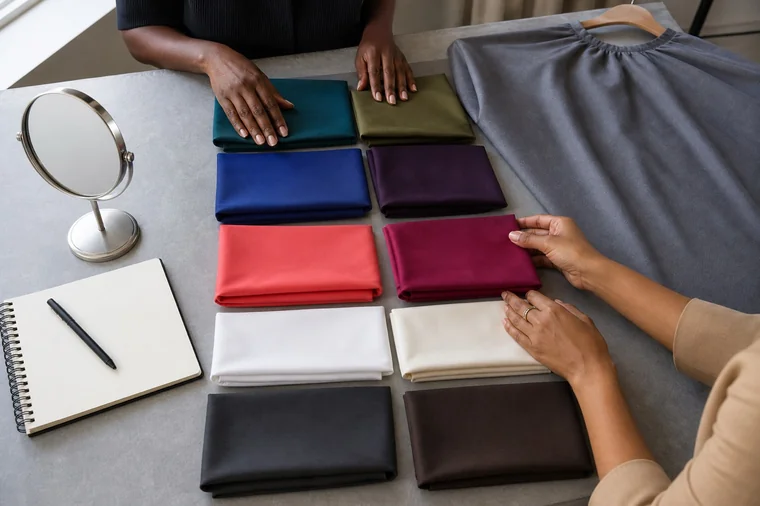
Personal colour consultant compares balanced berry and terracotta fabrics plus deep teal and olive fabrics on adult clients with olive and deep skin tones in controlled neutral light
An inclusive drape set offers comparable warm cool clear muted light and deep alternatives

Audit

Biased comparison

Correction

Depth

Mostly light and medium drapes

Add deep warm, cool, clear and muted counterparts

Temperature

Bright cool cloth against dull warm cloth

Match value, chroma, material and area

Chroma

Chalky pastel against saturated deep colour

Build clear and softened scales at comparable depth

Material

Glossy cloth against matte or differently weighted fabric

Use comparable reflectance, scale and support

Photograph and inventory the set, identify missing comparisons and retire faded or damaged cloths. Do not accept a supplier's season labels as proof that pairs isolate one variable. The professional colour-analysis kit guide explains procurement, care and records without confusing a large kit with a complete one.

Two professionals organise deep clear muted warm and cool drape pairs on a table with a neutral cape and mirror
Audit the comparison set by dimension before using it with clients

An eight-step protocol for a fair reading

Control the context before assigning a label

Change one variable at a time, reverse the order and document uncertainty

1–2

Consent, light, background and exposure

3–4

Baseline and genuinely matched pairs

5–6

Separate dimensions and observable effects

7–8

Applied checks, uncertainty and handover

Consent, setup, baseline observation, matched pairs, separate dimensions, neutral language, real-world checks and a transparent handover make the result more auditable.
  1. Define the objective, consent, scope and the person's preferred language. Separate colour analysis from medical or identity claims.

  2. Stabilise light, background, neutral cape and position. Confirm with direct vision that skin, eyes and textiles retain detail.

  3. Observe the whole face without assigning a season: apparent depth, contrast distribution, surface variation and temporary influences.

  4. Begin with broad but comparable pairs. Never place the strongest candidate against a cloth that is obviously too pale, chalky or reflective.

  5. Isolate temperature, value, chroma and contrast by changing one variable at a time, then repeat key pairs in reversed order.

  6. Describe continuity, volume, edges, sclera and shadows without calling skin healthy, unhealthy, dirty, corrected or naturally dull.

  7. Verify finalists with real wardrobe colours, metals and contrast patterns. Restore hair, head coverings, beard and personal preferences.

  8. Document evidence, uncertainty and alternatives. If two outcomes remain plausible, return useful dimensions rather than forcing a label.

This sequence sits inside the complete personal colour consultation protocol. Repeating a pair is not a way to persuade the client. It checks whether the observation remains stable after order and expectation change.

Test temperature without assuming yellow means warm

On olive or deep skin, yellow, gold, red or green components may be highly visible, but warm-cool response remains relational. Compare pairs at similar value and chroma: deep teal with olive, cool burgundy with rust, berry with coral, neutral white with ivory at equivalent lightness. If one side is deeper, cleaner or shinier, record that the comparison does not isolate temperature.

Do not search for the cloth that makes skin pinker or lighter. Observe whether facial volume remains intact, shadows become disconnected, lips and eyes integrate, or a surface cast separates from the whole. A warm cloth may increase visible yellow without improving the relationship; a cool cloth may suppress warmth while creating grey. The question is which comparison produces the more coherent whole.

Test value and chroma without using white-heavy pastels as defaults

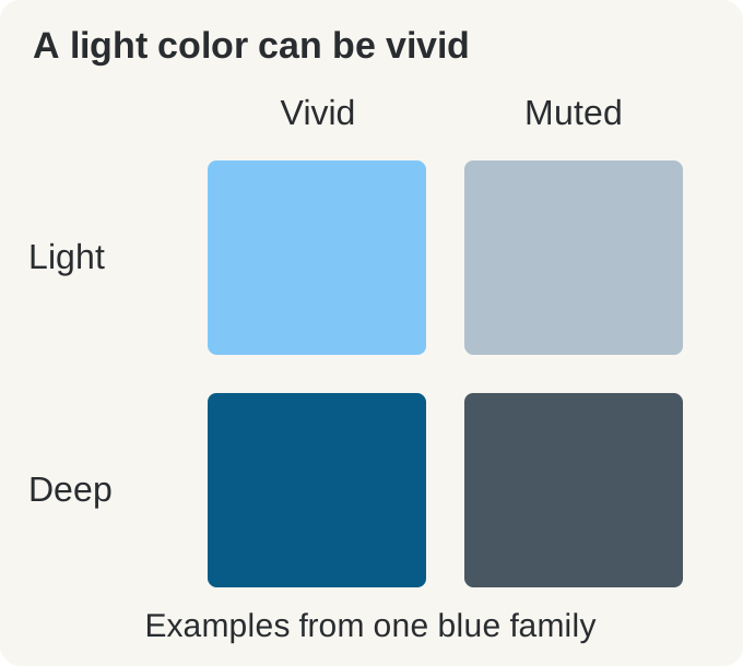
Lightness and softness are different. A light colour can be clean and adequately pigmented; a deep colour can be muted. White-heavy pastels may form a visible veil on deep skin, but that does not prove all light values fail. Compare a clear light colour, a medium equivalent and a deep equivalent within a related hue family, keeping fabric and area stable. Record the range rather than banning a value.

Chroma testing also needs equal depth. A vivid jewel colour against a greyed pale cloth tests several variables at once. Build clear and softened candidates at the value the face can support, then explore how much saturation is useful. An olive surface appearance does not automatically require muted colours, and deep skin does not automatically require maximal saturation.

Read contrast across the whole face

Contrast includes the distance between features, the size of those differences and their distribution. Evaluate hair and skin, brows and forehead, lips and surrounding skin, sclera and iris, teeth and smile, beard and jaw, then compare repeated outfit patterns. A small brilliant detail does not automatically make the whole face high contrast, and deep value does not imply that only dark-light graphics will work.

Test low, medium and higher contrast using patterns with comparable hue families and fabric. Adjust stripe width, spacing, scale and placement. A person may use more contrast in a small accessory than in a full jacket. Grey hair, coloured hair, facial hair and eyewear may change practical contrast over time without changing the foundational colour response.

Dimension

Keep stable

Observe

Do not infer

Temperature

Value, chroma, fabric, area

Warm-cool relationship across the whole face

Yellow skin equals warm

Value

Hue direction, chroma and material

Range that preserves face and garment

Deep skin requires only dark colour

Chroma

Value and temperature

Clear versus softened relationship

Olive always means muted

Contrast

Colours, fabric and total area

Feature distance, scale and distribution

Dark equals high contrast

Bias control belongs in the client record

Before the session, audit whether training images and portfolios show each season across a meaningful range of skin depths, ages and genders. During the session, record the actual pair, setup, order and observation rather than a conclusion alone. Afterward, ask whether evidence would have been interpreted differently on the lightest model in the manual. Bias control is a repeatable quality process, not a claim of personal neutrality.

Use descriptive language and invite the client's own terms. Avoid exotic, dirty, muddy, sallow, normal skin, too dark, needs brightening or correction when speaking about a person's complexion. Describe what the colour does: it separates, integrates, flattens, retains volume, increases a shadow or competes with a feature. Never treat lightening as improvement.

If the result remains unclear, audit the set, light and comparisons before calling the person difficult. Return confirmed dimensions, useful colours, unresolved questions and two plausible routes. Offer another controlled session or supervised review with consent. Documented uncertainty is more professional than precision manufactured from unequal evidence.

Common method failures and their corrections

  • Assigning warmth from yellow or gold appearance: compare matched warm and cool drapes.

  • Assigning Winter or Autumn from depth: test temperature and chroma independently.

  • Using light-skin season portraits as diagnostic templates: compare fabrics, not faces.

  • Allowing auto exposure to brighten each frame differently: stabilise capture and judge live first.

  • Comparing a deep jewel tone with a chalky pastel: match value, chroma, area and material.

  • Treating ethnicity, surname, tanning or vein colour as evidence: remove the shortcut from the record.

  • Calling skin grey, dull or corrected: describe relative fabric effects without ranking complexions.

  • Hiding identity-significant hair or coverings by default: agree analysis and reintegration with the client.

  • Commenting medically on pigmentation or lesions: stop and refer when concern is raised.

  • Forcing a subseason because the kit lacks alternatives: report uncertainty and improve the set.

Official sources and editorial limits

Colour-measurement context uses CIE 256:2025, Measurement of Human Skin Colour, which addresses instrument, geometry, anatomical site, individual diversity, uncertainty and protocol consistency. The technical report concerns measurement and reproduction; it does not validate seasonal colour systems or turn visual consulting into laboratory measurement.

Classification limits use the 2024 dermatology review Integrating skin color assessments into clinical practice and research. Imaging boundaries use the US National Institute of Standards and Technology's demographic effects in face recognition page, including its examples of underexposure and overexposure.

Health-related boundaries use American Academy of Dermatology information on dark marks in darker skin tones. These sources support caution around terminology, imaging and referral. They do not assign personal-colour seasons. This guide is educational and non-diagnostic; local professional scope and healthcare advice remain controlling.

Frequently asked questions about olive and deep skin tones in colour analysis

Is olive skin always warm?

No. Olive describes a visual surface relationship across multiple depths and cannot establish temperature, chroma, contrast or season. An olive complexion may respond more consistently to warm, cool or balanced comparisons. Use matched fabric pairs, controlled light and whole-face observation instead of deciding from one cheek or foundation label.

Does olive skin mean a green undertone?

Green is often shorthand for a complex perceived balance among yellow, red, blue, depth and lighting. It is not a diagnosis or direct measurement. Walls, camera processing, tanning and local pigmentation change perception. Do not search for a colour that makes skin pinker; compare continuity, volume, edges and the whole relationship.

Are deep skin tones always Winter or Autumn?

No. Skin depth primarily describes value and cannot decide temperature or chroma. Deep complexions can belong to every family within a seasonal framework. The stereotype often reflects limited teaching examples or drape kits containing only black, brown and a few saturated colours. Credible alternatives are needed in every direction.

Can a person with deep skin be a Summer?

Yes, if controlled comparisons support a cool or balanced-cool, moderated relationship within the system. Summer does not mean pale skin or white-heavy pastels. Soft navy, plum, slate, berry and cool green can occupy medium or deep values. Classification must come from comparisons, not a stereotyped portrait of the season.

Can a person with deep skin be a Spring?

Yes. Spring describes a warm, clear or light-led relationship according to the framework, not blonde hair or pale skin. Test well-pigmented warm clear colours, not only chalky pastels. Coral, warm turquoise, fresh green and lively blue need comparable alternatives at useful values.

Can Fitzpatrick skin type identify a season?

No. Fitzpatrick type was built around reported response to UV exposure, especially burning and tanning. It is not a precise visible-colour scale and does not assign undertone or season. Do not confuse it with ethnicity, complexion depth or a colour-consulting result.

Can ethnicity predict undertone?

No. Ethnicity is not a colour sample, and every community contains extensive variation in depth, pigmentation and visual response. People across different communities also overlap. Use identity information respectfully when relevant to the client's context, never as evidence that replaces draping.

Why do some pale drapes make deep skin look ashy?

The cloth may be too white-heavy, chalky, low in pigment or far from the useful value range; exposure may also compress shadow detail. That does not ban every light colour. Compare clearer, sufficiently pigmented lights in similar material and verify live. If the response changes, the earlier setup was not a fair test.

How is contrast assessed on deep skin?

Observe distances among skin, eyes, sclera, lips, brows, hair and facial hair, including scale and distribution. Compare low, medium and high-contrast patterns while other variables remain similar. Contrast can shift with grey hair, colouring, beard and styling, so skin depth alone cannot define it.

Is gold versus silver a useful quick test?

Not as a diagnosis. Metals vary by alloy, finish, brightness, scale and reflected surroundings; preference and tanning also affect judgement. Use several finishes as an application check after fabric testing. A person may wear both, and sentimental or professional jewellery never needs to be rejected.

Are vein-colour tests reliable on olive or deep skin?

No. Skin depth, thickness, anatomical site, light, camera and perception affect vein visibility. Blue or green cannot translate reliably into the face's response to colour. Use controlled draping and consult the dedicated guide to DIY colour-analysis mistakes rather than treating veins as a diagnostic shortcut.

Does tanning change the season?

Not automatically. Tanning can change visible depth and surface balance, so wardrobe proportions may need adjustment. Record the test date and current appearance. If a recent tan differs greatly from the person's usual presentation, consider a later verification rather than forcing a permanent conclusion.

Can draping be done over foundation or concealer?

A covering base changes colour and reflectance, so observing bare skin is preferable when removal is comfortable and appropriate. If it cannot be removed, record product, amount and placement and reduce certainty. Do not demand removal that conflicts with sensitivity, privacy, culture or wellbeing; arrange another verification if needed.

Do dark marks or pigmentation determine undertone?

No. Local variation does not necessarily represent the whole face, and a consultant must not diagnose its cause. Observe several areas and the overall relationship without seeking a drape that hides a mark. Pain, itching, lesions, recent change or concern call for healthcare assessment, not a seasonal explanation.

What makes a drape set inclusive?

It contains comparable warm and cool, clear and muted, light, medium and deep options. Deep cools cannot be only black and electric blue; deep warms cannot be only brown and orange; light choices need pigment and clarity rather than only white-heavy pastels. Inclusion improves comparisons rather than separating clients by ethnicity.

Can photographs confirm the result?

They can document a session but cannot replace live observation. Exposure, white balance, HDR, compression and displays alter skin and textiles, and automatic settings may react to every drape. Stabilise capture and preserve shadow detail. If the screen conflicts with direct observation, do not rewrite the result to satisfy the image.

How should an online session approach deep skin tones?

Remote work can gather goals, wardrobe evidence and carefully standardised photographs, but it cannot guarantee accurate depth, undertone or textile response across camera and display. Use consistent instructions, multiple original files and neutral checks, state limitations and offer in-person draping when the decision depends on subtle differences.

How can a consultant avoid colourist language?

Never present lightening, pinkness or eliminating yellow as proof of beauty. Avoid dirty, exotic, normal skin, too dark or naturally dull. Describe relative effects: a colour separates or integrates, flattens or preserves volume, increases or reduces an edge. Ask and respect how the client describes their own complexion.

What if the result remains uncertain?

Do not force a season. Return the strongest dimensions, confirmed colours, unresolved comparisons and plausible alternatives. Audit light, set and order; schedule another session or seek supervised review with consent. A cautious, usable result is more professional than a precise label built on unequal evidence.

How can students practise without stereotypes?

Work with consenting adults across skin depths, ages, genders and features using one documented protocol. Compare notes with a qualified supervisor rather than online season portraits. Regularly audit whether teaching, tutors, portfolios and kits genuinely demonstrate every family across varied complexions. Inclusive practice is a technical and relational competence.

Where can I study the professional method?

Build from four dimensions, light, draping, records and client handover, then practise varied cases with consent and feedback. Browse the colour-analysis guide hub and compare the English colour analysis courses including the current complete colour analysis course. Verify curriculum, supervised practice and inclusion rather than claims alone.

A better method does not ask skin to adapt to the kit

When olive or deep skin is described as difficult to analyse, audit drape representation, lighting, exposure, language and consultant expectations first. Human variation is not an exception to the method; it is why the method must change one variable at a time, preserve credible alternatives, document evidence and accept uncertainty.

Continue through the personal colour analysis guide hub. To build responsible practical skill, explore the English colour analysis courses and the current complete colour analysis course without leaving the English market.

To keep favourite clothes without turning a palette into a ban, use the guide to wearing colours outside your personal palette. It turns distance, visible area, face framing, bridge colours, texture and full-outfit testing into a reuse method.

For a focused application of seasonal colour to the hands, continue with personal colour analysis and nail polish. It covers seasonal starting directions, physical swatch comparison, finish, diverse skin tones and safety without replacing technical nail training.

For wedding-specific coordination of dress white, make-up, hair, jewellery and flowers, continue with the bridal colour analysis guide. It turns the personal palette into an inclusive, real-light brief while keeping every specialist within professional scope.

Continue learning