We use necessary cookies and the Meta Pixel to measure campaigns and improve our offers. You can change your optional-cookie preferences at any time. Read our Terms and conditions.
How to use a personal color palette for clothes, accessories and shopping
A personal color palette gives you samples to compare with clothes and accessories. Putting it to use means finding similar shades in real fabrics, choosing colors that work together and deciding whether a new piece belongs in your closet. A sweater does not have to match one tiny swatch exactly to be useful. This guide starts with a palette you already have and shows how to read it, build outfits and shop with it, including online, where product photos can be misleading.
At a glance
Choose a few neutrals and colors you enjoy wearing. Hold your physical swatches beside the garment in the same light, then compare warmth, lightness and color strength. Try the complete outfit, paying attention to colors near your face. Before buying, check that the piece works with clothes you own. A phone palette or HEX code can help you search, but it cannot confirm the color of a fabric.
Your palette contains a selection of colors identified during color analysis. It may be a fabric fan, a printed card or a digital file. The number of swatches and their names depend on the method: two palettes labeled "Summer" may cover different ranges. Check the system and subgroup on your consultation record before comparing them. The guide to 4, 12 and 16 seasons explains those differences.
Many usable shades fall between the swatches. A fabric can share your palette’s qualities without matching a swatch exactly. Even two colors from the same fan can look quite different as an outfit when you change their proportions or position. A small light collar covers much less space than a light coat.
If you have not had your colors assessed, start with how personal color analysis works. Buying a fan of colors you like cannot tell you your season.
Read temperature, value, chroma and contrast
When two garments seem almost the same color, separate the qualities that make them different. "Pink" could describe pale peach-pink or a vivid raspberry shade. Compare the garment with the swatches first, then with the rest of the outfit.
Quality
What to compare
Temperature
The warmer or cooler direction relative to nearby samples. One red may lean toward orange and another toward violet.
Value
How light or dark the color appears. A light blue shirt and a navy shirt may need different pants to create a similar light-dark contrast.
Chroma
How vivid or muted the color appears. Compare a strong green with a grayer green of similar lightness.
Contrast
The difference between colors placed together, especially light and dark. Navy with white creates a larger light-dark difference than navy with medium blue. Contrast describes the combination.
Temperature
What to compare
The warmer or cooler direction relative to nearby samples. One red may lean toward orange and another toward violet.
Value
What to compare
How light or dark the color appears. A light blue shirt and a navy shirt may need different pants to create a similar light-dark contrast.
Chroma
What to compare
How vivid or muted the color appears. Compare a strong green with a grayer green of similar lightness.
Contrast
What to compare
The difference between colors placed together, especially light and dark. Navy with white creates a larger light-dark difference than navy with medium blue. Contrast describes the combination.
Keep the comparison consistent: use the same light, place the pieces side by side and expose similar areas of fabric. You do not need to assign each quality a number. If you cannot tell why a piece looks different, note the quality you find confusing and ask your consultant to demonstrate it on that garment. The four color dimensions guide has more detailed comparisons.
Choose neutrals, main colors and accents
Start with two or three colors you wear often. Your neutrals might include navy, gray, brown, beige or light shades from your fan. Use them as bases for pants, jackets, shoes and bags, with your existing clothes in mind. If most of your pants are navy, try a new jacket with that navy before buying it.
Add a main color for shirts, sweaters or dresses, and an accent for an accessory if you want one. The roles can change: coral is an accent on a small scarf and the main color on a dress. Keeping a useful light and dark shade gives you ways to vary contrast without adding more color families.
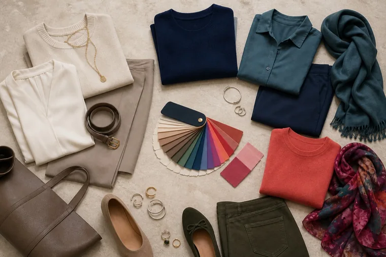
Cream pieces and neutral accessories sit on the left; navy, teal and coral appear on the right. A patterned scarf can repeat colors from several pieces. These are outfit examples, not a single seasonal palette.
For a small starting selection, try two neutrals, one light shade and two colors you love. Adjust that selection to what you actually wear. If you work in a uniform, a scarf or glasses may give you more room to use color than another shirt. You can leave colors unused even when they belong to your season.
Compare a garment with physical swatches
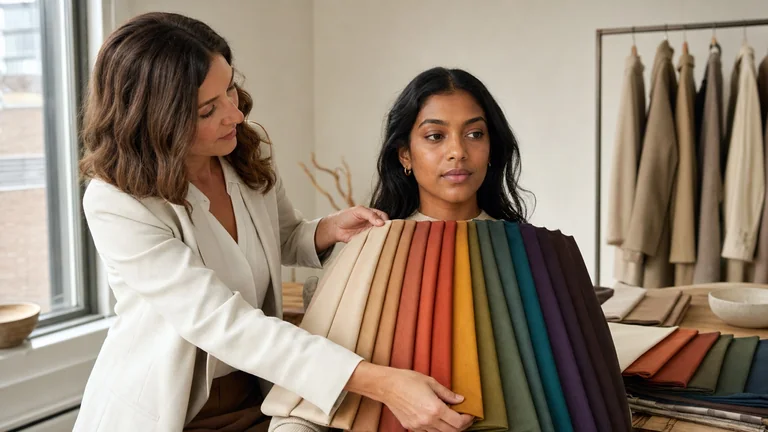
Use the reference supplied during your consultation. A fabric fan and a printed card are different materials from your clothing, so neither guarantees an identical match.
Choose two or three swatches close to the color you are considering. Leave a generous area of the garment visible beside them.
Hold the swatches and fabric in the same light at a similar angle. Avoid leaving one in shadow or glare while the other is evenly lit.
Ask whether the garment is warmer or cooler, lighter or darker, more vivid or more muted than the samples. Compare one quality at a time.
Try the garment on or hold it where you will wear it. For a shirt or scarf, look at the whole combination near your face from a normal conversational distance.
Try at least two combinations with clothes you own. If you like the difference from the swatch and the outfits work, you do not need to keep searching for an exact duplicate.
A navy sweater slightly darker than your swatch might still work as a wardrobe base. If it is also much more vivid and shifts toward another hue, several qualities have changed at once. Give it a closer look with the intended outfit, especially if it will cover a large area near your face. A narrow belt gives you more freedom to experiment.
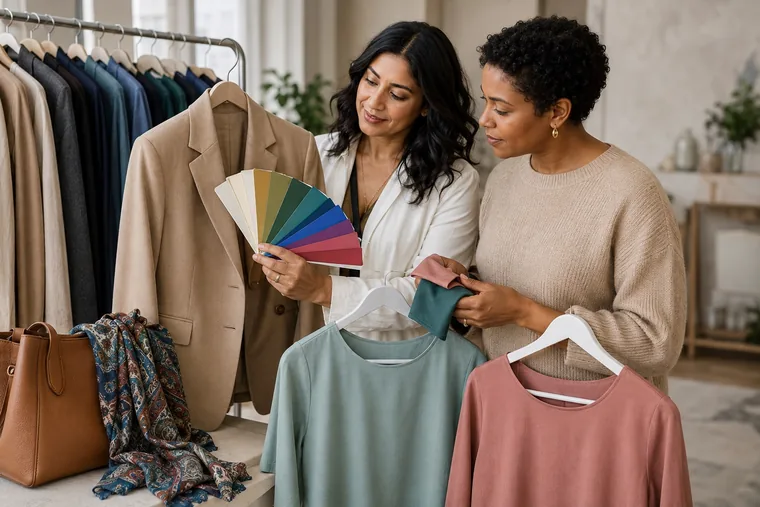
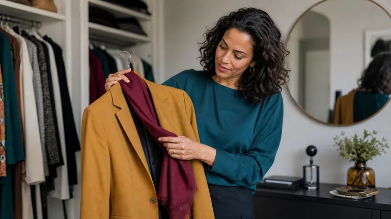
Keep several swatches visible beside the jacket, then compare the tops with it. This shows a garment comparison; the photo cannot establish a seasonal result or an exact color match.
A photo of the garment and swatches together can help you remember the comparison. Separate photos are less useful because exposure and white balance can change between shots. Use the photo as a note and make the color decision while looking at the actual materials.
Check light, fabric and finish
Start in diffuse daylight, away from direct sun and strong colored reflections from walls or curtains. In a store, check the item near a window if possible. For work clothes or an evening outfit, also look at the pieces together under lighting similar to where you will wear them.
Two fabrics can appear to match under one light and differ under another. This is called metamerism, and it matters when you buy a jacket and pants separately but want them to look like a matching suit. Compare both pieces together in more than one lighting condition. If they do not look consistent, choosing clearly different shades may work better. X-Rite explains how lighting affects visual color evaluation.
Glossy fabric produces highlights that matte fabric does not show in the same way. Move satin to distinguish its underlying color from the bright reflections; with velvet, check the direction of the pile. Fiber names alone do not settle this: wool can have different textures, and silk can have a matte or shiny finish.
For heathered knits, tweed and denim, look at the overall effect from a distance before examining individual threads. With sheer fabric, the layer underneath contributes to the color you see. Try the shirt over the camisole or top you plan to wear.
Three ways to put an outfit together
Choose a combination for the occasion, then try it with different pieces. These examples illustrate ways to combine colors; compare the actual shades with your fan because names such as "beige" and "blue" vary.
Combination
Example and check
Neutral plus main color
Navy pants with a pink sweater and navy shoes. Check the sweater near your face and the contrast between the top and pants.
Neutral, main color and accent
Beige pants, a teal top and a small coral detail in a scarf. Decide which color should cover most of the outfit and which should draw attention.
Tonal
A light blue shirt, medium blue pants and a dark blue jacket. Choose visible differences in lightness or texture instead of three shades that almost match.
Neutral plus main color
Example and check
Navy pants with a pink sweater and navy shoes. Check the sweater near your face and the contrast between the top and pants.
Neutral, main color and accent
Example and check
Beige pants, a teal top and a small coral detail in a scarf. Decide which color should cover most of the outfit and which should draw attention.
Tonal
Example and check
A light blue shirt, medium blue pants and a dark blue jacket. Choose visible differences in lightness or texture instead of three shades that almost match.
The 60-30-10 idea is an optional reminder to use a dominant color, a secondary color and a smaller accent. You do not need to measure your clothes. A shiny earring can attract attention even though it covers very little space.
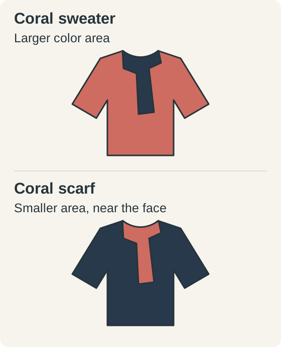
The same two colors switch places. Coral covers a larger area on the sweater; on the scarf, it stays near the face in a smaller area. The diagram shows placement and proportion, not an effect on a person.
To soften a light-dark transition, try an intermediate shade, such as a medium blue jacket with a pale blue shirt and navy pants. For a sharper contrast, put more widely separated light and dark shades next to each other. The strength of an individual color and the contrast of the outfit are separate choices.
Work with prints, black, white and denim
Look at a print from a normal viewing distance and identify its background and the colors covering the most space. Try repeating one of those colors in a solid piece. Small details outside your palette can stay in the print; consider how noticeable they are in the whole outfit. Large blocks keep colors visibly separate, while a tiny pattern can look more uniform from farther away.
You can keep wearing black and white, whether you enjoy them or need them for work. If you prefer a softer effect near your face, compare black with dark blue, charcoal or brown from your palette, and white with ivory, cream or pearl. A scarf or collar changes the color directly beside your face without requiring you to replace a coat.
Denim comes in many blues. The wash, pale threads, fading and stitching all affect its appearance. With jeans, focus on the complete outfit; with a denim shirt, also try the color next to your face. The guide to wearing colors outside your palette explores ways to use pieces you want to keep.
Choose scarves, glasses, jewelry, bags and shoes
Scarves, hats and eyeglass frames sit near your face. Try them on: thick, dark, matte frames have a different visual weight from thin or transparent ones. With a scarf, check how much fabric remains visible after you tie it.
For jewelry, consider the metal color, finish and size together. Yellow gold, rose gold and silver can be polished, brushed or antiqued; a flat matte swatch will not reproduce those effects. To compare metals, try pieces of similar shape and size with the same outfit. One piece of jewelry cannot determine a season. Comfort, metal sensitivities and the meaning a piece has for you also matter.
Bags, belts and shoes are farther from the face. A neutral already present in your clothes can connect the pieces; a different color can provide an accent. Check the hardware too: a large buckle adds a visible color and finish, while a small clasp is less prominent.
Use your palette when shopping
Before buying in a store
Decide what the new piece needs to do. For a work jacket, choose two shirts you own and check that it fits comfortably over each one. Bring your swatches and, when practical, one of those shirts. After comparing colors, check fit, movement, comfort and care requirements. A close color match will not make a scratchy sweater or tight jacket easier to wear.
Check the price and the store’s exchange or return terms before paying. If you cannot identify an occasion and clothes to wear with the piece, leave it for now. That applies even when the color is very close to your fan.
When you can only see the color on a screen
Compare several product photos, fabric close-ups and videos when available. Read the fabric and finish description, and ask the retailer for a swatch if a precise color matters. Reviews may warn that an item is darker in person, but customer photos have their own lighting and camera variations.
Retail names such as sage, dusty rose, teal and burgundy differ between brands. A HEX code used on the web specifies an sRGB color; it does not describe fibers, sheen or finish, and it cannot certify that a fabric belongs to a season. Use it to narrow a search, then assess the real product.
A palette on your phone is useful for remembering colors and outfits. Night filters and automatic display adjustments can change how it looks. Turning them off removes one source of variation, but the screen still cannot replace a physical swatch comparison. If color is decisive, check that you can inspect or return the item, including any return deadline, fees or final-sale exclusions.
Build a capsule with clothes you already own
A capsule is a group of clothes you can combine for a specific need, such as a workweek or a trip. Start in your closet. Separate the pieces you wear often from those you rarely reach for and consider why. A garment in your palette can still go unworn because of its cut, fabric or lack of a suitable occasion.
Choose two bottoms you own, such as navy and gray pants in shades you want to wear.
Try three tops with both pairs of pants, perhaps two shirts and a sweater. Check color, proportions and comfort.
Add a jacket, shoes and a bag to complete the outfits. Photograph the combinations you want to remember.
Write down the first piece you actually need. Look for that before adding more colors from the fan.
Two pairs of pants and three tops can make six combinations only if every top works with both pairs. Check each one. If one top works with just one pair of pants and the other two work with both, you have five combinations. Count the outfits you would wear, including the right fit and occasion.
Keep favorite pieces outside your palette. Try a different position for the color, a layer or an accessory before setting something aside. Replace clothes gradually as they wear out or stop meeting your needs. You do not need to rebuild your closet after color analysis.
Ask for a demonstration at your consultation
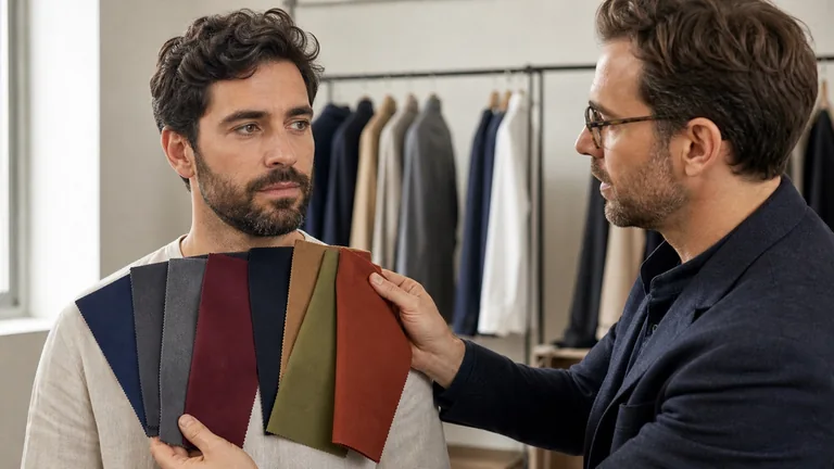
Before leaving with your palette, ask to compare it with a few clothes you own: a piece that is easy to combine, one you are unsure about and a favorite you want to keep. Have the consultant show which differences in warmth, lightness or chroma matter, and try a complete outfit.
If you are the consultant, name the system you used and explain the swatch material. Give the client a small selection they can use, including neutrals and alternatives, then ask them to repeat the comparison. The guide to a personal color consultation explains how this fits into the session and client record.
Frequently asked questions
Can I combine palettes from different brands?
You can compare them, but a shared season name does not make them equivalent. Check the method, subgroup and qualities of the samples. If you have had an analysis, use the palette you received as your reference and ask your consultant about differences before adding swatches from another system.
Can I use my palette for makeup and hair color?
It can suggest a direction for lipstick, eye shadow and hair color. Check makeup where you will wear it, since opacity and finish affect the color you see. A hair-color result also depends on your starting shade and the coloring process. Match foundation to your skin rather than deriving it from your season. The color analysis and makeup guide explains these differences.
Can I print my palette at home instead of using the original?
A home print can help you record names and outfit ideas, but its colors may differ from the original fan. Paper, ink and color management affect the result. When a shade needs a closer check, compare the garment with the reference used during your consultation.
Compare fabrics on olive and deep skin tones with steady light, matched pairs and repeatable observations. Keep useful results when a season remains uncertain.