We use necessary cookies and the Meta Pixel to measure campaigns and improve our offers. You can change your optional-cookie preferences at any time. Read our Terms and conditions.
Personal color analysis draping test: lighting, preparation and steps
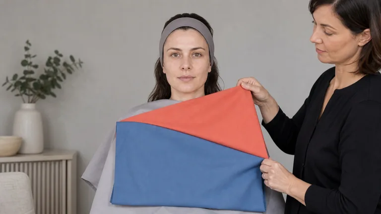
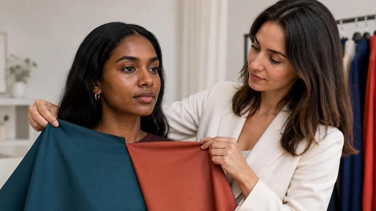
A personal color analysis draping test compares colored fabrics held near the face. The aim is to notice how each fabric affects the appearance of shadows, reflected color and facial features while the lighting and viewing position stay steady. Preparing the room and handling the drapes consistently makes those comparisons easier to repeat. This guide explains how to set up, choose useful pairs, run an A-B-A comparison and record what you see. A seasonal palette is considered after several comparisons within the chosen method; one flattering fabric cannot establish it.
At a glance
Use stable, diffused light, remove foundation and colored makeup, and cover colored clothing with a neutral cape. Compare similar fabrics by showing A, then B, then A again at the same height below the chin. Look at the same areas of the face, write down specific differences and check them with another pair. If the result changes with the light or presentation order, check the setup before deciding on a season.
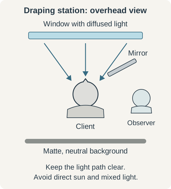
For daylight draping, seat the person facing a window so light reaches both sides of the face. Avoid direct sun. If a bright strip falls across a cheek or the chin, move the chair or diffuse the light with a neutral curtain. A window to one side can leave the other side in shadow; adding a warm lamp on that side introduces a second light color into the comparison.
With artificial lighting, use a stable, diffused setup and keep the lamps' output, position and distance fixed throughout the series. Avoid mixing sources with visibly different colors. Before showing any drapes, look at the face above a neutral cape. Uneven lighting, a strong colored reflection or a hard shadow needs attention before you compare fabrics.
Daylight setup viewed from above. Keep the mirror and observer out of the light reaching the face.
Use a matte, neutral background. Nearby walls, curtains, the consultant's clothes and shiny furniture can reflect color toward the face; cover or move anything that interferes. Position an untinted mirror where it does not block the light. If a cloud changes the daylight midway through a pair, pause and show both drapes again once conditions settle.
A 5000 K or 6500 K label alone does not establish a lamp's suitability. CIE standard illuminants D50 and D65 define reference spectral distributions for colorimetry. ISO/CIE 23603:2024 describes how to assess the spectral quality of daylight simulators. Neither certifies a personal color analysis method. Check the manufacturer's color-rendering information as well as the evenness and reflections in your actual room, and follow the lighting requirements of the method you use.
Prepare the face, hair and clothing
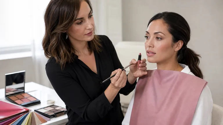
Agree on the purpose before the appointment: clothing near the face, makeup, hair color or a combination. Ask the client to arrive without foundation, concealer, blush or colored lipstick, or allow for gentle removal before draping. Wait for redness from rubbing to settle; if it persists, postpone judgments about the complexion. Note a recent tan and avoid testing immediately after self-tanner has been applied. House of Colour's US preparation guidance, for example, asks clients to arrive without makeup and avoid spray tans before their appointment.
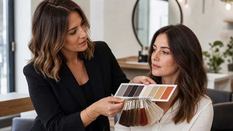
Cover colored clothing with a matte neutral cape and hold hair away from the face. A neutral hair covering can reduce the influence of dyed hair during the initial comparisons. Uncover it for the final styling check so the recommendations work with the hair the person actually wears. Neutral gray is one option; some kits use white capes and headbands. Follow the kit's method and keep the same covering in place for A and B.
Remove prominent earrings or colored accessories only if the client is comfortable doing so. Glasses can be set aside initially and put back on for the styling check, but someone who needs them to see should keep them. Leave essential hearing and comfort devices in place. Do not use cosmetics to cover freckles, facial hair or pigmentation differences. Record products or accessories that remain. Eye color, hair color, veins and ethnicity do not determine a season on their own.
Choose drapes that answer a clear question
Use clean, unfaded fabrics large enough to cover the upper chest. Within a pair, aim for similar size, opacity, texture and drape. Thin fabric lets the cape show through; glossy fabric or deep creases add reflections and shadows. Check the cape and headband too, and follow the manufacturer's care instructions without treatments that change the fabric's color or finish.
A pale matte pink and a dark glossy brown differ in several ways, so you cannot attribute a change in appearance to warmth alone. Choose the pair around one question and keep the other characteristics as close as practical. The guide to undertone, value, chroma and contrast explains how to separate those qualities.
Comparison
How to choose the samples
Temperature: warmer or cooler
Use the kit's comparison pairs, with lightness and color strength as similar as possible. An orange-leaning red and a cooler red can start a comparison; check the impression in another color family.
Value: lighter or darker
Compare shades in the same color family without also changing sheen or warmth. Note whether a darker fabric draws attention away from the face or makes particular features easier to distinguish.
Chroma: brighter or more muted
Choose colors close in value and temperature but different in saturation. A light color is not necessarily muted.
Contrast: higher or lower
Keep the arrangement and proportions of the colored areas similar. Changing stripe width, pattern size and light-dark contrast at once makes the comparison harder to interpret.
Temperature: warmer or cooler
How to choose the samples
Use the kit's comparison pairs, with lightness and color strength as similar as possible. An orange-leaning red and a cooler red can start a comparison; check the impression in another color family.
Value: lighter or darker
How to choose the samples
Compare shades in the same color family without also changing sheen or warmth. Note whether a darker fabric draws attention away from the face or makes particular features easier to distinguish.
Chroma: brighter or more muted
How to choose the samples
Choose colors close in value and temperature but different in saturation. A light color is not necessarily muted.
Contrast: higher or lower
How to choose the samples
Keep the arrangement and proportions of the colored areas similar. Changing stripe width, pattern size and light-dark contrast at once makes the comparison harder to interpret.
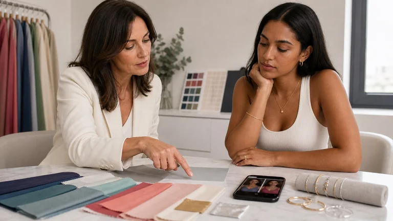
Real fabrics rarely isolate one quality perfectly. Treat the first pair as a starting hypothesis and check it with other samples. Metallic drapes may belong to a particular method, but their shine adds another difference; a gold-versus-silver preference cannot settle the analysis. Check that the kit includes useful alternatives across light and dark values and bright and muted colors. If a needed comparison is missing, record that limitation instead of forcing the client into the nearest available palette.
Run the A-B-A comparison
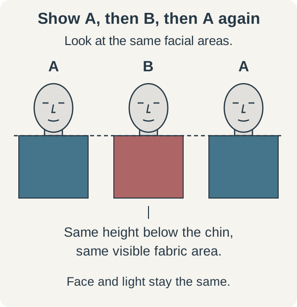
Draping systems differ in their order and interpretation of comparisons. Use the sequence taught for your kit; the guide to 4, 12 and 16 seasons explains why labels also vary. A-B-A is a practical way to revisit a pair: returning to the first fabric lets you check whether the initial impression returns. It is not a universal protocol or scientific proof of a season.
Check the face above the neutral cape. Set the chair, mirror and direction of gaze, and keep the drapes within reach so you can change them without moving the person.
Decide which quality you are comparing and identify the fabrics as A and B. Avoid announcing which one you expect to work better.
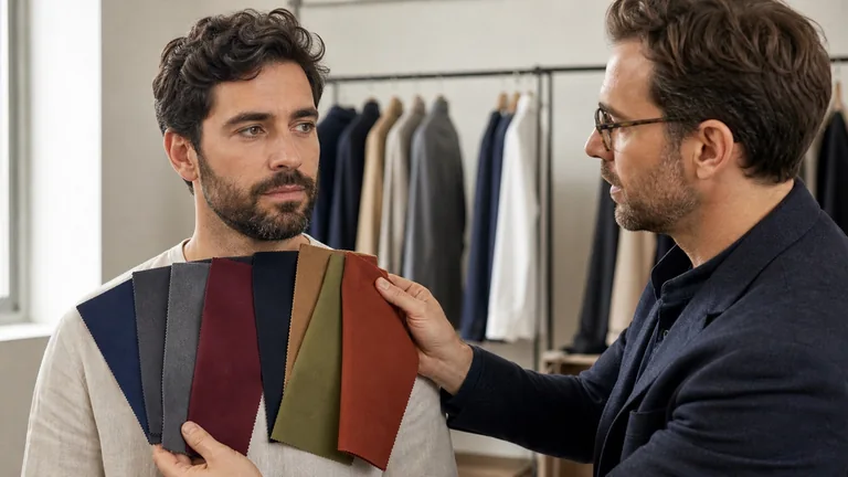
Show A below the chin with the fabric spread out. Look at the face as a whole, then the under-eye areas, sides of the nose and jawline.
Switch to B while keeping the upper edge, visible area and distance from the face consistent. Allow enough time to inspect the same areas without holding one sample much longer than the other.
Return to A and check whether the difference returns. Record an unclear or absent difference too. If presentation order seems to affect the result, repeat the pair starting with B.
Check the hypothesis with another comparable pair in a different color family. Consider a palette direction or seasonal label only after reviewing the comparisons together.
Only the fabric changes in this sequence diagram. The identical faces do not simulate skin changes or show a seasonal result.
Change fabrics without changing the setup
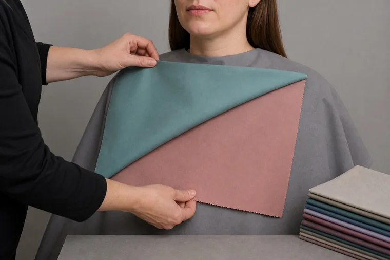
Stack the drapes and lift the front one without brushing it across the face. Keep the person's head still and avoid moving one fabric closer than the other. Judge the comparison once the new drape is spread out and covers the same area. Partway through the movement, two colors are visible in unequal proportions, so the next comparison is not ready yet.
Finish lifting the front drape before comparing the face. Both colors are still visible during the change shown here.
There is no universal number of seconds for each view. Give yourself time to look at the whole face and recheck the same areas with both fabrics. If the change is too quick to follow, slow down and repeat the pair. If concentration fades, pause and look at a neutral surface. Continuing with more drapes just to obtain a definite answer can make the session harder to interpret.
Describe what you see on the face
Ask the client to watch their face in the mirror while you inspect the same areas with each drape. Describe a change you can locate: a more noticeable shadow under the eyes, reflected color beneath the chin or a lip edge that is easier to distinguish. These are observations of appearance under the session's conditions. They are not measurements of skin or evidence about health, age or personality.
Observation
What to check before interpreting it
One side of the face looks darker
Check that the head has not turned and that light reaches both sides. Repeat the pair before attributing the difference to the fabric color.
A colored cast appears below the chin
Check the fabric's height, angle and sheen. A local reflection does not establish the person's undertone.
The eyes, lips or jawline seem more defined
Name the specific edge or area. Check whether the effect returns from B to A, then look for it with another pair.
The fabric draws more attention than the face
Record that visual effect separately from taste. The client may still want the color as a small accent or a bold outfit choice.
One side of the face looks darker
What to check before interpreting it
Check that the head has not turned and that light reaches both sides. Repeat the pair before attributing the difference to the fabric color.
A colored cast appears below the chin
What to check before interpreting it
Check the fabric's height, angle and sheen. A local reflection does not establish the person's undertone.
The eyes, lips or jawline seem more defined
What to check before interpreting it
Name the specific edge or area. Check whether the effect returns from B to A, then look for it with another pair.
The fabric draws more attention than the face
What to check before interpreting it
Record that visual effect separately from taste. The client may still want the color as a small accent or a bold outfit choice.
A note such as "With B, the shadows under both eyes look stronger; with A again, they look less noticeable" gives you something to recheck. This is an example of wording, not a real session result. "It brightens everything" is less useful unless you can identify what changed. Keep the client's preferences in the record as well: enjoying a color and noticing its visual effect are both relevant when choosing clothes.
Keep useful notes and handle uncertain results
Record the date, purpose, preparation, light source and chair position on a session sheet. For each pair, note the A/B identifiers, presentation order, quality being compared, facial area and observed effect. Add the check you made and a provisional conclusion, such as a repeated effect, an unclear difference or a comparison that could not be interpreted. These are descriptive working categories, not a scientific certainty score.
Keep the pairs that produced no clear difference. If you work with another observer, write your notes separately before comparing them. When consultant and client disagree, return to the area each person mentioned and clarify whether you are discussing a shadow, a contour, reflected color or a preference.
If results change from one pass to the next, check the light and reflections first, then head position, preparation and the fabric surface. Repeat the decisive pairs after a pause, including the reverse order when needed. If uncertainty remains, retain only the observations that held up. For example, you might note that medium-value fabrics made the jawline easier to distinguish while leaving the season undecided. Arrange another session when you can correct a specific problem, such as variable light or missing samples.
Save the lamp settings and workstation arrangement; for daylight, add the time and sky conditions. Recheck your reference comparisons when you replace a faded drape or change the lighting. Once you have a useful color direction, try the palette with real clothes and accessories, using the proportions the client plans to wear.
Use photos and video with consistent settings
Agree separately on photography, storage and any permission to publish images. Someone who declines photos can still take part in live draping. For a photo series, keep the light, camera position, framing, exposure and white balance consistent. Turn off filters and beauty modes, and check that the phone does not automatically change brightness or color between A and B.
If you cannot lock those settings, use the photos to remember which fabrics you tested without treating subtle complexion differences as confirmation. Do not brighten a frame or warm its colors to fit the expected result. A collage with different exposures cannot show a fair comparison. The guide to photographing makeup covers lighting and capture in more detail.
The display and the room where you view the images also affect perceived color. The International Color Consortium explains how calibration, profiles and viewing conditions affect a display. For online color analysis, use a consistent image series and check practical recommendations with real fabrics. Digital color frames change the surroundings of a photograph without reproducing light reflected from cloth onto the person.
Correct these errors before continuing
The light changes between samples: repeat both drapes under the new conditions instead of comparing the second with your memory of the first.
One fabric is closer, higher or shinier: match the position and visible area, or choose a more comparable pair.
The first impression drives every later choice: reverse a useful pair and check it in another color family.
One drape, vein color, jewelry or a selfie seems to settle the result: return to repeated fabric comparisons before naming a season.
The notes contain only a seasonal label: add the pairs, conditions and observations so you can review how you reached it.
Frequently asked questions
Can I use clothes instead of professional drapes?
Yes, for practicing color comparisons. Choose solid, matte garments with similar fabrics, fold them to show equal areas and cover prints, logos and prominent seams. Record the limitation if texture, sheen and color all differ. Your closet can provide useful outfit comparisons without containing every pair needed for seasonal classification.
How many drapes do I need?
The number depends on the method and the questions you need to test. To practice one comparison, prepare a pair plus another pair in a different color family to check the impression. That is a starting exercise, not a complete seasonal analysis kit. For a client consultation, use the set required by your method and record which comparisons support your conclusion.
Can I use a ring light for color analysis?
Its shape does not establish whether it is suitable. Consider color rendering, evenness, brightness, distance from the face and any other light sources. If the lamp creates strong reflections, lights the center of the face unevenly or changes settings during the series, correct the setup. A "white light" label or Kelvin number alone is not enough.
Compare fabrics on olive and deep skin tones with steady light, matched pairs and repeatable observations. Keep useful results when a season remains uncertain.