We use necessary cookies and the Meta Pixel to measure campaigns and improve our offers. You can change your optional-cookie preferences at any time. Read our Terms and conditions.
Undertone, value, chroma and contrast in personal color analysis
Undertone, value, chroma and contrast describe different aspects of color and the way colors work together. Understanding them helps you see why two fabrics can look different next to your face and what to look for in clothing or makeup. Blue, for example, can be light or dark, vivid or muted; the color name alone does not tell you its lightness or chroma. In personal color analysis, you compare these qualities separately, then combine the observations into a palette you can use.
At a glance
Undertone guides warm and cool comparisons; value describes lightness or darkness; chroma distinguishes stronger color from more muted color. Contrast is the difference between elements placed together. To find out which quality affects a comparison, change one at a time and keep the others similar. One flattering drape cannot establish a season.
Placement and area, until you deliberately test proportions
Undertone or temperature
What you compare
Relatively warm and cool colors
What you keep similar
Lightness, chroma and fabric finish
Value
What you compare
Lighter and darker colors
What you keep similar
Hue family, chroma and finish
Chroma
What you compare
More vivid and more muted colors
What you keep similar
Hue, lightness and finish
Contrast
What you compare
The difference between colors in a combination
What you keep similar
Placement and area, until you deliberately test proportions
These dimensions are separate from the four seasons. A seasonal family combines several qualities according to the system being used. Dark value does not automatically mean Winter, and low chroma alone does not establish Summer or Autumn. The introduction to personal color analysis explains how draping and seasonal systems fit together.
Undertone: comparing warm and cool colors
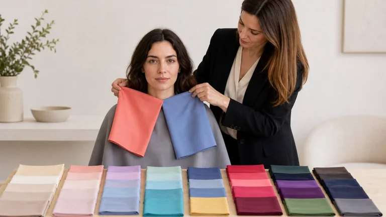
In color analysis, "undertone" often means the warm or cool direction attributed to a person. Draping compares how the face looks next to different fabrics under consistent light. It does not directly measure a hidden pigment beneath the skin.
Start with two samples of similar lightness and chroma, such as medium reds with an orange or a violet cast. Repeat with another family, such as yellow-leaning and blue-leaning greens. Check the actual fabrics under the same light: a color name on a label does not guarantee a balanced pair. If all the warm drapes are pale and muted while the cool ones are dark and vivid, you cannot attribute the difference to temperature alone.
Look at the outline of the jaw and lips, whether shadows attract more attention, and whether you notice the fabric before the face. Describe those changes before choosing a favorite. Vein color, jewelry preferences, tanning and natural hair color are insufficient to confirm a warm or cool direction.
Warm and cool are relative descriptions. A red can look warmer than a violet-red while looking cooler than an orange-red. For foundation, you also need to match a formula to your skin and check it after application. A clothing palette cannot select your foundation shade; the foundation depth and undertone guide covers that separate test.
Value: telling light, medium and dark apart
Value describes how light or dark a color appears. Higher value means lighter; lower value means darker. "Deep" is another word for dark in this context. Keep the lightness of the fabric separate from the amount of light falling on it: increasing a photo’s exposure is not the same as choosing a lighter fabric.
Compare samples in the same hue family with similar temperature and chroma. A light blue and a dark blue can work, provided one is not also much grayer than the other. If both lightness and color strength change, note that difference and look for a closer pair before deciding that value explains the result.
A very dark fabric may make its edge or the shadows around the face more noticeable. A very light one may give the features less definition. Check those effects during the comparison and decide whether they suit the look you want. Fabric area, neckline and surrounding colors all influence the result. Deep skin does not require a dark wardrobe, and light skin does not limit you to pastels.
Chroma: comparing vivid and muted colors
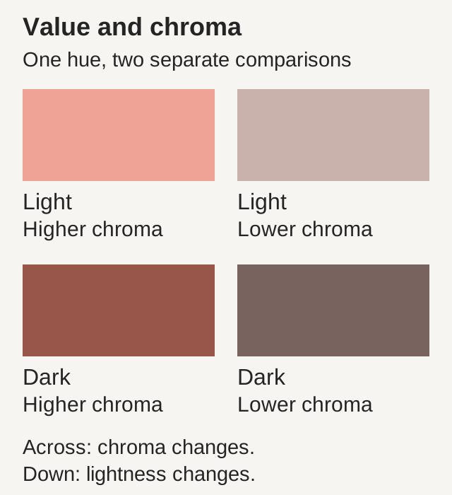
For a practical draping comparison, chroma describes how strong or muted a color looks. A light pink can look vivid or dusty; a dark red can also be more colorful or more grayish. Choose samples with similar hue and value. Lightening a color while making it more muted changes two qualities at once.
Across each row, chroma changes; down each column, lightness changes. These digital examples explain the difference. Screen settings affect their appearance, so use them to understand the terms rather than choose a personal season.
During draping, notice whether the eyes, brows and lips remain easy to see or whether the fabric draws most of your attention. A vivid color can be a strong focal point; a muted one can create a softer effect or leave the features looking less distinct. Repeat with comparable samples before treating that impression as a consistent preference.
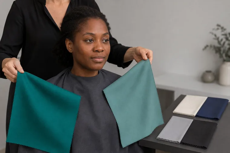
These fabrics differ in lightness as well as color strength. To test chroma more closely, choose a pair with similar value and alternate each fabric beneath the whole face.
"Bright" in everyday color-analysis language usually describes a vivid color. It does not necessarily mean a light color or shiny fabric. Satin, velvet and matte knits reflect light differently, so use similar finishes and folds for a comparison. When putting an outfit together, you can experiment with a smaller area of vivid color or a different texture.
Color science uses more precise definitions. CIE defines chroma by comparing an area’s colorfulness with the brightness of a similarly lit neutral reference. Saturation compares an area’s colorfulness with its own brightness. Consultants may use intensity, clarity or softness more loosely. Those terms can help describe what you see, but a mirror comparison is not a numerical color measurement.
Contrast: comparing color combinations
Contrast requires at least two elements. It can involve a light-dark difference, a difference in hue, or a vivid color beside a neutral. Around the face, you can compare skin, hair, brows, irises, the whites of the eyes and lips. Clothing adds edges, prints and different areas of color.
Dark hair against light skin can create strong value contrast without establishing which temperature or chroma to wear. To try contrast in clothing, start with two similar neutrals, then compare two with a larger light-dark difference. Keep the fabric area and position near the face consistent. Look for whether the combination gives the features more definition or makes the boundary between the fabrics the main focal point.
The top row changes the light-dark difference while keeping the areas equal. The bottom row keeps the same two grays and changes the proportion. A small dark accent has a different visual weight from a half-dark composition.
You can adjust an outfit without giving up a color. A medium-gray scarf between a white collar and a black jacket introduces an intermediate step. A narrow black border occupies less space than a large black panel. Moving the strongest contrast farther from the face also changes where the eye goes, even when the colors stay the same.
How to set up a useful draping comparison
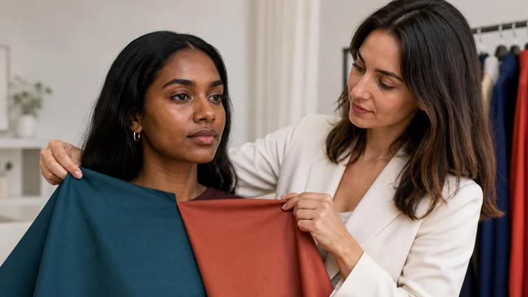
Use matte fabrics of similar size, a neutral background and steady, diffuse light. Avoid mixing window light with a warm lamp. Keep the face and fabrics in the same position throughout the comparison; changes in folds, lighting or visible area can alter what you see.
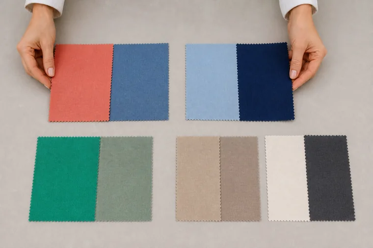
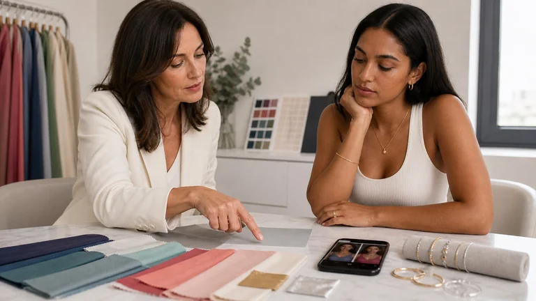
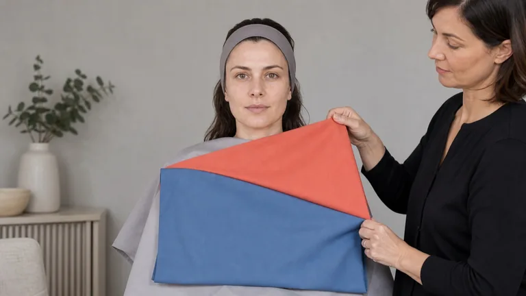
Fabric examples for planning comparisons. Check lightness, chroma and finish before testing: a photographed pair does not establish that only one quality changes.
Write down which dimension you want to compare. Choose samples that differ mainly in that quality. For contrast, prepare two combinations instead of two isolated swatches.
Show fabric A, then B, then A again, in the same position for similar lengths of time. Alternate them beneath the whole face. Holding them side by side helps compare the fabrics, but places a different color beside each side of the face.
Record what changes, such as the lip outline, the prominence of shadows or the balance between face and fabric. Keep "no clear difference" as a possible result.
Repeat with other hue families. A recurring effect is more useful than one isolated preference. If the result changes, check the light, samples and finish before drawing a conclusion.
Try a combination using the qualities that looked useful, in the way you would wear it. A shirt under a jacket is a more practical check than a swatch held in an unrelated position.
There is no single testing order shared by every system. If the first warm-cool comparison is hard to read, try another value or chroma range and record why you changed it. The draping test guide explains preparation and common sources of error.
What to write down after each comparison
Record the date, light, background, sample names, dimension and presentation order. Separate what you see from your interpretation: "the shadow under the chin stands out more with B" describes an effect; "you are a cool season" is already a conclusion. Avoid judgments such as "this ages you" or "this makes you healthy," which the comparison cannot establish.
Example comparison
Observation to record
Next step
Two medium reds, one orange-leaning and one violet-leaning
The lip outline looks clearer with B, then less distinct on returning to A
Repeat with another warm-cool pair of similar value and chroma
Two blues with different values
The darker blue draws more attention, but it is also more vivid
Find a more muted dark blue; the first pair does not isolate value
Two gray combinations
A sharp edge dominates near the face but works as a small border
Repeat with the same colors and a smaller dark area
Two medium reds, one orange-leaning and one violet-leaning
Observation to record
The lip outline looks clearer with B, then less distinct on returning to A
Next step
Repeat with another warm-cool pair of similar value and chroma
Two blues with different values
Observation to record
The darker blue draws more attention, but it is also more vivid
Next step
Find a more muted dark blue; the first pair does not isolate value
Two gray combinations
Observation to record
A sharp edge dominates near the face but works as a small border
Next step
Repeat with the same colors and a smaller dark area
These are examples of notes, not observations from a real consultation. In your own record, include possible interference such as a wall reflection, opaque makeup, colored glasses or changing light. Ask how the person feels about the effect as well: a favorite color and a visible change tell you different things about the choice. If the effect remains uncertain, keep both options and repeat under steady conditions.
Combining the results into a usable palette
A dimension becomes a priority when it produces consistent differences across several comparisons. Suppose warm and cool samples give similar results, while vivid and muted samples give noticeably different effects. Explore chroma before forcing a temperature label. You may find a useful range of muted colors with more flexibility on warmth. This is an example of how to reason through a result, not a formula for assigning a season.
Describe ranges and combinations: medium-to-dark value, moderate chroma and gentle contrast near the face, for example. When two tests disagree, check whether the fabrics also differ in finish or lightness. Seasonal systems organize these observations differently and may give similar palettes different names.
Use the same care with deep and olive skin tones. Skin depth alone does not determine temperature, chroma or contrast, and olive coloring does not automatically mean cool. Include light, medium and dark samples, with enough warm, cool, vivid and muted options to make useful comparisons. Freckles, facial hair, gray hair and differences between the face and neck are part of the appearance you are observing.
A usable palette includes neutrals, main colors, accents and ways to combine them. Test each in its intended position: a shirt frames the face, a belt occupies a small area and pants sit farther away. The guide to using a personal color palette connects those observations to shopping and outfits.
Frequently asked questions
Can someone have a neutral undertone?
Yes. A person may show only a small difference between warm and cool drapes, or find a range of near-neutral colors useful. Value or chroma may offer clearer guidance. Neutral does not mean every color has the same effect; combinations still need to be tested.
Does a tan change the result?
A tan can change visible skin depth and its contrast with hair, eyes and clothing. That does not automatically mean a new season. If some combinations look different, record the condition and try them again later with the same samples and comparable light.
How should I account for dyed hair or changed brows?
They change the visible relationships around the face. With the person’s agreement, pull back or temporarily cover the hair to see how much it contributes, then uncover it and test combinations with the current style. Record makeup and filled-in brows so the two observations remain distinct.
Can a black-and-white photo tell me my contrast level?
It can help you notice some light-dark differences, but it loses differences in hue. Exposure, processing and the black-and-white conversion can also change the differences between grays. Use it as a record of a comparison, not as a scale that automatically assigns a personal contrast level.
Why do colors look different in the mirror and on my phone?
The camera may adjust exposure and white balance when you change drapes, and the display can shift the colors again. Keep camera settings fixed when possible, avoid filters and screen modes that warm the image, and view the whole series on the same device. Calibration and a display profile can improve consistency, but cannot correct a photo taken under different lighting. One selfie cannot separate all those effects.
Can I have high contrast and still prefer muted colors?
Yes. Visible contrast describes one relationship; your preferred style may use another. Try muted colors in combinations with a lighter or darker neutral, adjust their proportions, or move the strongest edge away from your face. The palette should help you make those choices without overruling your taste.
CIE, ISO/CIE 11664-4:2019: the L*a*b* color space and its lightness, chroma and hue correlates. This describes color; it does not validate personal seasonal classifications.
Compare fabrics on olive and deep skin tones with steady light, matched pairs and repeatable observations. Keep useful results when a season remains uncertain.