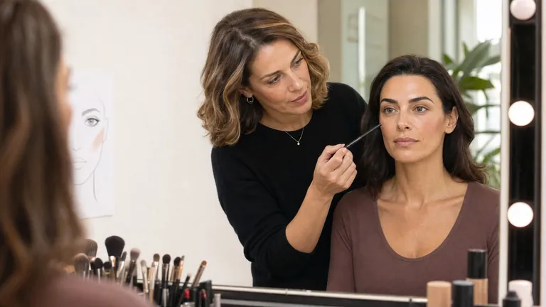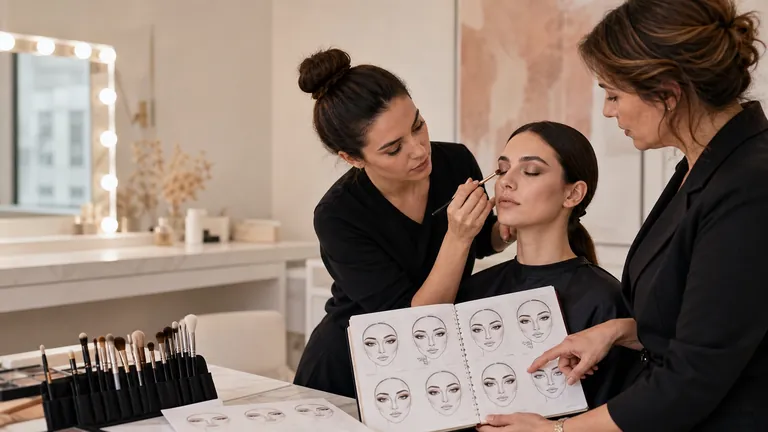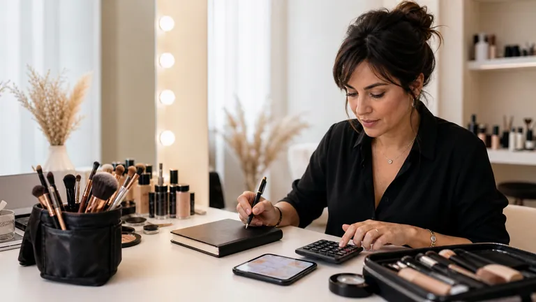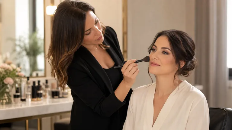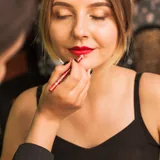
A makeup face chart is a plan drawn on a simplified face. Use it to choose where colour will go and how strongly each feature will stand out. It also gives you a record to return to: a useful chart shows the design clearly and keeps the choices you would otherwise have to remember. When you try the look on a face, you can note what needs adapting and keep that information with the design.
Before you fill the outline, decide what you want people to notice first. Defined eyes with soft lips give you a simple starting point: as you work, check whether the cheeks and lips support the eyes or draw attention away from them.
To get started:
Write down the aim and lightly mark where the makeup will go.
Build up colour gradually, keeping your chosen feature as the focus.
Record products, placement and order as you work.
Try the look on a face and note what you change, with the reason.
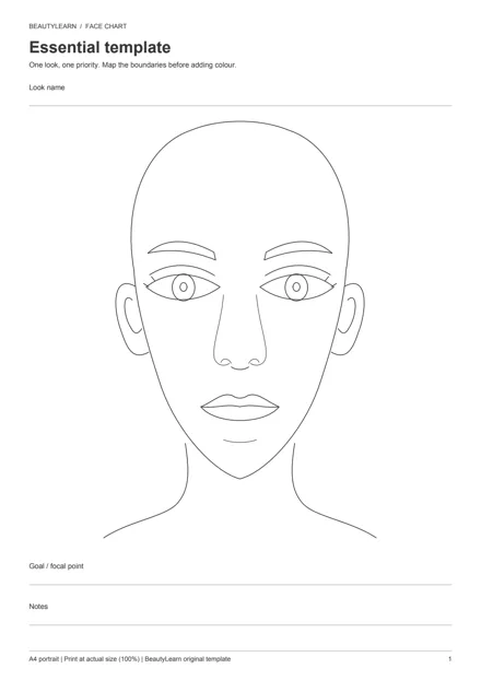
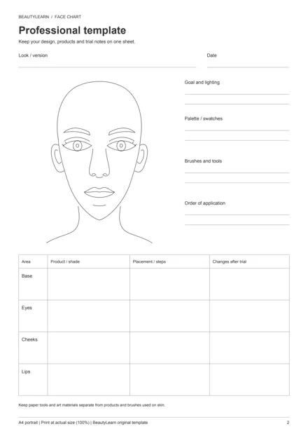
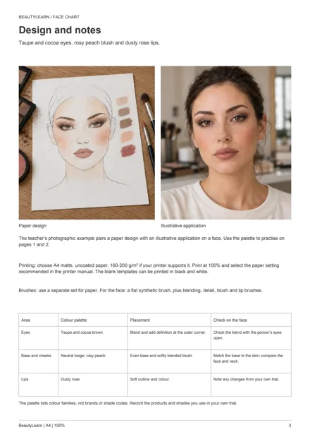
3 A4 pages · Free direct download · No email required
Choose a printable face chart template
The free PDF contains three A4 pages. Start with the Essential template on page 1 if you want a large face to practise shape and colour. Choose the Professional template on page 2 when you also need a record of products and application: it has separate spaces for base, eyes, cheeks and lips, plus notes from the trial.
On page 3, Design and notes, photographs show the teacher’s paper design beside an illustrative application on a face. The notes identify colours and placement for you to use as a reference in your own trial. Later in the guide, a sample record shows how to write down what you observed and what you want to change.
Print just the sheet you need and keep the example on screen. The blank templates are original BeautyLearn worksheets. Use the photographs to help you place the colours on your own template; you do not need to copy every detail of the drawing.
For this exercise, try matte, uncoated A4 paper at 160–200 g/m², provided your printer accepts it. Check the printer manual for supported paper types and weights, then choose portrait orientation, 100% scale and single-sided printing. The blank templates can be printed in black and white. Before printing, check that the preview shows the whole outline and all the fields.
Test your paper and materials
Gather the template, a pencil, a clean eraser, a mixing palette and brushes reserved for paper. Start with colours you already own: a medium and a darker eye colour, a blush and a lip colour are enough for the first exercise. The photographed design also uses a neutral beige base, with taupe and cocoa around the eyes, rosy peach on the cheeks and dusty rose on the lips.
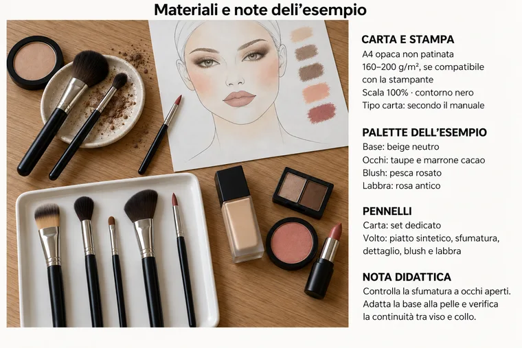
Set out your palette and keep paper tools separate from those for the face.
Keep the paper brushes separate from the set you will use on a face, as the two groups in the photograph show. With a clean tool, transfer small portions of makeup to a palette reserved for the chart. Do not put anything used on the paper back into the original container. Artist's pencils and other drawing materials stay on paper.
Test the eyeshadow on a scrap of the same paper before you start the chart. Pick up a little with a dry brush and brush off the excess on one part of the scrap. Make a small mark on a clean area, then soften its edge without adding more colour. You should be able to move from a stronger mark to a softer edge without rubbing hard. Test any base or lipstick separately: a paper that works with one product may respond differently to another.
- What you see on the scrap: The first mark is a dark patch
- What to try next: Repeat with less product, keeping the paper and brush the same. Compare the edges of the two marks.
- What you see on the scrap: A halo appears or the paper fibres lift
- What to try next: Stop working on that spot. Try the product on another paper instead of rubbing or adding more to cover the mark.
To compare two papers, use the same product and brush, with a similar amount and pressure. Put the scraps side by side in the same light. Choose the paper on which you can best control the transition from colour to clean paper; weight alone will not tell you how easily it blends.
How to make a face chart: step-by-step tutorial
For your first chart, use a clear aim: defined eyes with soft cheeks and lips. Write it in the goal field. The four stages below show how the design develops. Look at where colour is added at each stage, then follow the steps on your own sheet.
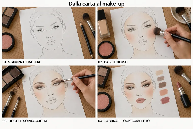
Follow the design from a light outline to a complete palette in four stages.
1. Mark the placement lightly
Use light pencil marks to establish the outer edge of the eye shading, the blush area and the lip outline. Keep the marks erasable so they guide rather than dominate the colour. Look at the whole face before picking up a brush. If the sheet is crowded with marks, keep only those that tell you where to work.
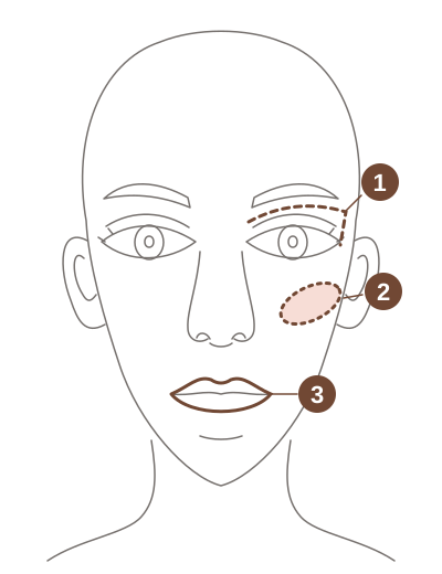
- 1Outer edge of the eye shading
- 2Blush area
- 3Lip outline
2. Add base and blush
If you want a base, use the one you tested on the scrap and spread a thin layer with a flat brush, keeping the outline visible. Otherwise, go straight to the blush. For the rosy peach blush, brush off the excess on the scrap, then place the brush in your chosen cheek area. Work outwards with light strokes and soften the edge with the colour left on the brush. Pause to look at both cheeks before adding more: the blush should stay in the chosen area rather than spread across the centre of the face.
3. Build the eyes and brows
Apply taupe to the lid area and blend towards the boundary you marked. Add cocoa to a smaller area at the outer corner, leaving the transition between the two colours visible. Soften the edge with a clean brush, without dragging the darker colour across the whole lid. Then define the brows with short strokes that follow the direction of the hairs. Check how strong they look beside the eyes before darkening them further.
4. Finish the lips and add swatches
Trace the lip outline with dusty rose and gradually fill it in. Add a small swatch of each colour beside the face so you can distinguish the original shade from its blended effect. Hold the sheet further away and look at the design as a whole. If the lips are now the first thing you notice, make them softer in your next version while keeping the eyes the same.
Record products and changes you can follow later
Make notes as you work, while you still remember which brush you used and in what order. A colour name alone is not enough: “cocoa” could describe many products. Copy the product name, brand and shade from the packaging, then note its placement and the steps needed to repeat the application. The photographs provide colour references; your own record should name the products you actually used.
On the professional sheet, use Base for any foundation, concealer and powder, and Cheeks for blush. Keep the original plan separate from what you notice and change on the face. This hypothetical example shows how to record an observation and the change you want to try; it does not describe a trial carried out on the person in the photographs.
- Stage: Plan
- Example note: Cheeks: rosy peach blush from the centre of the cheek outwards, with a soft edge.
- Stage: Observation during the trial
- Example note: From the front, the colour comes closer to the nose than I intended.
- Stage: Change to try next
- Example note: Start further out on the cheek and leave the area beside the nose clear. Keep the product and brush the same so I can compare the placement.
A proposed change remains an idea until you try it. After the next attempt, add what happened to the trial notes and enter the version number in “Look / version”. You can then return to the version you prefer without losing the earlier decision that led to it.
Compare neutral, plum and coral palettes
Once you can complete a chart, use another version to explore a different direction. In the comparison below, the neutral design on the left has low-contrast lips. The plum design in the middle darkens both eyes and lips, while the coral design on the right adds brighter colour to the lips and around the eyes. These are three different proposals; a palette name does not decide which occasion it suits.
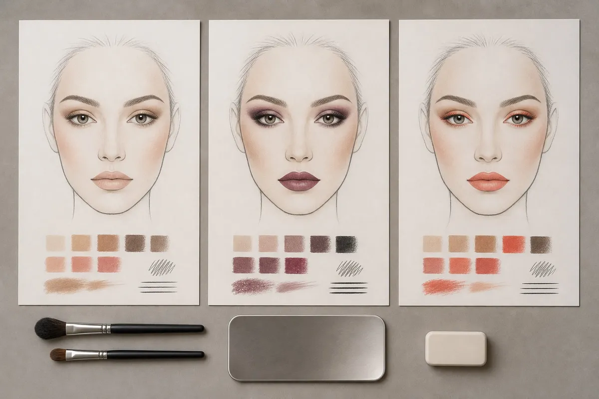 Open the full-size image (new tab)
To keep the eyes as the focus, start with the neutral design and make a second version in which you change only the lip colour. Keep the eye shape and blush placement the same so you can see what draws your attention. The three illustrated palettes offer possible directions; your two-sheet exercise lets you examine a single choice.
Place your two versions side by side and write which better fits your aim, with a specific reason: “The plum lips draw my attention first,” or “The softer pink leaves the eyes as the focus.” You do not need to choose a palette that is best for every look. For more on the difference between hue, intensity and light–dark contrast, see colour theory for makeup.
Adapt the face chart to a real face
The pair below shows a paper design beside an illustrative application in the same colour family. Look closely at the eyes: the chart gives you a drawn space, while the face has an eyelid and crease that change what remains visible. Keep the intended effect in mind, then decide the placement by looking at the person in front of you.
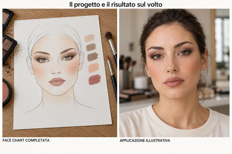
Compare where the colour sits on the paper and on the face.
Switch to the brush set reserved for faces and use cosmetics suitable for each area. Before deciding where the eye shading should end, look at the person from the front with their gaze straight ahead. Ask them to open their eyes again after the first few strokes. If the colour you wanted to show disappears into the crease, adjust the boundary a little and check again with the eyes open before adding more colour. Mark the placement you actually used on the chart.
Choose the base on the person too: beige on the paper does not identify the right foundation. Assess the colour and amount on the skin, and check how the face and neck look together. On cheeks and lips, observe how far the colour extends across the contours and as the face moves, then record any differences from the plan. A photograph records the makeup at that moment; to learn how it wears, observe it during the trial.
If you photograph the trial, agree this with the person first. Keep the lighting, distance and framing similar between shots, without filters. Different lighting can make a colour look darker even when you have not changed the product. Compare the photo with what you see in person before deciding that the makeup needs correcting.
Save versions and choose work for your portfolio
Paper lets you practise brush pressure, blending edges and layering colours directly. Digital work makes it easy to duplicate a design and compare alternatives without drawing it again. Choose the medium to suit the exercise: use paper to practise removing excess from a brush and blending colour, or two copies of a digital file to compare colour placement.
For digital work, keep an editable original and an exported copy to view or share. Photograph a paper chart from above with the camera parallel to the sheet, in even light, and check for glare over the colours. Save the image and notes together with the look name, date and version. If colour is central to the decision, keep the paper sheet as a reference alongside the screen image.
A chart earns its place in a portfolio when it shows something the makeup photograph cannot explain on its own: how you compared alternatives, for example, or adjusted eye placement after a trial. Choose a few legible charts and pair each design with the application and a brief note about your decision. The makeup artist portfolio guide explains how to select and arrange that work.
Further reading
L'Oréal Paris on using face charts, including the difference between a flat drawing and the contours of a face.
Liza Kondrevich on paper for face charts, including testing a product on a small area before starting.
Frequently asked questions
Do I need drawing skills to use a face chart?
You can start with the face outline in the template. Make the makeup areas recognisable and add notes you can read later. To practise one technique, complete just that area and write down the action you are practising; you do not need to produce a finished portrait every time.
Can I fill in the PDF on a computer?
This file is designed for printing and has no interactive fields to type into. If your PDF program supports annotations, you can add text boxes or marks over the page. Save a copy under a different name, then reopen it to check that your annotations are still visible.