We use necessary cookies and the Meta Pixel to measure campaigns and improve our offers. You can change your optional-cookie preferences at any time. Read our Terms and conditions.
Seasonal color analysis can help you choose nail polish by narrowing the colors you want to compare: cool or warm reds, soft or bright pinks, light or deep nudes. Your palette gives you a starting point; the polish on your nails shows how the formula, coverage and finish work together. Because a manicure occupies a small area away from your face, you can follow your palette closely or enjoy a stronger contrast, including with polishes you already own.
At a glance
Try cherry red or fuchsia for Winter, mauve or dusty rose for Summer, terracotta or cocoa for Autumn, and coral or peach for Spring. These are color families to explore, not required shades. Compare two similar polishes in the same light with matching coverage and finish, then check your favorite on the nail. A sheer polish can look quite different from an opaque polish in a similar shade.
Seasonal palettes are conventions used in color consulting, not medical diagnoses or guarantees that you will like a color. In the four-season system used by House of Colour, Winter and Summer are cool directions; Autumn and Spring are warm. Subseason names and boundaries vary among systems. The examples below help you choose samples to compare, without classifying anyone from their hands.
Season
Nail polish colors to compare
Winter
Cool cherry red, cranberry, fuchsia, raspberry, plum, navy and charcoal. Compare cool colors at the depth and brightness you want.
Summer
Dusty rose, mauve, muted berry, grayish lavender, slate blue and cool taupe. Look for softened colors; they can be either sheer or opaque.
Autumn
Terracotta, brick red, rust, warm olive, cocoa and cinnamon. Compare warm, muted shades at medium or deep values.
Spring
Coral, peach, apricot, poppy red, warm pink and apple green. Explore warm colors that are light, bright or both.
Season: Winter
Nail polish colors to compare: Cool cherry red, cranberry, fuchsia, raspberry, plum, navy and charcoal. Compare cool colors at the depth and brightness you want.
Season: Summer
Nail polish colors to compare: Dusty rose, mauve, muted berry, grayish lavender, slate blue and cool taupe. Look for softened colors; they can be either sheer or opaque.
Season: Autumn
Nail polish colors to compare: Terracotta, brick red, rust, warm olive, cocoa and cinnamon. Compare warm, muted shades at medium or deep values.
Season: Spring
Nail polish colors to compare: Coral, peach, apricot, poppy red, warm pink and apple green. Explore warm colors that are light, bright or both.
Shade names are loose descriptions. Two polishes called cherry can differ in undertone, depth and coverage. If you have a physical color fan, compare it with the dry polish sample. The guide to using a personal color palette explains how to look for similarities when there is no exact match.
Winter: choose depth or brightness
For a vivid manicure, compare fuchsia with raspberry; for a dark one, start with plum or navy. In common subseason systems, Bright Winter emphasizes saturation, Deep Winter emphasizes depth, and Cool Winter emphasizes coolness. Black is one option among these colors. You can also try a silver detail or a crisp French tip if you like a graphic effect.
Summer: compare soft pinks at different depths
A medium mauve or dusty rose may suit your taste better than a milky pink. If a pale color looks too white against your hand, compare it with a deeper or less milky version. Light Summer, Cool Summer and Soft Summer put different emphasis on lightness, coolness and muted color. A glossy top coat is still an option: a soft color does not require a matte surface.
Autumn: refine browns, reds and greens
Terracotta and cocoa can differ as much in depth as in warmth. Try cinnamon or a medium brown for a neutral manicure, then compare a deeper olive or cocoa if you want more contrast. Soft Autumn emphasizes muted colors, Warm Autumn emphasizes warmth, and Deep Autumn emphasizes depth. Copper shimmer is an optional effect; the palette does not prescribe a metallic or matte finish.
Spring: separate light color from bright color
Peach and apricot are useful starting points for a light manicure; coral and poppy red offer brighter options. Light Spring, Warm Spring and Bright Spring emphasize different parts of that range. A grayish pastel and a clearer pastel can look quite different even at similar lightness. A neon label alone does not tell you whether a polish resembles your Spring palette.
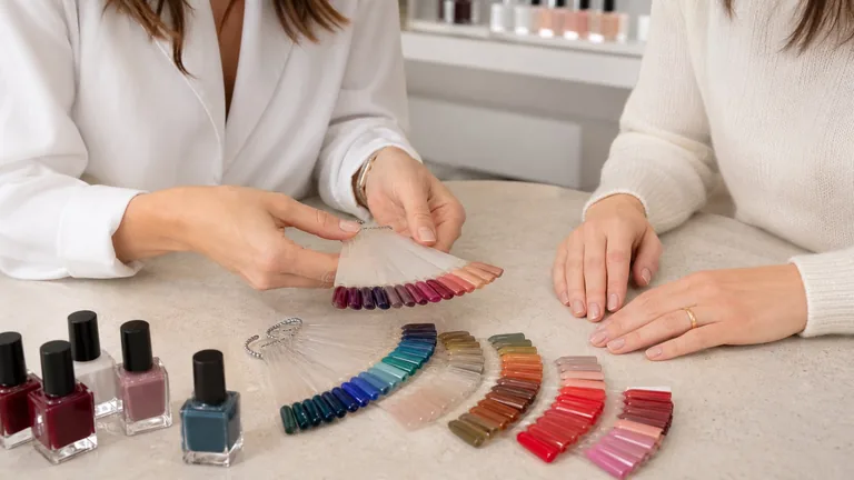
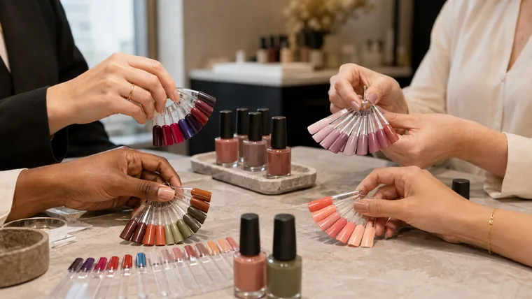
The fans show different color families. The people holding them are not assigned seasons: the hands, lighting and colors vary, so this photograph is an example of the range, not a controlled comparison.
Compare undertone, depth, saturation and contrast
Hue is the color family, such as red, purple or green. When comparing nail polish, undertone usually describes a warmer or cooler lean within that family. A red can lean orange or blue; how dark or muted it is remains a separate question.
Color dimension
What to compare
What to keep similar
Undertone or temperature
An orange-leaning red and a blue-leaning red.
Depth, saturation, coverage and finish.
Depth or value
A lighter and a darker version of a similar color.
Undertone, saturation and finish.
Saturation or chroma
A clear pink and a more muted, grayish pink.
Depth, undertone, coverage and finish.
Contrast
How much the polish stands out against your hand or another nail color.
The hand, light, nail length and area covered by color.
These differences are easier to see when you change one variable at a time. Comparing a sheer beige with a dark metallic purple cannot tell you whether you prefer warmer or cooler colors. For more examples, see undertone, value, chroma and contrast.
Compare the nail polishes you already own
Start with the occasion: an everyday neutral, a bright accent or a color for a particular outfit. Consider any workplace requirements alongside your preferences. Choose one pair to compare, such as two reds of similar depth. You do not need to replace your collection to try this.
Use two identical display tips, the artificial nail samples sold on sticks or rings. Keep their background the same: polish over a white tip can look different from polish over a clear one. Label each with the product line and shade name or code.
For a color comparison, choose regular air-dry polishes with similar coverage and finish. Apply the same number of thin coats when that fits both products’ directions, and use the same compatible top coat. Allow the drying time each product requires before comparing them.
Rest your hand on a neutral background near a window in diffuse daylight. Avoid direct sun and a mix of daylight and yellow lamplight. Hold each sample beside the same finger in turn, keeping your hand and the samples at the same angle.
Notice what you prefer: a slight or strong contrast with your skin, a lighter or darker color, or less brightness. If a red is close to what you want but too vivid, compare it with a more muted red at a similar depth.
Try your preferred polish on a healthy nail using its directions, then look at it in the lighting where you will wear it. Your natural nail color and curve can change the result from the display tip. For pearl or metallic effects, rotate your hand slowly under the same light.
Record the base, number of coats and top coat with the shade. Next time, change one element if you want a different result. Keep a favorite even if it does not closely match your color fan.
The application steps above are for regular air-dry polish. If you are choosing gel polish in a salon, ask to see a finished sample of the actual product line. The same shade name can look different across formulas.
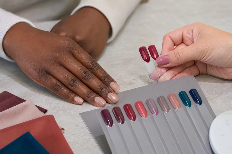
Holding samples beside the same hand helps you compare them. Here the colors and reflections both vary; the photograph shows the placement, without identifying the person’s season or proving that one shade is better.
Coverage, coats and finish
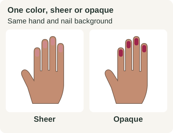
Coverage describes how much of the nail underneath remains visible. Sheer polish lets that background show through; opaque polish covers it. Finish describes the surface, including gloss, matte or reflective particles. A polish can be opaque and glossy, or sheer with a matte top coat.
Characteristic
What to check on the dry sample
Sheer or jelly
The nail or tip underneath remains visible. More coats may increase coverage, but a formula designed to be sheer may stay translucent.
Opaque color without shimmer
Uniform coverage reduces the background’s influence. A cream or crème description does not guarantee full coverage in one coat.
Glossy or matte
Compare the sheen after drying. Use the same top coat on both samples when you want to isolate a color difference.
Pearl, shimmer or metallic
Observe the underlying color and the reflected light as you rotate the sample. A straight-on photograph may show only part of the effect.
Characteristic: Sheer or jelly
What to check on the dry sample: The nail or tip underneath remains visible. More coats may increase coverage, but a formula designed to be sheer may stay translucent.
Characteristic: Opaque color without shimmer
What to check on the dry sample: Uniform coverage reduces the background’s influence. A cream or crème description does not guarantee full coverage in one coat.
Characteristic: Glossy or matte
What to check on the dry sample: Compare the sheen after drying. Use the same top coat on both samples when you want to isolate a color difference.
Characteristic: Pearl, shimmer or metallic
What to check on the dry sample: Observe the underlying color and the reflected light as you rotate the sample. A straight-on photograph may show only part of the effect.
For example, Mademoiselle in the essie Original line is listed as a sheer light pink on the US product page. Its application sequence is one base coat, two coats of color and one top coat. Those two color coats are the intended application for this sheer formula; they are not a promise that it will hide the nail completely.
Illustration: the hand, nail background, geometry and flat lighting stay the same; only the simulated opacity of the dark pink changes. This is not a product sample or a comparison of coat counts. Screen colors cannot replace a physical polish test.
You can also change how much space a color occupies. A thin colored tip or one accent nail uses less of a bright shade than a full manicure. Keep the other details the same while comparing these ideas so you can judge the effect of the colored area.
Choose a nude, red, dark shade or French tip
Nude: decide whether to blend or stand out
Nude includes pink-beige, peach, caramel, taupe, cocoa and milky pink. If you want a subtle transition from hand to nail, compare samples close to your skin’s depth. If you want a light accent, try a milky shade too. Pale beige can create a strong contrast on a deep skin tone; that can be a deliberate choice, and it is only one of many nude options.
If a nude looks too gray to you, try a less muted version at a similar depth. If it looks too orange, compare a pinker or more neutral one. Keep coverage and finish similar while making that comparison, so you can identify which color difference you prefer.
Red: compare similar shades first
Place an orange-leaning red beside a pink- or blue-leaning red of similar depth and saturation. Light coral against dark burgundy changes too much to isolate undertone. Start with dry samples without shimmer, then explore a pearl or metallic version if you want one. A favorite red can stay in your manicure even when it differs from your seasonal palette.
Dark colors, white and French tips
Black and white are available to anyone who likes a graphic manicure. If solid black feels too strong, compare it with navy, plum, burgundy or cocoa, or try it as a small detail. Nail length changes the area covered by color, so judge the sample at a length close to the one you plan to wear.
For a French manicure, adjust the base color, tip color and line width separately. Compare a milky white and a bright white tip over the same base. Then, if needed, change the line width while keeping the colors fixed. This makes it easier to tell which change gives you the result you want.
What your hands and photographs can tell you
A manicure is usually seen beside your hands, rings and clothing. Draping for seasonal color analysis compares larger areas of color near the face. You may prefer a different balance of color in those two settings. Olive skin does not automatically mean Autumn, and deep skin does not automatically mean Winter. Ethnicity, a tan, visible veins or a preferred metal cannot establish a season from your hand.
Product photos can help you narrow your options, but lighting, camera exposure, white balance and display settings affect the color you see. The International Color Consortium explains why even calibrated displays have limits. When two nudes look almost alike online, look for physical samples. For your own records, keep the lighting, exposure and white balance consistent and leave filters off; the guide to photographing nails explains the setup.
Use nail polish safely
Read the directions and warnings for the actual product, allow its stated drying time and work with good ventilation, as the FDA recommends for nail products. A color comparison does not test whether a formula is safe for you. Avoid using polish to conceal a painful, swollen or unexpectedly changed nail; ask a healthcare professional about those changes.
If a product causes itching, redness, swelling or another suspected reaction, stop using it and seek medical advice. The FDA’s guidance on cosmetic allergies explains symptoms and when to consult a healthcare professional.
Frequently asked questions
Does nail polish have to match my jewelry?
You can echo the metal or choose a contrast. If you wear the same ring every day, include it when making your final choice. A silver line, a gold tip and a full metallic manicure cover different areas. Look at your hand, ring and polish together at a normal viewing distance before judging a close-up detail.
Should nail polish and lipstick be the same color?
No. You can choose a similar family, such as two cool reds, or give your nails a separate color. For a coordinated event look, compare the lipstick on your lips and the dry polish with your outfit. The bottle and lipstick bullet do not show how either product looks when worn.
Why does my plum polish look black indoors?
A very dark shade can be hard to distinguish from black in dim light. Check it in diffuse daylight before replacing it. If you want the plum color to remain more visible indoors, compare a lighter plum at the same coverage. Using fewer coats can also change evenness, so it is not necessarily equivalent to choosing a lighter shade.
Compare fabrics on olive and deep skin tones with steady light, matched pairs and repeatable observations. Keep useful results when a season remains uncertain.
Compare swatches with real fabrics, combine neutrals and accents, and use your personal color palette to plan outfits and shop for clothes you will wear.