We use necessary cookies and the Meta Pixel to measure campaigns and improve our offers. You can change your optional-cookie preferences at any time. Read our Terms and conditions.
Personal color analysis for men: shirts, suits, beard and accessories
Personal color analysis can help you choose shirts, suits and accessories by comparing colors near your face. The same principles apply to anyone: temperature, depth, intensity and contrast. They are especially useful when a few jackets need to work with several dress shirts, or when a beard and eyeglass frames occupy much of the face. Your palette gives you colors to try; fit, the occasion and your own taste shape the outfit.
At a glance
Start with the shirt collar or sweater nearest your face. Compare two garments in similar fabrics under the same light, changing one color variable at a time. Use the same jacket for both shirts, then add accessories. A red beard, dark hair or light eyes cannot identify your season on their own. Keep the clothes you use: changing a shirt or the amount of an accent color may be enough to make an outfit work better for you.
Separate temperature, depth, intensity and contrast
A blue can be dark and muted or dark and vivid. A pale shirt can create strong contrast under a navy jacket and much less under a light gray one. The properties of one color and the relationship between two colors give you different things to adjust.
Color variable
What to compare
Temperature
A warmer or cooler hue at similar depth and intensity. Try two pink shirts in the same fabric, one leaning peach and one leaning mauve.
Depth, also called value
How light or dark a color is. Compare two sweaters from the same blue family, one medium and one dark.
Intensity, also called chroma
How vivid or muted a color is. Compare two burgundy ties of similar lightness, one grayer and one more saturated.
Contrast
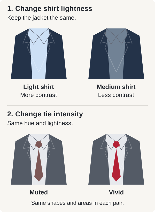
The difference between neighboring colors. To compare light-dark contrast, wear the same navy jacket with a pale shirt, then a medium blue shirt.
Color variable: Temperature
What to compare: A warmer or cooler hue at similar depth and intensity. Try two pink shirts in the same fabric, one leaning peach and one leaning mauve.
Color variable: Depth, also called value
What to compare: How light or dark a color is. Compare two sweaters from the same blue family, one medium and one dark.
Color variable: Intensity, also called chroma
What to compare: How vivid or muted a color is. Compare two burgundy ties of similar lightness, one grayer and one more saturated.
Color variable: Contrast
What to compare: The difference between neighboring colors. To compare light-dark contrast, wear the same navy jacket with a pale shirt, then a medium blue shirt.
The guide to undertone, value, chroma and contrast explains these dimensions in more detail. A palette described as soft emphasizes muted colors; it can still contain both light and dark shades.
How to compare shirts and jackets near your face
Use a mirror in even, indirect daylight. Avoid direct sun or a lamp lighting only one side of your face, and keep your position, background and viewing distance the same. Compare clothes with your beard at its usual length. If your glasses are prominent, make an initial comparison without them, then put them back on to check the complete outfit.
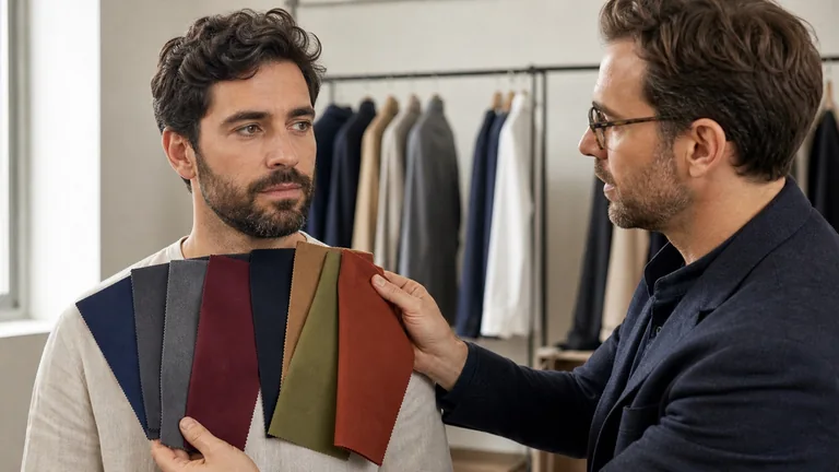
Hold each shirt below your chin, one at a time, showing a similar area of fabric. Choose comparable weaves and finishes. Ivory linen and white satin change several variables at once.
Switch from the first shirt to the second, then back to the first. Look at whether your skin appears more even, whether shadows or redness look more noticeable, and how much the collar stands out beside your beard and brows. Decide whether you like the effect.
Put on your preferred shirt and jacket. Check them from a normal conversation distance, then try the other shirt with the same jacket. The difference between the garments may be stronger or subtler than you expected.
Add a tie, glasses or scarf one at a time. Record the garment and the effect, such as "medium blue shirt: less contrast with navy," so you can repeat an outfit you like.
If the result seems to change with every switch, repeat the comparison in more consistent light or with more similar fabrics. This exercise helps you choose outfits. Establishing a broader palette takes systematic draping comparisons. A phone photo with automatic exposure or white balance may hide the difference you are trying to see.
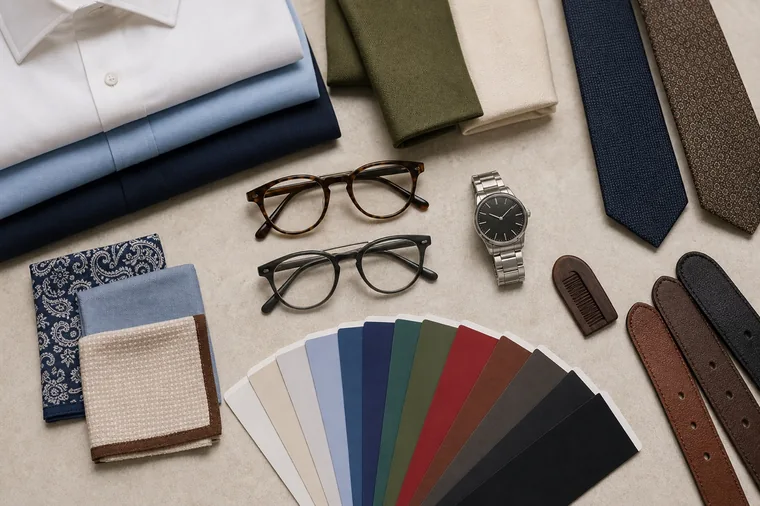
Fabric swatches and frames show how much color can sit close to the face. Several variables differ here; for your own comparison, change one garment or frame at a time.
Choosing white, blue, pink and striped dress shirts
The collar sits directly beside your skin and beard. Bright white, neutral white, ivory, cream and ecru can have different casts, and retail color names are not standardized swatches. Compare how yellowish or bluish the fabric looks, as well as how light it is. Ivory does not necessarily create less contrast than white.
If a very white shirt stands out more than you want, try pale blue or a less brilliant white with the same jacket. If the outfit needs more definition, compare a lighter shirt or a darker jacket. Keep the collar shape and fabric similar: smooth poplin, Oxford cloth, linen and brushed cotton reflect light differently.
For colored shirts, separate the comparisons. Light blue and medium blue help you judge depth; two similarly light pinks, one peachier and one more mauve, help you compare temperature. Stripes and checks add contrast within the fabric. A wide navy stripe on white looks more distinct than a narrow pale blue stripe. Step back to see how the pattern reads when its finer details blend together.
Suits, blazers and sweaters: compare the full garment
Navy, charcoal, medium gray, brown and olive are useful starting points for outfit combinations. Each name covers a range of fabrics: a nearly black navy creates a different contrast with a shirt than a medium blue, and a blue-gray differs from taupe. When comparing warmer and cooler shades, choose similar depths so a large light-dark difference does not dominate the result.
Try the jacket on and button it as you plan to wear it. A small swatch on a counter cannot show how much color will cover your torso. Finish matters too: matte wool and a glossy fabric reflect light differently even when their colors are close. Pinstripes, checks and herringbone can become much more noticeable across the whole jacket.
The top pair changes shirt lightness while keeping the jacket the same. The bottom pair changes tie intensity at nearly the same hue and lightness. These illustrated outfits show color relationships; compare real fabrics near your face before choosing clothes.
Sweaters, polos and T-shirts let you try a color near your face before buying a suit. A turtleneck surrounds more of the face than an open neckline. Try a scarf with your coat too: it changes both the color next to your skin and how much of the coat is visible.
With denim, compare the wash. An even dark blue, a faded blue and a wash with strong light patches have different depths and internal contrasts. On jeans, these differences mainly affect the overall outfit; on a denim shirt, they sit closer to the face. If you buy one coat, check it with the sweaters and shoes you actually wear, as well as for warmth and weather protection.
Ties, pocket squares, eyeglass frames and metals
A tie concentrates color just below the face. Once you have chosen a shirt and jacket, compare solid ties first so you can judge intensity without a pattern competing for attention. Then try patterns with a similar background color. A muted tie can still create strong light-dark contrast against a pale shirt.
A tie and pocket square can share a color without being identical. For example, a small burgundy motif on a pocket square can pick up a burgundy tie against a navy jacket. This is one styling option. If your shirt already has a strong stripe, try solid accessories before adding another pattern.
Eyeglass frames combine color with thickness, transparency and finish. A thin black frame covers less of the face than a thick black one; tortoiseshell may look golden, reddish or very dark. Compare frames of similar shape while wearing a shirt you use often. An optician can help with fit, lens alignment and optical needs.
Compare metals by their color, finish and size. A preference for gold or silver cannot establish your season. A watch sits farther from the face, so consider its dial and strap along with the metal. Similar shoe and belt colors and finishes are a common choice for formal outfits; casual outfits allow more variation. A tan belt does not change your personal palette.
The frames differ in color and thickness; the ties and fabrics differ in pattern and texture. Use a flat lay to plan combinations, then try the pieces on together.
How a beard or gray hair changes visible contrast
A beard sits directly on the face. Its density, length and distribution of gray or white hairs can change the contrast around your mouth and jaw. A full dark beard adds a dark area to the lower face; trimming it shorter reveals more skin. The effect depends on the difference between the hair and skin colors, so it varies from person to person.
A red beard does not automatically mean Autumn, and a black beard does not identify Winter. Gray facial hair can alter contrast without making a palette cool. After a major grooming change, compare a pale and a medium shirt with the same jacket before replacing clothes. If you are also considering a new hair color, the guide to hair tone, depth and contrast helps you prepare the discussion with a colorist.
If you choose to color your beard
Decide whether you want to blend a few gray hairs, cover them or change the tone. Covering gray with a dark dye makes the beard area more uniform and may increase its contrast with your skin. A palette labeled deep does not require darker facial hair. Keeping your natural beard is an option.
Use only a product labeled for the intended area, and follow its full warnings, mixing directions, application time and rinsing instructions. As one US example, Just For Men Mustache & Beard requires its skin allergy test 48 hours before each use, even after previous use without a reaction. Follow the test procedure for that exact product. The FDA notes that a reaction can still occur after a negative skin test.
A strand test checks the color result on hair; it does not test for allergy. The consumer skin allergy test is also different from clinical patch testing, which a dermatologist may use to investigate contact allergy. If you have reacted to hair dye before, stop using it and consult a healthcare professional instead of trying another product at home.
Do not apply beard dye to irritated or damaged skin, or use it on eyelashes or eyebrows. If burning, itching or irritation develops, rinse the product out immediately and stop using it; follow the package instructions for washing it out and seek medical advice. Trouble breathing, chest tightness, hives or swelling require immediate medical attention.
Outfit ideas for Winter, Summer, Autumn and Spring
The four seasonal families are a convention for grouping colors in a personal palette. These are examples to try with an existing palette, not a way to classify someone from skin tone, eyes, ethnicity or facial hair. A subgroup may put more emphasis on depth, intensity or temperature.
Seasonal family
Example outfit and comparison
Winter
Try a dark navy jacket, white or icy blue shirt and a cool burgundy tie. Compare two shirt lightness levels to adjust the contrast with the jacket.
Summer
Try a medium gray jacket, powder blue shirt and muted mauve tie. Keep the colors softened while checking that the outfit has the definition you want.
Autumn
Try a brown jacket, ivory shirt and a rust or olive tie. Compare medium and deeper browns near your face.
Spring
Try a medium blue jacket, light ivory shirt and a small coral accent. Compare a vivid accent with a muted one of the same size.
Seasonal family: Winter
Example outfit and comparison: Try a dark navy jacket, white or icy blue shirt and a cool burgundy tie. Compare two shirt lightness levels to adjust the contrast with the jacket.
Seasonal family: Summer
Example outfit and comparison: Try a medium gray jacket, powder blue shirt and muted mauve tie. Keep the colors softened while checking that the outfit has the definition you want.
Seasonal family: Autumn
Example outfit and comparison: Try a brown jacket, ivory shirt and a rust or olive tie. Compare medium and deeper browns near your face.
Seasonal family: Spring
Example outfit and comparison: Try a medium blue jacket, light ivory shirt and a small coral accent. Compare a vivid accent with a muted one of the same size.
If temperature is your main priority, compare warm and cool hues first. If depth matters more, find the range of lights and darks you like. With a soft or bright palette, compare intensity before adjusting the light-dark contrast between pieces. Four-, twelve- and sixteen-season systems use different subdivisions and names, so ask for examples with your clothes as well as a season label.
Work, interviews and weddings: follow the dress code
A personal palette helps with color choices; a dress code sets expectations for the occasion. If a dark suit and white shirt are required, choose among the permitted variations. You might compare navy with charcoal, or two white shirts in similar fabrics. If the colors are fixed, focus on fit and any accessories you are allowed to choose. There is no need to change your beard or hair to compensate for a uniform.
For an interview, check the employer's expectations and prepare the whole outfit in advance. Sit and move in it to check the shirt and jacket fit. For a video interview, check your camera preview using the light and webcam you will use on the day. Even frontal light and a neutral background make your face easier to see, though automatic exposure, filters and the other person's screen can still change the colors.
For a wedding, follow the invitation and any instructions for your role. A rented suit or tuxedo may limit the color choices: try your shirt and accessories with it before buying other pieces. Black can remain useful for a particular event even if you usually prefer lighter or warmer colors.
Build a capsule wardrobe from clothes you own
A capsule is a small set of clothes that work in several combinations. Start with how often you wear a suit, your casual activities and your laundry routine. Choose two coordinating neutrals you already own, a light color for shirts or sweaters, and one or two accents. This is a starting structure, with no required number of colors or garments.
For example, try a navy blazer, medium gray pants, a powder blue shirt, a medium blue sweater and a muted burgundy tie. Wear the blazer and pants with the shirt, add the tie when appropriate, or replace the shirt with the sweater for a more casual setting. For a warmer base, try brown and olive with ivory and a rust accent, checking which pieces combine in outfits you would wear.
Hang successful outfits together or photograph them as reminders. Before buying a shirt, identify at least two outfits you would use it in. Keep useful or sentimental pieces outside your palette; you may prefer them farther from your face, layered under a jacket or in a smaller area. The guide to using a personal palette when shopping explains proportions and substitutions.
Shopping in stores and online: fabric, light and returns
In a store, bring a shirt or accessory you want to match. Hold the fabrics vertically, then try the garment on: a match on the counter may look different when the light comes from another direction. If possible, also check near a window out of direct sun. CIE colorimetry describes controlled lighting and viewing conditions for measuring color; it does not establish personal seasonal palettes.
Check fiber content, care instructions, opacity and finish. In the US, the FTC's textile labeling guidance covers fiber information, while its care labeling guidance explains cleaning instructions. Use the labels to decide whether the garment fits your routine. Fiber content alone cannot predict its color beside your face.
Online photos and videos can narrow your choices, but screens cannot confirm an exact fabric color. Check return deadlines, fees and conditions before ordering. When the garment arrives, compare it with clothes you own before removing tags. Keep the model, fabric and retailer's color name for future reference; "navy" or "ivory" alone does not guarantee a match across brands.
Learning to advise clients
Practice comparing real shirts and jackets under consistent light, then record the choices so another person can repeat the outfits. To study palette selection and draping, review the curriculum of the BeautyLearn color analysis course.
Frequently asked questions
Can I use a palette without knowing my season?
You can start with combinations you have compared and recorded, even without a seasonal label. Look for recurring preferences, such as medium-light, muted shirts, and test them across several garments. If the results conflict, a consultation can help separate color from differences in lighting, fabric and contrast.
Do hair and beard color have to match?
No. Hair and beard can naturally have different tones and depths. Consider them with your brows, skin and clothing; dyeing your beard to match your hair is optional. If you want to color it, discuss the result and maintenance separately, using a product intended for facial hair.
Does a color consultation include a wardrobe review?
Not always. Color analysis and a wardrobe review may be separate services. Before booking, ask whether you can try your own shirts or jackets, whether you will receive physical swatches, and whether the service includes work or wedding outfits. The guide to color consultation costs and inclusions helps you compare what you receive.
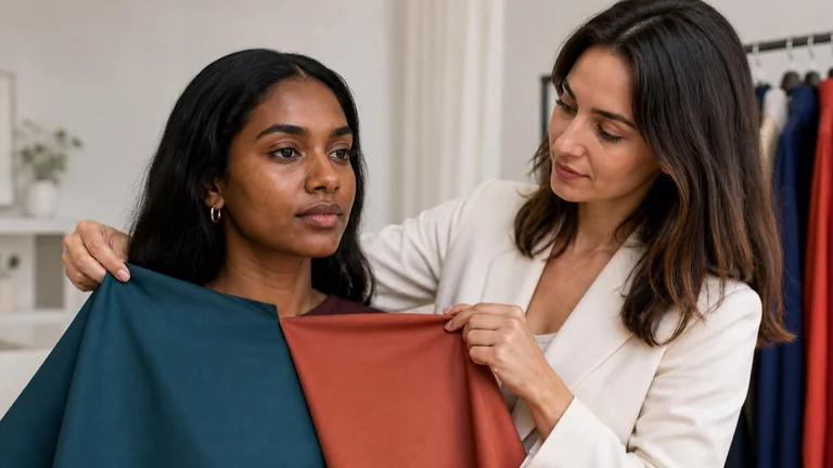
Compare fabrics on olive and deep skin tones with steady light, matched pairs and repeatable observations. Keep useful results when a season remains uncertain.
Compare swatches with real fabrics, combine neutrals and accents, and use your personal color palette to plan outfits and shop for clothes you will wear.