We use necessary cookies and the Meta Pixel to measure campaigns and improve our offers. You can change your optional-cookie preferences at any time. Read our Terms and conditions.
Autumn color analysis: characteristics, subseasons and palette
Autumn color analysis describes a family of warm, generally softened palettes, from cream and camel to olive, deep teal and chocolate. The family has room for both gentle combinations and stronger light-dark contrast. Understanding those differences helps you use an Autumn palette in clothes, accessories and makeup without filling your closet with brown and orange. Start with how colors look beside your face and the method used to name your palette.
At a glance
Autumn palettes combine warmth with muted color; their depth and contrast vary. The 12-tone model described below uses True, Soft and Dark Autumn. Other schools use names such as Warm, Deep or Assoluto, which need their own definitions. Try camel with teal or cream with chocolate, then adjust the contrast. Skin tone, ethnicity, eye color and hair color alone cannot establish a season.
Autumn characteristics: warmth, depth, chroma and contrast
A color can be dark and muted, or light and bright. Contrast describes the difference between colors placed together. Keeping these dimensions separate helps you understand why one brown works with an outfit while another looks too pale, too gray or too strong.
Dimension
What to look for
Temperature
Compare a red that leans orange with one that leans blue. Autumn palettes lean warm; Soft and Dark Autumn in the 12-tone model are warm-neutral. Warm colors include greens and blue-greens as well as oranges and browns.
Value, or lightness
Cream, camel and chocolate occupy different points from light to dark. Autumn palettes include light colors. The subseason helps you decide how much emphasis to place on medium or deep shades.
Chroma, or intensity
A muted olive looks less vivid than a bright green of similar lightness. Low chroma is central to Soft Autumn. A deep color can still be muted, so dark and bright are not interchangeable.
Contrast
Camel and chocolate differ more in lightness than camel and honey. The size of each color area, its placement and the pattern of a print also change the effect.
Dimension: Temperature
What to look for: Compare a red that leans orange with one that leans blue. Autumn palettes lean warm; Soft and Dark Autumn in the 12-tone model are warm-neutral. Warm colors include greens and blue-greens as well as oranges and browns.
Dimension: Value, or lightness
What to look for: Cream, camel and chocolate occupy different points from light to dark. Autumn palettes include light colors. The subseason helps you decide how much emphasis to place on medium or deep shades.
Dimension: Chroma, or intensity
What to look for: A muted olive looks less vivid than a bright green of similar lightness. Low chroma is central to Soft Autumn. A deep color can still be muted, so dark and bright are not interchangeable.
Dimension: Contrast
What to look for: Camel and chocolate differ more in lightness than camel and honey. The size of each color area, its placement and the pattern of a print also change the effect.
For a closer comparison, see undertone, value, chroma and contrast. Warm drapes do not require visibly yellow skin, copper hair or hazel eyes. People with light or deep complexions need the same range of warm-cool, light-dark and muted-bright comparisons. A season does not describe personality or prescribe a rustic style.
True, Soft and Dark Autumn: names depend on the method
The 12-tone descriptions published by Spicemarket Colour distinguish True Autumn, Soft Autumn and Dark Autumn. True Autumn is fully warm. Soft and Dark Autumn are warm-neutral, with Summer and Winter influences respectively. These are categories within that model; the same name on another chart may cover different colors.
True Autumn: fully warm color
Mustard, rust, olive and warm browns are useful starting points. Try a terracotta top with camel pants and an olive jacket, choosing the depth of each piece from your own swatches. There is no need for the darkest brown in every outfit.
When comparing Autumn with Spring, look at chroma as well as warmth. Choose two warm greens of similar lightness, one muted and one clearer, and compare their effect near the face. Changing fabric sheen, lightness and intensity at once makes the result difficult to interpret.
Soft Autumn: muted color and gradual transitions
Soft Autumn places more emphasis on low chroma. Warm taupe, muted camel, sage, dusty terracotta and cocoa can make gentler combinations. A sage shirt with a camel cardigan and cocoa pants gives you color and definition without a sharp light-dark split. Soft palettes can include enough depth to keep an outfit from looking uniformly pale.
To compare Soft Autumn with Soft Summer, use fabrics of similar lightness and chroma that differ in temperature. An earthy rose and a cooler mauve can be a starting pair. Check the actual samples and repeat with greens or neutrals; store color names do not guarantee a controlled comparison.
Dark Autumn: deeper colors with warmth
Dark Autumn gives deeper shades more space. Chocolate, forest green, deep teal and earthy plum can anchor an outfit, while cream or camel adds a lighter area. For example, try a deep teal shirt with a chocolate jacket and a camel scarf. The scarf changes the balance without making the whole outfit light.
Dark Autumn and Dark Winter share depth in the 12-tone model. Compare dark fabrics with similar lightness, then assess temperature and chroma separately. An earthy red and a cooler red are more informative when their lightness and finish are close. Chocolate versus black alone changes too many properties to settle the question.
Warm, Deep and Assoluto in other systems
In Rossella Migliaccio's method, Warm, Soft and Deep Autumn are named for a dominant quality: warmth, softness or depth. The pure palette, also called Autunno Assoluto, combines the seasonal qualities without one dominant feature. Four families, each with three subgroups and a pure palette, make 16 categories. True Autumn cannot automatically be relabeled Warm or Assoluto, and a Dark result cannot be converted to Deep from the name alone.
For a US example of another approach, House of Colour describes four seasonal palettes, then uses its ratings process to identify a subseason and WOW Colors. Ask which system your consultant uses and compare its actual swatches before following advice from a different school. The guide to 4-, 12- and 16-season systems explains these distinctions.
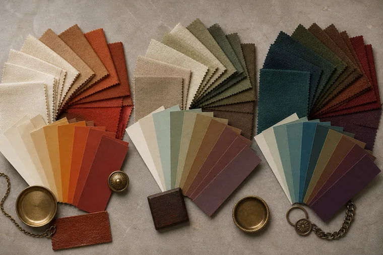
Terracotta and ochre appear on the left, softened neutrals and greens in the middle, and deeper teal and brown on the right. These illustrate color differences; they are not official palettes from a particular method.
How to explore an Autumn result with drapes
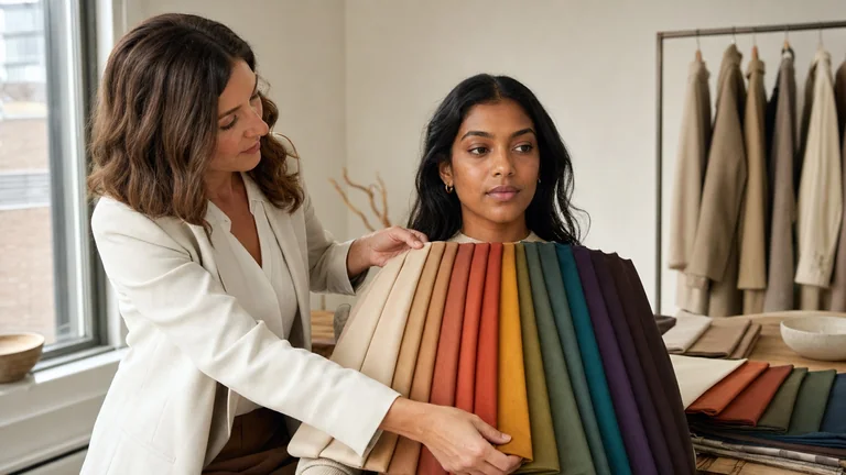
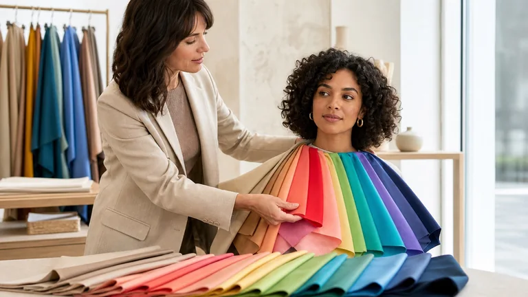
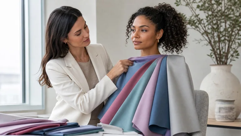
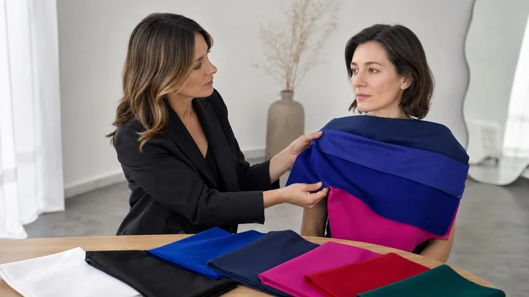
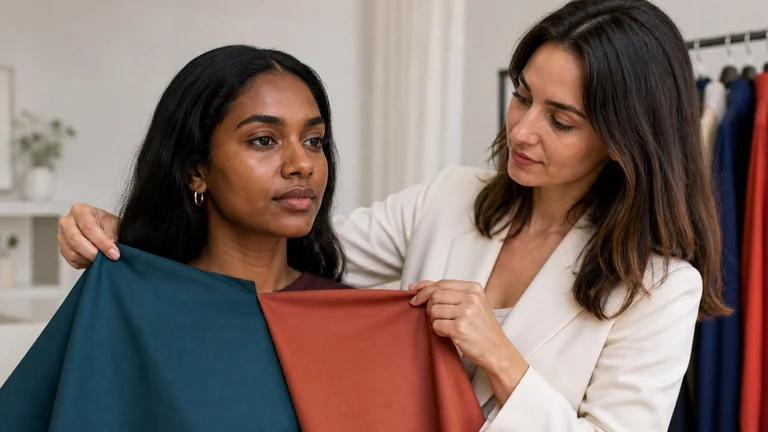
Use stable, diffuse light, a neutral background and a face free of makeup. Avoid direct sun and mixed lighting. Cover brightly colored clothing and keep dyed hair back or under a neutral cloth if it affects the comparison. Hold fabrics of similar size and finish at the same height below the chin.
Alternate warm and cool samples with similar lightness and chroma. Two reds, one more orange and one more blue, can work. Look for changes in the apparent evenness of the complexion, shadows under the eyes and definition around the mouth.
If warmer colors repeatedly work well, compare clearer and more muted versions within the same hue family. Repeat with more than one family so a single olive or rust drape does not decide the result.
Explore light, medium and deep values, then place two drapes together to assess contrast. Notice when a dark fabric takes attention away from the face or a pale fabric makes facial contours less distinct.
Repeat the most informative pairs and record uncertain results. If the outcome keeps changing, check the light and samples before assigning a subseason. Ask a consultant to explain the comparisons behind the result.
The draping test guide covers setup in more detail. Vein color, a gold-versus-silver jewelry test and a single selfie cannot replace this process. Reflections, automatic white balance and filters can change the comparison. Photographs can document an outfit, but subtle shade decisions need the real fabric in consistent light.
Autumn palette ideas for clothes
Start with what you wear near your face. Choose a light neutral, a medium or dark neutral and a color you already enjoy. Cream, chocolate and teal give you more options than several new rust-colored pieces. If your result comes from a four-season system, use the wider Autumn range to explore the depths and intensities that work for you.
Occasion or effect
Combination to adapt to your palette
Work, moderate contrast
A cream blouse, camel jacket and olive pants. Tortoiseshell glasses can repeat the browns in the outfit.
Softer transitions
A sage top, warm taupe cardigan and cocoa pants. If the sage looks too gray near your face, compare a less muted version.
Stronger contrast
A cream top under a chocolate jacket. Buttoning the jacket reduces the light area; wearing it open exposes more of the contrast.
Evening
An eggplant dress with bronze accessories, or a forest-green suit with a cream top. Check how the fabric reflects light when you move.
Occasion or effect: Work, moderate contrast
Combination to adapt to your palette: A cream blouse, camel jacket and olive pants. Tortoiseshell glasses can repeat the browns in the outfit.
Occasion or effect: Softer transitions
Combination to adapt to your palette: A sage top, warm taupe cardigan and cocoa pants. If the sage looks too gray near your face, compare a less muted version.
Occasion or effect: Stronger contrast
Combination to adapt to your palette: A cream top under a chocolate jacket. Buttoning the jacket reduces the light area; wearing it open exposes more of the contrast.
Occasion or effect: Evening
Combination to adapt to your palette: An eggplant dress with bronze accessories, or a forest-green suit with a cream top. Check how the fabric reflects light when you move.
Blue-greens, earthy pinks and reddish purples offer alternatives to orange and brown. Look for teal, dusty terracotta and plum; for lighter colors, try ivory, cream and warm beige. A fabric labeled camel may lean yellow, pink or gray. Compare it with your swatches instead of relying on the label.
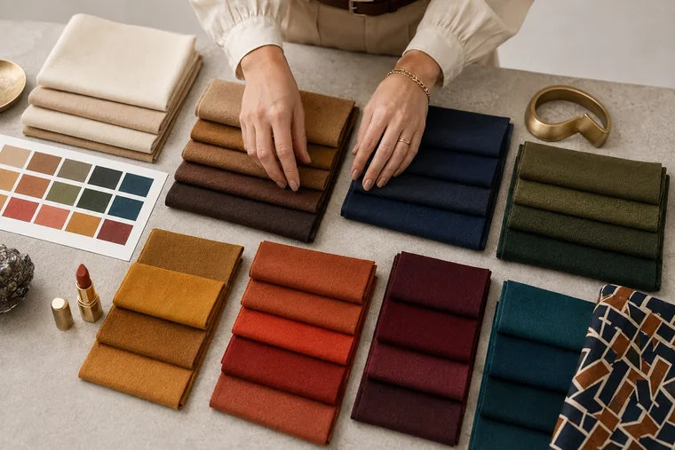
An illustrative wardrobe selection with light neutrals, deeper fabrics and colored accents. The navy and patterned fabric show why individual shades and proportions need checking against your own swatches.
Contrast, black and white: change the combination
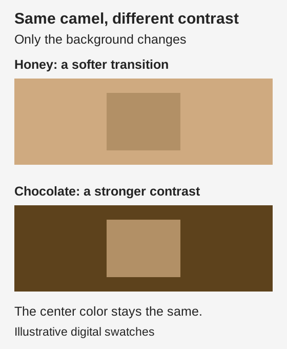
Camel and honey make a gradual transition; camel and chocolate separate more clearly. Try changing this light-dark relationship before replacing every color. With prints, look at the background, the scale of the pattern and the amount of light and dark. A small white detail has a different effect from broad black-and-white stripes.
The center color, shape and area are identical in both panels. The darker chocolate background creates a larger lightness difference. These digital samples demonstrate contrast, not a personalized palette.
For an alternative to black near your face, try chocolate or deep teal; compare cream or ivory with bright white. You can also keep a black jacket and wear it open over a top from your palette. Pants, shoes and bags give you more freedom because they do not directly frame the face.
Satin, wool and suede reflect light differently even when sold under the same color name. Move the garment under the light as you compare it. Not all silk is shiny and not all wool is matte. Screen brightness, photography and fabric texture can all change the shade you think you are seeing.
Autumn makeup: foundation, eyes and lip color
Match foundation and concealer to your actual skin. Test a small amount along the jaw and check the transition toward the neck after the formula has settled. An Autumn result does not require a yellow base: a shade that is too golden or orange can leave a visible edge even when warm drapes work well.
Cocoa and olive are useful eye colors to try; copper, bronze, teal or plum can add an accent. Smudged dark-brown liner can give a softer edge than black. If you want more definition, try black close to the upper lashes and judge it with the finished look.
For cheeks and lips, explore peach, rosy terracotta, cinnamon or brick in a depth that shows clearly on your skin. A pale peach can look chalky on a deep complexion. For a softer effect, use muted color and blend the edges; for more depth, compare dark brick or earthy plum. These are starting points to test with your palette.
Natural lip color, coverage and finish change how a lipstick looks. If a pale nude looks gray, try a deeper shade or a sheerer formula. If opaque brick dominates the face, blot it to a stain and compare. The guide to color analysis and makeup connects these choices with foundation and eye makeup.
Hair color, metals and accessories
Yellow gold, bronze and copper are options to explore. Size and finish matter too: compare a satin-finish earring with a highly polished one in a similar color and shape. Antique silver and mixed metals can also work with the outfit. Comparing jewelry of very different sizes will not isolate temperature.
For glasses, try tortoiseshell, cognac, olive or teal and consider the thickness of the frame. Accessories farther from your face can repeat a color in a print or add a contrast you enjoy. They do not need to match every swatch.
Copper hair is optional. A dye can change the contrast you see and the way you combine your colors. Discuss depth and highlights with a colorist, taking your starting shade, hair condition and maintenance into account. You can keep gray hair and adjust your outfits to your current contrast.
Use your palette without replacing your closet
Try two neutrals you already own with a main color before shopping. If you have chocolate pants, a cream shirt and an olive jacket, check that a new top works with at least two of them and suits the occasions when you will wear it. A scarf may change the color near your face without replacing a coat.
After a consultation, ask for light, medium and dark swatches, outfit examples and an explanation of the comparisons that mattered. It helps to know which colors are easiest for you to combine and which need more attention to area or contrast. If two categories remain close, record that uncertainty and agree on what to compare next.
For consultants, describe the effect of the fabric: it draws attention away from the face, makes a contour harder to see or changes the apparent contrast. Avoid turning those observations into judgments about the person's age, ethnicity or personality. Seasonal systems are styling frameworks, and their categories vary between schools.
Frequently asked questions
Can I wear blue if my palette is Autumn?
Yes. Try blue-greens such as teal and compare their depth and chroma with your swatches. For denim, inspect the garment: pale washes and faded patches create a different effect from an even, darker fabric. Jeans sit away from the face, so they usually need less attention to palette matching than a shirt.
Does a tan make me an Autumn?
A tan can change visible skin depth and contrast with hair or clothing, but it does not establish a new season. If your combinations seem different, repeat comparisons in similar conditions and distinguish the temporary change from the original analysis. A summer photo cannot determine the subseason.
How can I use a digital palette while shopping?
Use it to narrow your search, then compare the fabric with physical swatches in the same light. Turning off color filters and night mode on your phone removes one possible distortion, but it does not calibrate the display. Avoid making a purchase depend on a tiny shade difference visible only on screen.
Is an Autumn palette only for fall clothes?
No. Autumn is a color-analysis category. Cream, sage and terracotta work on light linen or cotton in warm weather, and the same colors can appear in sweaters and coats in winter. Choose fabric and garment weight for the weather and occasion.
Explore Light, True and Bright Spring, understand differences between methods, and try practical color combinations for clothes, accessories and makeup.
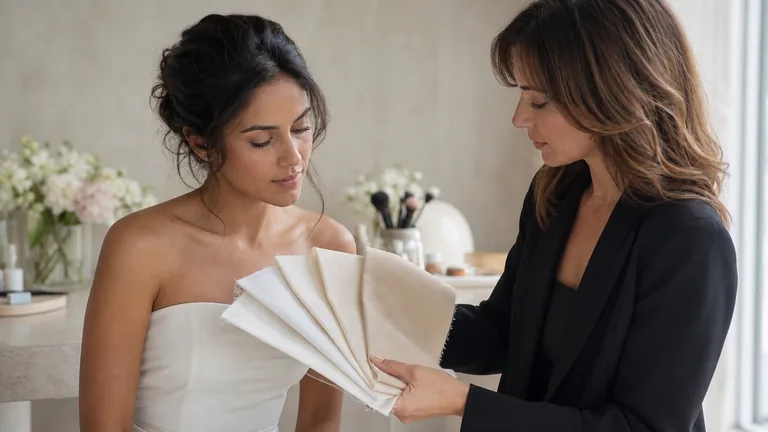
Compare wedding dress fabrics, then try makeup, hair, jewelry and flowers together. Use real swatches, clear notes and the lighting you expect on the day.
Compare fabrics on olive and deep skin tones with steady light, matched pairs and repeatable observations. Keep useful results when a season remains uncertain.