We use necessary cookies and the Meta Pixel to measure campaigns and improve our offers. You can change your optional-cookie preferences at any time. Read our Terms and conditions.
Spring color analysis: characteristics, subseasons and palette
Spring color analysis describes a family of warm, clear colors, from cream and peach to coral, leafy green and turquoise. Its palette can be light and gentle or much more vivid, depending on the subseason. Understanding that range helps you choose clothes, accessories and makeup without treating every Spring shade as interchangeable. A season is assessed through repeated color comparisons near the face; hair color, eye color and skin depth alone cannot establish it.
At a glance
In the 12-tone framework described here, Light Spring emphasizes lightness, True Spring warmth, and Bright Spring high chroma. Other schools use different labels and boundaries. Start with cream and peach for a light outfit, camel and coral for a warmer one, or ivory and turquoise for a stronger contrast. Use your own swatches to choose the shades, and keep colors you enjoy even when they fall outside your palette.
Spring characteristics: warmth, value, chroma and contrast
A pale peach shirt, a vivid coral shirt and a shiny satin shirt can all be described as bright. They differ in lightness, color intensity and reflected light. Separating those qualities makes it easier to understand why two items sold as Spring colors can look so different.
Dimension
What it means in a Spring palette
Temperature
The direction is warm or warm-neutral, depending on the subseason. Compare an orange-leaning red with a bluer red of similar lightness and intensity to examine warmth.
Value, or lightness
This describes how light or dark a color is. Spring palettes include many light and medium colors; Light Spring favors the lighter end, while Bright Spring can include deeper shades.
Chroma, or color intensity
This distinguishes vivid color from a more muted version. Coral can be intense or subdued without necessarily becoming lighter or darker. Bright Spring places particular emphasis on chroma.
Contrast
This is the difference between colors placed together. Cream and pale peach create a smaller light-dark difference than cream and dark brown. A vivid color does not require an outfit with extreme contrast.
Dimension: Temperature
What it means in a Spring palette: The direction is warm or warm-neutral, depending on the subseason. Compare an orange-leaning red with a bluer red of similar lightness and intensity to examine warmth.
Dimension: Value, or lightness
What it means in a Spring palette: This describes how light or dark a color is. Spring palettes include many light and medium colors; Light Spring favors the lighter end, while Bright Spring can include deeper shades.
Dimension: Chroma, or color intensity
What it means in a Spring palette: This distinguishes vivid color from a more muted version. Coral can be intense or subdued without necessarily becoming lighter or darker. Bright Spring places particular emphasis on chroma.
Dimension: Contrast
What it means in a Spring palette: This is the difference between colors placed together. Cream and pale peach create a smaller light-dark difference than cream and dark brown. A vivid color does not require an outfit with extreme contrast.
The guide to undertone, value, chroma and contrast includes comparisons for practicing these distinctions. Warm palettes also contain blues and violets: the precise turquoise, blue or violet depends on the method and subseason.
Light, True and Bright Spring: what the names mean
The Light Spring, True Spring and Bright Spring descriptions from Spicemarket Colour illustrate a 12-tone framework. True Spring is fully warm. Light and Bright Spring are warm-neutral, with Summer and Winter influences respectively within that model.
Light Spring
Lightness is the main priority. Cream, sandy beige, pale peach, light yellow and aqua offer starting points. Spicemarket Colour's Light Spring palette excludes black and navy; its darker neutrals are still relatively light, such as coffee cream. Try a medium-tone accessory when you want more definition without a large dark area.
True Spring
Warmth is central to True Spring. Cream, camel, apricot, coral, golden yellow and leaf green are useful colors to explore. Compared with a muted rust-and-olive combination, the overall effect keeps more color intensity. True Spring has plenty of clear color without requiring every piece to be as vivid as a Bright Spring accent.
Bright Spring
Bright Spring emphasizes vivid colors such as strong coral, turquoise and apple green. It can use more light-dark contrast than Light Spring. Spicemarket Colour includes black in this palette, especially as an accent or a base for warmer colors. High chroma does not require fluorescent fabric: a clear red or green can provide plenty of intensity.
Warm, Clear and Primavera Assoluta in other systems
You may also see Warm Spring or Clear Spring. Before treating either as an equivalent of True or Bright Spring, compare the school's definitions and swatches. In Rossella Migliaccio's system, the Italian Image Institute describes Light, Warm, Bright and Primavera Assoluta. Assoluta combines the family's qualities without one dominant feature taking priority. It is not an automatic translation of True Spring or a palette made by combining the other subgroups.
In the United States, House of Colour starts with four seasonal palettes and refines the result through individual color ratings. A Spring result from that service should be read within its own method. The comparison of 4-, 12- and 16-season systems explains why more labels alone do not make an analysis more precise.
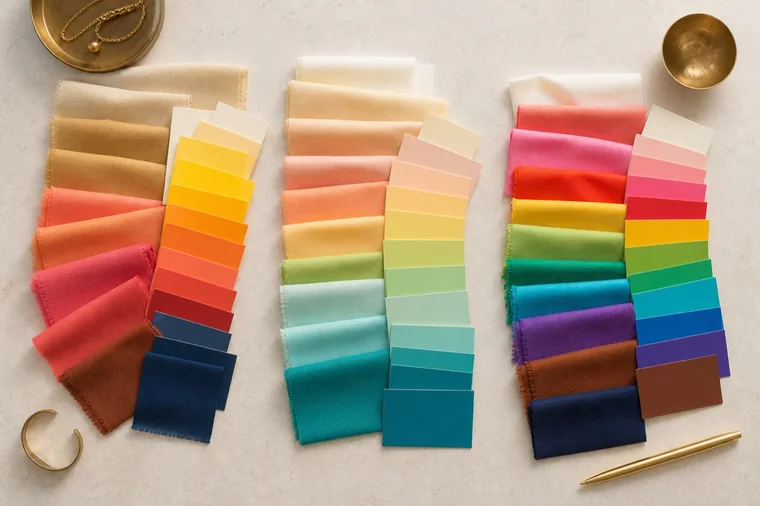
These arrangements illustrate differences in lightness and intensity. They are styling examples, not official palettes from the schools discussed here.
How to explore Spring with drapes
Remove your makeup and sit against a neutral background in steady, diffuse light. Avoid direct sun and a mixture of lamps with different color casts. Cover dyed hair with a neutral cloth when you want to separate its effect from the drapes. Hold fabrics of similar size and finish at the same height below the chin.
Compare temperature first. Alternate a warm coral red and a bluer red with similar lightness and intensity. Look for a repeated difference in the apparent evenness of the face and the shadows around the eyes and mouth.
Compare intensity using a vivid and a muted version of the same hue. Notice whether the fabric takes all your attention or whether the eyes and facial features remain easy to distinguish.
Compare light and medium shades, then a darker one. Keep temperature and intensity as similar as possible so the comparison tells you about depth.
Repeat the useful comparisons in another color family and reverse the order of the drapes. If the result changes with the lighting or between attempts, record that uncertainty before choosing a subseason.
Choose comparison fabrics by their actual color: two fabrics called coral may differ in every dimension. The draping-test guide covers preparation, comparison order and recording observations. A single phone photo is insufficient for assigning a season because automatic exposure, white balance and screen settings can alter the differences you are trying to assess.
Blond or dark hair, light or brown eyes, and fair or deep skin do not determine Spring. Neither ethnicity nor a tan assigns a seasonal palette. Vein color and a preference for gold also leave too many variables uncontrolled. Use the repeated drape comparisons within the chosen method, and describe what you see without treating it as evidence about someone's health or personality. The photographs here illustrate colors and arrangements; they do not document a client's analysis result.
Spring compared with Autumn, Summer and Winter
Comparison
What to hold steady and what to change
Spring and Autumn
Both include warm colors. Compare vivid coral with a more muted coral at similar lightness. Pale coral versus dark terracotta also changes value, so it does not isolate chroma.
Light Spring and Light Summer
Both emphasize light colors. Compare pale peach with a cooler pink of similar lightness and intensity, then repeat with two aqua shades. Eye color cannot resolve this boundary.
Bright Spring and Bright Winter
Both include intense colors. Compare warm and cool reds with similar chroma and lightness. Two colors can be equally vivid and still produce different effects near the face.
Comparison: Spring and Autumn
What to hold steady and what to change: Both include warm colors. Compare vivid coral with a more muted coral at similar lightness. Pale coral versus dark terracotta also changes value, so it does not isolate chroma.
Comparison: Light Spring and Light Summer
What to hold steady and what to change: Both emphasize light colors. Compare pale peach with a cooler pink of similar lightness and intensity, then repeat with two aqua shades. Eye color cannot resolve this boundary.
Comparison: Bright Spring and Bright Winter
What to hold steady and what to change: Both include intense colors. Compare warm and cool reds with similar chroma and lightness. Two colors can be equally vivid and still produce different effects near the face.
Seasonal systems are styling frameworks, not a universal scientific classification. Cha and Kim's comparison of personal color systems found that measured skin-color attributes did not distinguish the seasons consistently across the systems studied. Keep the swatches and observations behind a result, as well as the seasonal name.
Spring palette ideas for clothes and accessories
Start with something worn near your face, such as a shirt, sweater, jacket or scarf. Choose a neutral and a color that work with clothes you already own. These combinations are suggestions to try; adjust each shade to your swatches and the effect you want.
Outfit goal
A combination to try
Keep it light
Pair a peach shirt with sand-colored pants and a cream cardigan. An aqua accessory adds color without a large dark area. This is a useful starting point for Light Spring.
Emphasize warmth
Try a coral top, camel pants and a caramel belt. If you are working with a True Spring palette, compare the actual camel fabric with the top: a very grayish camel may look more muted than you intended.
Add stronger contrast
Wear a turquoise jacket over an ivory top, with pants in a neutral from your palette. A small coral accent can echo the jacket’s intensity for a Bright Spring combination.
Outfit goal: Keep it light
A combination to try: Pair a peach shirt with sand-colored pants and a cream cardigan. An aqua accessory adds color without a large dark area. This is a useful starting point for Light Spring.
Outfit goal: Emphasize warmth
A combination to try: Try a coral top, camel pants and a caramel belt. If you are working with a True Spring palette, compare the actual camel fabric with the top: a very grayish camel may look more muted than you intended.
Outfit goal: Add stronger contrast
A combination to try: Wear a turquoise jacket over an ivory top, with pants in a neutral from your palette. A small coral accent can echo the jacket’s intensity for a Bright Spring combination.
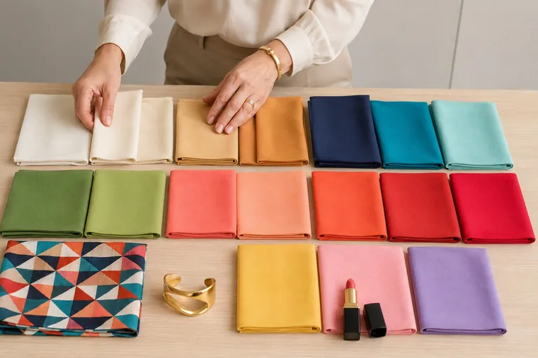
For prints, look at both the colors and the area each occupies. A cream background with small coral motifs creates a different effect from large cream-and-dark-brown blocks. Hold the fabric near your face and look from a normal conversation distance, as well as up close.
The print repeats colors from the solid fabrics. Use this as an example of coordinating pieces, not as a complete Spring palette; navy and the other darker shades depend on your subseason.
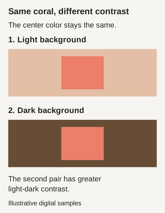
The same coral can create different contrast
You can increase light-dark contrast without changing the coral itself. In this diagram, both coral rectangles have the same color and size. Only the background lightness changes. The darker background creates a larger value difference, which is why you need to consider neighboring colors when planning an outfit.
Digital example: the coral samples are identical. Only the backgrounds’ CIELAB lightness changes; this does not demonstrate an effect on a person.
Screens and printed copies can shift colors. Use the diagram to understand the relationship, then compare actual clothes in the same light. Fabric finish matters too: glossy silk and matte cotton reflect light differently, so try the material you will wear.
Wearing black, white and colors outside your palette
If you already own a black coat, try a cream or coral scarf near your face before replacing it. Black pants leave more freedom to choose the color of your top. You can also keep a strong black contrast simply because you like the look.
For Light Spring, compare black with a coffee-cream or medium brown shade from your swatches. For True Spring, try camel and warm browns. For Bright Spring, assess a dark neutral alongside a vivid color. Navy is not a universal Spring neutral, and its presence and shade vary between methods. Compare optic white with cream and ivory in the same way.
When sorting your closet, separate pieces worn near the face from pants, shoes and bags. Before buying a new jacket, try it with at least three pieces you own and check that you have somewhere to wear it. For online shopping, use photos to make a shortlist, then inspect the delivered fabric in steady light. The guide to using a personal color palette for clothes and shopping explains how to build combinations without requiring exact swatch matches.
Spring makeup: foundation, eyes, blush and lipstick
Match foundation and concealer to your actual skin. A Spring result is not a reason to choose a yellow base. Test a small amount along the jawline, check how it blends with the neck, and look again after the product has settled. Depth, undertone, coverage and lighting all affect the match.
For a light makeup look, try a little peach blush, warm champagne eyeshadow and brown pencil blended along the lash line. Check the result with the top you plan to wear. If pale peach looks chalky on your skin, try a more pigmented or deeper version with the warmth you want; adding more layers of an overly pale shade may make the problem more visible.
Coral lipstick changes with coverage and your natural lip color. A sheer, light coral is one option for Light Spring, a more orange coral for True Spring, and a stronger, more defined coral for Bright Spring. These are starting points. Compare a blotted application with a fully opaque one before deciding that a shade does not work.
A turquoise or green liner can add color while the rest of the makeup stays simple. Brown, warm taupe and light bronze are other options for definition. Black mascara or pencil remains available when you want a stronger line. Judge it in the complete look, and choose matte, satin or glossy finishes according to the effect you enjoy.
Jewelry, glasses and hair color
Yellow gold is a common starting point for warm palettes. Spicemarket Colour also includes silver and mixed-metal options for warm-neutral Light and Bright Spring. Compare jewelry of similar size with the same outfit: a wide matte necklace reflects light differently from a thin polished chain, even when both are the same metal.
For glasses, try honey, cream, coral or turquoise frames in shades from your palette. Check frame thickness as well as color. A wide, dark frame may become a prominent part of the look, while a transparent one leaves more of the face visible. Try them close up and at a distance, with and without your usual makeup.
A Spring result does not require blond or copper hair. Consider your natural color, hair condition and maintenance preferences before making a change. Bring examples to your colorist and compare hair swatches near your face. Dye changes visible contrast, but it cannot establish a new season on its own.
What to ask for after a Spring analysis
Ask which method was used, which subseason was identified, and which comparisons supported the result. Useful recommendations include recognizable swatches, a light neutral, a deeper neutral within your range, and combinations with clothes you actually wear. If two groups remain close, ask which colors worked consistently and which need another comparison.
If you are recording an analysis for someone else, note the date, lighting, current hair color, makeup and tan so later comparisons have context. Describe the observation, such as a drape drawing attention away from the face, without calling the person dull or old. Record uncertainty when the comparisons do not clearly favor one subtype.
Use physical swatches when comparing fabrics in stores. A photo can help you remember an outfit, but a digital color code or a picture of your fan cannot guarantee the same appearance on a screen, on fabric and next to your skin.
Frequently asked questions
Can I use a Spring palette in winter?
Yes. Spring names a color family, not the time of year. Cream, camel, coral and turquoise can work in sweaters and coats. Check the actual fabric: a heathered wool may look more muted than a solid cotton in a similar shade.
Can I be a Spring with dark hair and brown eyes?
Those features do not rule Spring out. Assessment depends on repeated drape comparisons and the method's definitions, not resemblance to an online example. Dark hair alone is not a reason to assign Winter.
Does a Spring formal outfit have to be pastel?
No. You can choose a light aqua, warm coral or intense turquoise from your range, depending on the effect you want. Try the actual dress, suit or top: satin, sequins and velvet change reflected light and apparent depth.
Compare wedding dress fabrics, then try makeup, hair, jewelry and flowers together. Use real swatches, clear notes and the lighting you expect on the day.
Compare fabrics on olive and deep skin tones with steady light, matched pairs and repeatable observations. Keep useful results when a season remains uncertain.