We use necessary cookies and the Meta Pixel to measure campaigns and improve our offers. You can change your optional-cookie preferences at any time. Read our Terms and conditions.
Summer color analysis: characteristics, subseasons and palette
In seasonal color analysis, Summer palettes combine cool or cool-neutral colors with moderate to muted intensity. Powder blue, dusty rose, mauve and slate are common examples. They also include deeper blues, berries and plums, so dressing within this family can go well beyond pastels. A subseason helps narrow the choices: Light Summer emphasizes lightness, while Soft Summer places more weight on muted color. Understanding those differences makes it easier to choose clothes and makeup, adjust contrast and use the pieces you already own.
At a glance: start with cool grays, denim blue, mauve and softened pinks; add slate or plum when an outfit needs more depth. The Sci/ART 12-tone system distinguishes True, Light and Soft Summer. Other schools use different names and boundaries. Skin, hair and eye color cannot establish a season on their own: compare drapes under consistent conditions before choosing a palette.
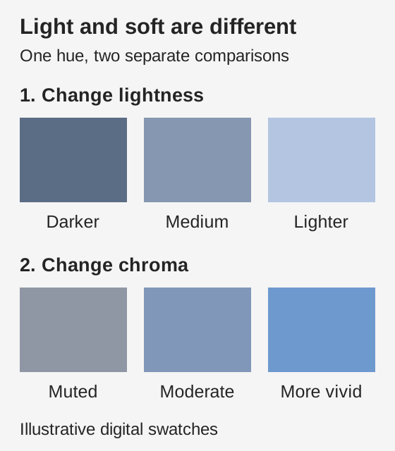
Temperature describes a color's warm or cool direction. Summer palettes lean cool, although some methods include cool-neutral groups. Chroma is how vivid or muted a color appears: a dusty blue looks grayer than a clear, intense blue. Muting a blue makes it less vivid without necessarily making it lighter.
Value means lightness or darkness. Pale blue is light; slate blue is deeper, but both can be muted. Light and soft therefore describe different properties. Many Summer palettes contain light and medium values alongside deeper options for jackets, pants and accents. If every piece is pale, an outfit may have less definition than you want.
The top row changes lightness while hue and chroma stay fixed in the color model. The bottom row changes chroma at fixed hue and lightness. These digital examples explain the difference; they are not an official Summer palette.
Contrast is the difference between colors placed together. Dusty rose and medium gray create a smaller light-dark gap than pearl and dark blue. You can adjust that gap separately from how vivid the colors are. The guide to undertone, value, chroma and contrast explains how to compare each property.
Ash-blonde hair, blue eyes and fair skin are a familiar Summer stereotype, but they are not requirements. Brown eyes, dark hair and deep skin do not rule out this family. Vein color, tanning and a preference for silver also cannot settle the result. Use fabrics that offer a range of depths and intensities, without assigning a season from ethnicity or one physical feature.
True, Light and Soft Summer
The Sci/ART 12-tone system has three Summer groups. Spicemarket Colour describes True Summer as fully cool, Light Summer as cool-neutral with high lightness and medium chroma, and Soft Summer as cool-neutral with very low chroma. Light Summer has a Spring influence; Soft Summer has an Autumn influence. These are relationships within that system.
Group
Palette characteristics
A practical starting point
True Summer
Fully cool, with lightness and softness. Cool temperature is central to the palette.
Try a cool rose or mauve top with slate. Compare warm and cool fabrics at similar lightness and chroma.
Light Summer
Cool-neutral, light and somewhat clearer than the other Summers. A medium blue may already act as a dark color.
Try powder blue with pearl gray, then add medium denim if the combination needs more definition.
Soft Summer
Cool-neutral and strongly muted, with more depth than Light Summer. Softness does not mean every color must be pale.
Try muted teal, blue-gray or dusty mauve. Compare equally muted warm and cool fabrics before choosing a group.
True Summer
Palette characteristics
Fully cool, with lightness and softness. Cool temperature is central to the palette.
A practical starting point
Try a cool rose or mauve top with slate. Compare warm and cool fabrics at similar lightness and chroma.
Light Summer
Palette characteristics
Cool-neutral, light and somewhat clearer than the other Summers. A medium blue may already act as a dark color.
A practical starting point
Try powder blue with pearl gray, then add medium denim if the combination needs more definition.
Soft Summer
Palette characteristics
Cool-neutral and strongly muted, with more depth than Light Summer. Softness does not mean every color must be pale.
A practical starting point
Try muted teal, blue-gray or dusty mauve. Compare equally muted warm and cool fabrics before choosing a group.
You may also see Cool Summer used alongside True Summer. Sterling Style Academy uses both names for one group in its 12-season explanation. That naming choice does not make them interchangeable across all schools.
For example, Italian Image Institute distinguishes Estate Assoluta, Light, Cool and Soft, and sells separate Summer, Summer Light, Summer Cool and Summer Soft palettes. Do not automatically translate its Assoluta or Cool result into Sci/ART True Summer. Ask which method was used and compare its definitions and physical samples. The guide to 4-, 12- and 16-season systems explains why the number of groups alone does not identify a method.
How to compare Summer drapes
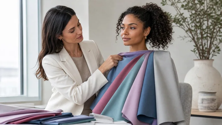
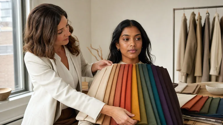
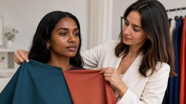
Use a neutral background and steady, diffuse light. Avoid direct sun or a warm lamp mixed with window light. Remove colored makeup, and cover dyed hair with a neutral cloth if it distracts from the comparison. Keep the fabric area, position and distance from the mirror consistent. The cover photo illustrates draping materials; it does not establish the person's season.
Compare temperature with fabrics similar in lightness and chroma, such as a cool pink and a peach of similar depth. A dark berry against pale peach changes too many variables at once.
Compare a vivid color with a grayer version in the same color family. To explore Summer versus Winter, avoid making the clearer blue much darker as well; otherwise you cannot tell which difference affected the result.
Try light, medium and deeper values while keeping temperature and chroma similar. Look at the apparent shadows beneath the eyes and chin, the definition of the lips and the outline of the face.
Repeat the comparisons in another color family, then return to the first drape. Record a specific observation, such as the fabric drawing attention before the face or the area around the mouth appearing more even. One preferred color is not enough to choose a subseason.
When Light Summer and Light Spring seem close, keep the fabrics light and compare warmer with cooler options. For Soft Summer and Soft Autumn, match depth and softness before comparing temperature. Mauve and a muted terracotta pink, or eucalyptus and olive, are color families from which to find comparable samples. Different fabric shine or texture can obscure the comparison.
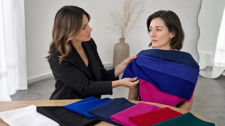
A consultation should explain which comparisons supported the result, which colors work near your face and how to create the amount of contrast you prefer. If two groups remain close, repeat the decisive pairs and record the uncertainty. Photos can change apparent temperature and chroma through exposure and white balance, so a single uncontrolled selfie cannot confirm Summer. The draping test guide covers the setup in more detail.
Summer palette colors for clothes
A useful palette includes light and deeper neutrals, everyday colors and accents. Color names on a tag are only a starting point: two sweaters called dusty rose may lean toward mauve and peach respectively. Hold your physical swatch next to the fabric in the same light, and look at the whole garment.
Color family
Examples to compare
An outfit idea
Neutrals
Pearl, cool gray, cool taupe, slate and softened navy.
Slate pants with a pearl blouse.
Blues and greens
Powder blue, periwinkle, denim, eucalyptus and muted teal.
A muted green sweater with medium-blue jeans.
Pinks and purples
Cool rose, mauve, lavender, softened raspberry and plum.
A mauve shirt with a gray jacket.
Deeper accents
Smoky blue, plum and berry shades within your tested range.
A plum dress with a pearl-gray accessory.
Neutrals
Examples to compare
Pearl, cool gray, cool taupe, slate and softened navy.
An outfit idea
Slate pants with a pearl blouse.
Blues and greens
Examples to compare
Powder blue, periwinkle, denim, eucalyptus and muted teal.
An outfit idea
A muted green sweater with medium-blue jeans.
Pinks and purples
Examples to compare
Cool rose, mauve, lavender, softened raspberry and plum.
An outfit idea
A mauve shirt with a gray jacket.
Deeper accents
Examples to compare
Smoky blue, plum and berry shades within your tested range.
An outfit idea
A plum dress with a pearl-gray accessory.
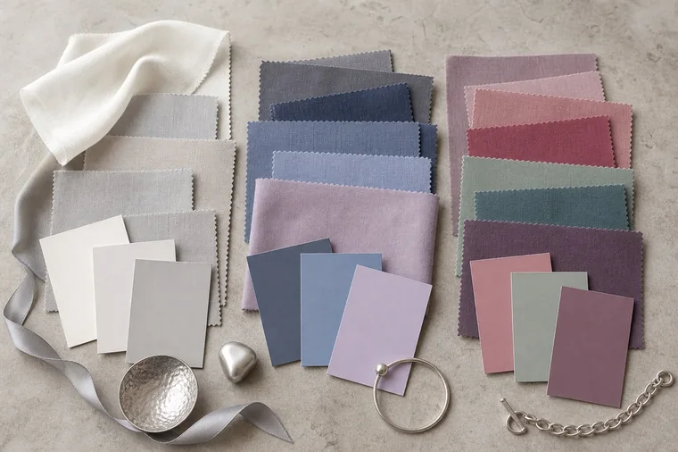
Light neutrals, medium blues and deeper colors give an outfit several possible levels of contrast. These illustrative fabric groups are not certified swatches for a particular subseason.
For Light Summer, a medium blue may provide all the depth you want. A softer palette may use a grayed plum or teal for a deeper accent. Check the actual sample: yellowish sage, bright raspberry and golden taupe can share names with colors that work well for you while looking quite different.
Outfit contrast, prints and fabric finish
If an outfit looks too pale, change one piece first. With a light pink shirt, replace pearl pants with medium gray; with a lavender sweater, try a plum skirt. If the light-dark gap feels too strong, bring the values closer together. Powder blue and medium denim make a gentler pairing than stark white and black.
For work, try powder blue with softened navy. Denim and eucalyptus make an easy casual combination, while plum or muted teal can give an evening outfit more depth. Move a garment in the light before deciding: satin may attract more attention than matte wool in a similar color.
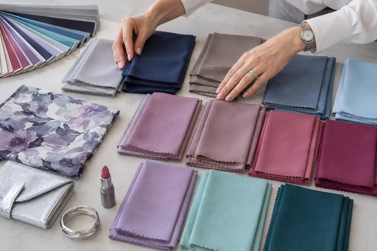
With prints, look at the background, the size of the pattern and the area each color occupies. Small, softly contrasting flowers may blend from a distance; broad light and dark stripes remain distinct. A little warm color in a print does not automatically make it unusable. Hold the full garment near your face and judge the overall effect.
The floral fabric repeats colors from the solid swatches, showing one way to connect a print with other pieces. The arrangement is a styling example, not a client's analysis result.
Summer makeup: base, lips and eyes
Foundation and concealer should match your actual skin. A cool seasonal palette does not call for pink foundation. Check depth and undertone on the face and neck after the product has settled. Seasonal color is more useful for choosing decorative makeup and deciding how much contrast to create.
For lips and cheeks, try cool rose, mauve, softened raspberry or a sheer plum. A thin layer lets your natural lip color show through; an opaque formula creates a more defined result. If a pale pink looks chalky, test a deeper shade or less coverage. Check lipstick and blush with the outfit you plan to wear.
For eyes, cool taupe, gray, slate, mauve and softened navy offer different degrees of definition. Compare graphite and black eyeliner at the same line thickness, or try plum for a colored accent. Matte, satin and metallic finishes reflect light differently, so choose the finish as well as the shade. Choose eye makeup for the effect you want instead of matching it only to your eye color. For more on combining shades, see makeup by seasonal palette.
Hair color, jewelry and glasses
A Summer result does not require blonde or ash hair. Discuss your starting color, gray coverage, upkeep and desired contrast with your colorist. Golden or copper highlights can change the overall effect: compare clothes with your hair visible and then held back. A palette can help describe the result you want, but the subseason name cannot provide a hair-color formula.
Silver, white gold and platinum are common starting points. Brushed or satin finishes give less sharply defined reflections than polished surfaces. Spicemarket Colour includes warmer metal options for its cool-neutral Light and Soft Summer palettes. Compare jewelry of similar size and finish. With a large shiny necklace and a tiny matte earring, it is hard to judge color separately from size and shine.
For glasses, try transparent gray, navy, mauve or plum and compare frame thickness too. A thin frame and a broad frame create different effects even in the same shade. Bags and shoes allow more freedom because their colors sit farther from your face.
Use your palette without replacing your wardrobe
Choose two neutrals from clothes you own, such as gray and denim. Then put together one outfit with a light top and another with a medium-value top. A pearl shirt and a mauve sweater can give you four combinations with two suitable pairs of pants. Photograph the outfits in consistent light as a reminder, and identify a specific missing piece before shopping.
You can keep black, camel and other colors you love. To bring an outfit closer to a Summer palette, try a scarf near your face, a more open neckline or the color in pants instead of a high-neck top. If you prefer the original effect, keep it. The guide to wearing colors outside your palette offers more ways to use existing clothes.
Frequently asked questions
Can a Summer palette include yellow?
Yes. In the Sci/ART interpretation described by Spicemarket Colour, True Summer includes softened lemon yellows, while Light Summer has light yellows with a little more warmth. That does not make mustard, ocher and vivid yellow equivalent choices. Compare the fabric with the palette from your own method.
Does gray hair change my season?
Gray hair can change visible contrast and the way you use colors near your face. You may prefer lighter frames or a more defined lipstick, for example. Hair color alone is not enough to reassign a season. If familiar outfits no longer give you the effect you want, another draping session can help identify what to adjust.
Why does an online purchase look different from my palette?
Product lighting, photo editing and your screen can all change the apparent color. Fabric finish matters too: a shiny surface reflects light differently from a matte one. Use product photos to narrow your choices, then compare the delivered item with your physical swatches under the same light. An RGB or HEX code alone cannot guarantee a fabric match.
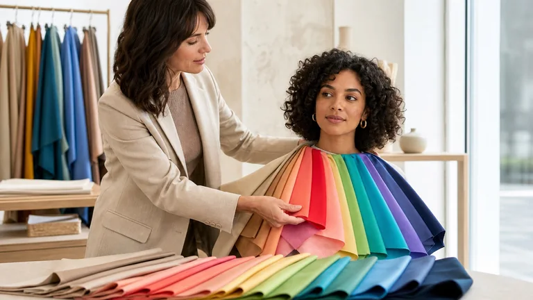
Explore Light, True and Bright Spring, understand differences between methods, and try practical color combinations for clothes, accessories and makeup.
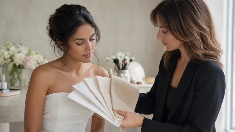
Compare wedding dress fabrics, then try makeup, hair, jewelry and flowers together. Use real swatches, clear notes and the lighting you expect on the day.
Compare fabrics on olive and deep skin tones with steady light, matched pairs and repeatable observations. Keep useful results when a season remains uncertain.