We use necessary cookies and the Meta Pixel to measure campaigns and improve our offers. You can change your optional-cookie preferences at any time. Read our Terms and conditions.
How to wear colors outside your palette with clothes you own
You can wear colors outside your personal color palette with the clothes you already own. A favorite sweater, a winter coat or a gift can still be useful after a color analysis consultation. Where the color sits, how much fabric shows and what you wear beside it all affect the outfit. Try a different neckline or an existing layer if you want a change, and keep the original combination if you prefer it. Your palette can guide color choices, while fit, comfort and personal taste also shape what you wear.
At a glance
Put on the garment and change one thing at a time. Open an adjustable neckline to show more skin, try a visible collar or scarf to add another color near your face, or wear an open jacket to cover part of a bright top. For skirts, pants, shoes and bags, check the whole outfit. These changes affect placement and visible area; no accessory automatically neutralizes a color or guarantees a better effect on your skin.
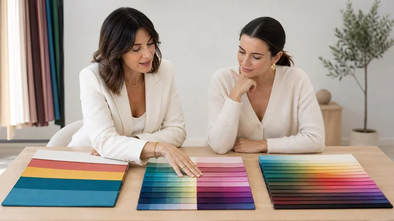
A color missing from a swatch fan may still be close to the recommended shades. Compare the actual fabric with physical swatches in diffuse daylight, away from direct sun and colored lamps. Look for differences in warmth, lightness or darkness, and intensity. Contrast describes the difference between colors, such as a pale shirt against a dark jacket. The guide to using a personal color palette explains how to use samples without expecting an exact match.
Two sweaters sold as teal can differ in depth and intensity. Fabric matters too: comparing matte wool with shiny satin changes more than color. If you want to understand those differences, start with temperature, depth, intensity and contrast, then compare garments in similar materials.
Being inside or outside a palette depends on the color analysis system used. Josef Albers’s color exercises demonstrate how surrounding colors affect what we see. The CIE definition of chromatic induction describes how adjacent colors can change each other’s appearance. Neither source validates a seasonal classification or shows that a particular scarf will make every dress suit its wearer.
Distance, neckline and visible area: what to change
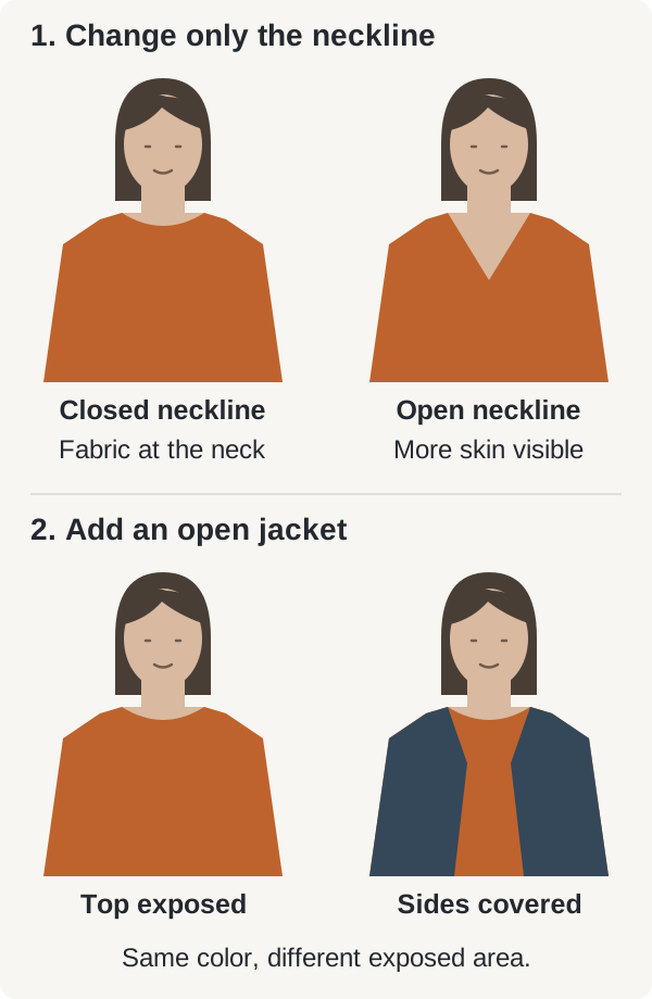
Start where the fabric meets your neck. A high neckline and an open neckline in the same color expose different amounts of skin. A skirt places the color farther from your face, though a large, bright skirt can still draw attention in a full-length mirror. Check the area around your face and the outfit as a whole.
What you are wearing
Try this and check what changes
A shirt buttoned to the neck
Open one or two buttons if the fit and dress code allow it. More skin shows between your chin and the fabric; the shirt stays the same color.
A crewneck sweater you want to keep wearing
Try a shirt underneath with its collar visible. The collar adds another color near your face, while the sweater still shows across your chest and shoulders.
A bright top covering much of your upper body
Put an open cardigan or jacket over it. The outer layer covers the sides of the top and leaves a central strip visible.
A skirt or pants outside your palette
Keep a familiar top and the same accessories. Check the contrast between the upper and lower halves of the outfit.
A coat you need to button up for warmth
Try a scarf you already own, tied as you would wear it outdoors. It changes the fabric next to your neck; the coat still covers much of your body.
What you are wearing: A shirt buttoned to the neck
Try this and check what changes: Open one or two buttons if the fit and dress code allow it. More skin shows between your chin and the fabric; the shirt stays the same color.
What you are wearing: A crewneck sweater you want to keep wearing
Try this and check what changes: Try a shirt underneath with its collar visible. The collar adds another color near your face, while the sweater still shows across your chest and shoulders.
What you are wearing: A bright top covering much of your upper body
Try this and check what changes: Put an open cardigan or jacket over it. The outer layer covers the sides of the top and leaves a central strip visible.
What you are wearing: A skirt or pants outside your palette
Try this and check what changes: Keep a familiar top and the same accessories. Check the contrast between the upper and lower halves of the outfit.
What you are wearing: A coat you need to button up for warmth
Try this and check what changes: Try a scarf you already own, tied as you would wear it outdoors. It changes the fabric next to your neck; the coat still covers much of your body.
Only the neckline changes in the first pair. An open jacket is added in the second. The face, skin color, hair, top color and scale stay the same. The diagram shows placement and exposed fabric; it does not show a change in skin appearance. Screen colors vary.
A thin necklace or small earrings leave most of the top uncovered, so they do not do the same job as a collar or scarf. Rolling up sleeves changes the visible fabric on your arms, not the edge beneath your chin. Choose the adjustment for the area you want to change.
Try layers with a sweater, dress or coat
If you love a mustard sweater but prefer a cooler color near your face, try a dusty blue shirt you already own underneath it. Let the collar show and decide whether you like the combination. A shirt almost hidden under a turtleneck will not change the fabric at your neck. You can try a visible scarf, or wear the sweater as it is.
Over a bright red dress, an open navy jacket covers part of the shoulders and upper body while leaving red visible down the center and in the skirt. A dark belt changes the outfit at the waist but leaves the neckline untouched. Try the jacket to reduce the amount of red up top, or the belt if you want to define the waist.
With a camel coat, compare two scarves you own, perhaps medium gray and burgundy. Keep the knot and the amount of visible fabric similar. Close the coat for both versions: a combination you like with open lapels may look different once only the collar and scarf show. Neither scarf color is a universal solution.
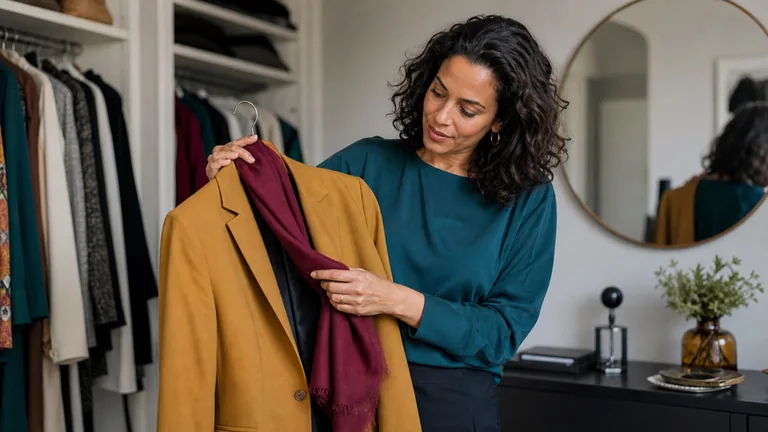
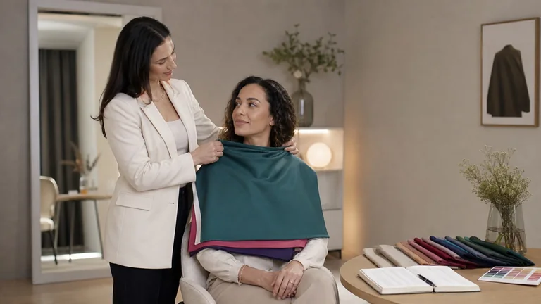
The open jacket leaves the teal top visible, while the berry scarf sits at the neckline. This is an outfit example. It is not a controlled comparison with the cover photo, where the clothing, pose and setting differ.
Sit down and move your arms to check that the layers do not pull or feel too warm. In hot weather, a neckline already built into a garment may be more comfortable than an added scarf. Before paying to alter a neckline, fold the edge temporarily in front of a mirror; a tailor can tell you whether the cut and fabric allow that change.
Use a bridge color or an accessory you already own
A bridge color helps connect parts of an outfit. It may be a neutral already present or a color repeated from a print. It does not have to be a mathematical midpoint between two shades, and it does not cancel the color you want to keep.
With a mustard jacket and charcoal pants, try a teal top, then a burgundy one, leaving everything else unchanged. Compare the depth of the colors, the contrast between them and the color closest to your face. The cover photo brings mustard, teal and burgundy together as an outfit idea; it cannot establish the person’s season.
If a floral skirt contains red, blue and cream, you could repeat its blue in your top. With a solid red skirt, you might keep red as the only bright color. You do not need matching shoes, a bag and earrings to make either choice work. Add a repeated color when you like it and already have something suitable.
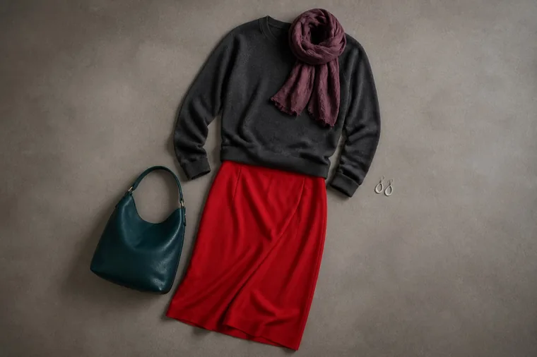
The red skirt occupies a large area below the face; the sweater and scarf place darker colors higher in the outfit. The flat lay shows the combination. Try it on to judge the proportions and how the scarf sits.
Shoes, bags and belts let you keep a color away from your face. Glasses, hats and scarves sit closer to it. Along with color, look at size, transparency and shine: a broad scarf covers more of a top than earrings do, and thin eyeglass frames expose more skin than thick ones. Useful or sentimental accessories can stay even when they do not match the swatch fan.
Keep black, white, beige and denim in your closet
The piece you own
An outfit to try
A black top or dress
Open an adjustable neckline or add a collar in a light color you like. Black remains part of the outfit; a very light collar can increase contrast.
A white shirt
Try it under a jacket, then with the first button open. The jacket covers some white across the body, but the collar stays near your face.
A beige or camel jacket
Leave a familiar colored top visible under the open jacket. Compare the actual fabric: beige can lean pink, yellow or gray.
Jeans or a denim shirt
Wear the jeans with a favorite top, or try the denim shirt open over a tank top. Pale washes, deep indigo and faded areas look different; denim is not one color.
The piece you own: A black top or dress
An outfit to try: Open an adjustable neckline or add a collar in a light color you like. Black remains part of the outfit; a very light collar can increase contrast.
The piece you own: A white shirt
An outfit to try: Try it under a jacket, then with the first button open. The jacket covers some white across the body, but the collar stays near your face.
The piece you own: A beige or camel jacket
An outfit to try: Leave a familiar colored top visible under the open jacket. Compare the actual fabric: beige can lean pink, yellow or gray.
The piece you own: Jeans or a denim shirt
An outfit to try: Wear the jeans with a favorite top, or try the denim shirt open over a tank top. Pale washes, deep indigo and faded areas look different; denim is not one color.
If you like wearing black close to your face, you can keep doing so. Use these ideas to compare your own clothes, whatever your seasonal palette. When a piece wears out or you identify a real gap, compare alternatives for that specific job.
Read prints, bright colors and shiny fabrics
In a print, look at the background, the largest area of color and the part that reaches the neckline. Small orange details on a blue background occupy less space than an orange background with tiny blue dots. Look close up and from a normal viewing distance: small motifs may blend visually farther away. Counting how many colors appear in your palette will not describe the whole pattern.
A bright or neon color can be the focus of an outfit. To reduce its presence, cover part of it with a layer or wear it in an accessory you already have. If a muted top seems hard to distinguish from the rest of your outfit, try lighter or darker pants. That changes contrast without requiring more saturated colors throughout.
Finish changes how light reflects from the fabric. Satin, sequins and patent leather can produce noticeable highlights; wool, denim and heathered knits have different textures and variations. Matte does not automatically mean muted or suitable for your palette. Move in the light where you will wear the outfit, especially when checking evening clothes.
Compare outfits in the mirror without buying anything
Choose one garment and a specific aim, such as showing less red near your neck or reducing the contrast between a top and jacket. Put it on with your usual clothes and accessories.
Stand in diffuse light and keep your position, background, hair and makeup the same. Look at your face, then step back to see the whole outfit.
Change one element: open the neckline, add a visible collar or put on a jacket. Return to the starting version to check whether you still prefer the change. Notice the amount of color, contrast and any difference in how shadows or redness appear. These observations alone cannot identify a season.
Check the combination in the light where you will use it, then move and sit down to test comfort. Record the actual pieces: “mustard sweater with the blue shirt collar showing” is easier to repeat than a list of color names.
Photos can help you remember combinations, but automatic exposure, white balance and your screen can change their appearance. Two selfies taken under different lights cannot settle a palette decision. The guide to controlled draping explains how to prepare more comparable color tests.
Review your wardrobe before shopping or altering clothes
Start with a few pieces you wear in the current weather. Separate the ones you combine easily from pieces you love but rarely wear, and from those that feel uncomfortable or no longer suit your daily life. Try a few realistic outfits with each difficult piece. Keep combinations you would actually want to wear.
If a sweater feels itchy, a scarf in your palette will not fix that problem. If you only lack a top to wear under two jackets, write down that function before looking for a color. An accessory is more useful when you would wear it with other outfits too. There is no deadline for changing your wardrobe after a consultation.
Before a purchase, check the fabric, care, fit and combinations with clothes at home. For online shopping, read the seller’s return deadline, condition and tag requirements, return shipping costs, fees and final-sale exclusions. The FTC’s online shopping advice explains what to check in refund policies. Do not assume you can wear, alter or dye a garment and then return it.
Tailoring may make a piece easier to wear, but consider its construction, cost and sentimental value. For dyeing, check the fiber content, starting color and any fabric treatments before choosing a product. New dye combines with the existing color, and stitching or mixed fibers may respond differently. Rit’s color FAQs explain the limits of overdyeing. Adding dye will not turn a dark shirt into a pale pastel. Follow the product’s instructions and seek professional advice for valuable or complex garments.
Repairing and continuing to wear clothes can extend their useful life, an aim described by the Ellen MacArthur Foundation. One styling choice does not establish a garment’s overall environmental impact. If an item no longer has a use for you, consider resale or donation when it is wearable, and check local collection options for textiles that cannot be reused.
For consultants: show options on the actual garment
Ask the client to bring a piece they love but find difficult to style. Start with how they usually wear it, then change one thing and describe the result: “less mustard shows across the torso” or “the light collar increases contrast with the black top.” Ask which version they prefer and record the combination. Get consent before taking photos.
The AICI Core Competencies include color as a design element and wardrobe management as a skill. A clothing exercise can be part of a consultation when the service includes it. If the analysis is uncertain, return to controlled comparisons; a client’s favorite clothes, hair, eyes or jewelry cannot establish a season on their own. The consultation guide explains how to connect observations with practical recommendations.
Frequently asked questions
Can makeup help me wear a color outside my palette?
You can choose a lipstick or eye shadow shade that repeats a color in your clothing if you like the effect. You do not need a more yellow or pink foundation to compensate for fabric; it can create a mismatch with your neck or other exposed skin without changing your undertone. The color analysis and makeup guide separates choices for complexion, eyes and lips.
What if my uniform has a fixed color?
Follow the uniform requirements. If permitted, try an existing visible underlayer or accessory that allows safe, comfortable movement. If nothing can be added, wear the uniform as required; you do not need to change your hair or makeup to compensate. For an event dress code, check which variations are allowed before planning the outfit.
Should I keep a sentimental piece I do not wear?
You can keep a meaningful garment without justifying its value by how often you wear it. If you want to use it again, try a simple outfit before altering it. Delay irreversible dyeing or cutting until you know which features you want to preserve.
Compare swatches with real fabrics, combine neutrals and accents, and use your personal color palette to plan outfits and shop for clothes you will wear.
A practical path into personal colour consulting: competencies, course evaluation, deliberate practice, kit, client service, portfolio, pricing, local requirements and continuing development.