We use necessary cookies and the Meta Pixel to measure campaigns and improve our offers. You can change your optional-cookie preferences at any time. Read our Terms and conditions.
Personal color analysis: what it is and how it works
Personal color analysis is a styling consultation that compares colored fabrics near your face to help you choose clothing, makeup, hair colors and accessories. The result is a palette: a selection of colors and combinations you can use in everyday life. Understanding how that palette is chosen means separating what the analyst observes during draping from the seasonal system used to describe it.
At a glance: color analysis compares temperature, value, chroma and contrast while keeping light and position consistent. Spring, Summer, Autumn and Winter are palette families; a single photo, eye color or vein test cannot establish your season. A useful result explains which combinations work for your goals, where the assessment is uncertain and how to use the colors with clothes you already own.
An analyst looks at the relationship between your skin, eyes, brows, lips, hair and the colors you wear. A scarf might make your eyes stand out, draw attention to itself or make an under-eye shadow seem more noticeable. The aim can be a more even-looking complexion, stronger contrast or a wardrobe that is easier to coordinate. Agree on that aim before testing.
Personal color analysis is the broader process; seasonal color analysis organizes the result into named groups. Some consultants use tonal or other systems instead. Ask what the labels mean, because two methods can give different names to a similar range of colors.
Scientific colorimetry has a different purpose. It describes and measures color under defined conditions, using references such as the CIE's standard observers and illuminants. A styling consultation applies ideas about color and light to an aesthetic assessment. It does not provide a laboratory measurement of your ideal palette or guarantee agreement between analysts.
Temperature, value, chroma and contrast
During draping, the analyst watches what changes around the eyes, mouth, jawline and areas of uneven color. A fabric can make a shadow look stronger without changing the skin itself. Temperature, value and chroma describe aspects of a color; contrast describes the relationship between colors or features.
Dimension
Meaning and a useful comparison
Temperature
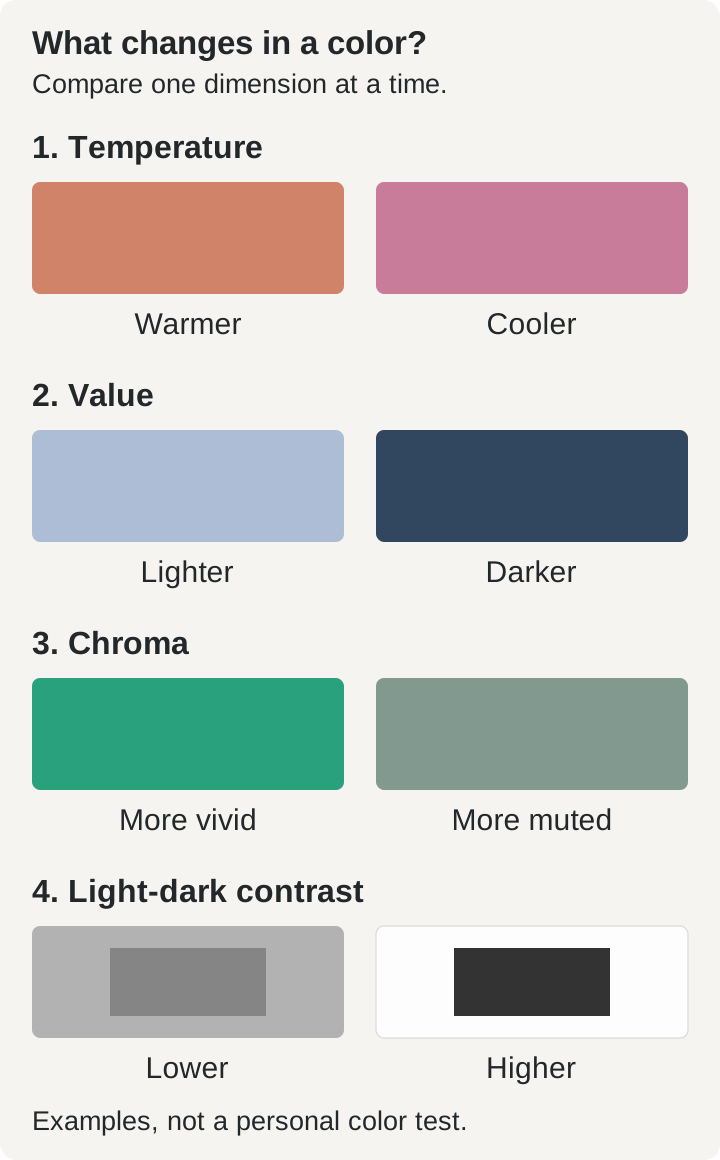
The relatively warm or cool direction of a color. Compare an orange-red with a raspberry red of similar lightness and intensity. In personal analysis, the analyst also explores how warm and cool colors relate to your skin's undertone.
Value
How light or dark a color is. Compare a light blue with a deeper blue from the same color family. Light skin does not automatically need a light palette.
Chroma
How vivid or muted a color appears. Compare a vivid green with a grayish green of similar lightness. A bright color can also be dark; bright and light are different qualities.
Contrast
How strongly adjacent colors stand apart. Compare light gray with medium gray, then white with charcoal. For clothing, consider the combination as well as each individual shade.
Dimension: Temperature
Meaning and a useful comparison: The relatively warm or cool direction of a color. Compare an orange-red with a raspberry red of similar lightness and intensity. In personal analysis, the analyst also explores how warm and cool colors relate to your skin's undertone.
Dimension: Value
Meaning and a useful comparison: How light or dark a color is. Compare a light blue with a deeper blue from the same color family. Light skin does not automatically need a light palette.
Dimension: Chroma
Meaning and a useful comparison: How vivid or muted a color appears. Compare a vivid green with a grayish green of similar lightness. A bright color can also be dark; bright and light are different qualities.
Dimension: Contrast
Meaning and a useful comparison: How strongly adjacent colors stand apart. Compare light gray with medium gray, then white with charcoal. For clothing, consider the combination as well as each individual shade.
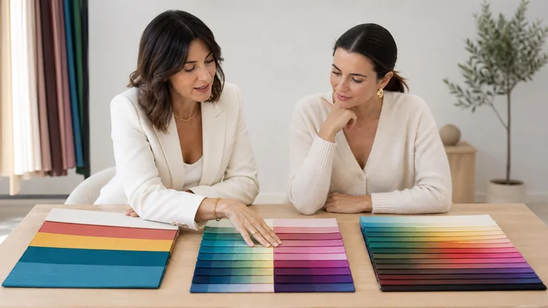
These illustrative swatches help separate the four dimensions. Screen colors show the relationships; they are not personal drapes or a test of your season.
A light color can be warm or cool, and a deep color can be vivid or muted. Skin depth alone therefore cannot establish temperature or chroma. The guide to undertone, value, chroma and contrast explains how to compare these characteristics separately.
How draping works
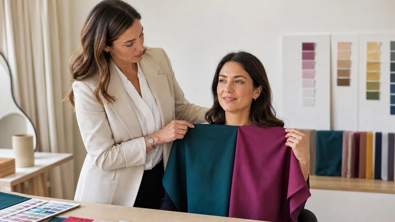
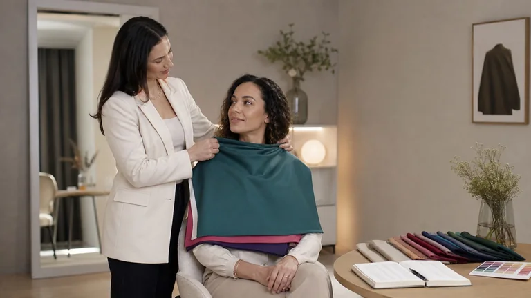
Draping brings selected fabrics under the chin to compare their effect on the face. A useful pair differs mainly in the dimension being tested. To explore temperature, keep lightness and chroma as similar as the fabrics allow. Comparing a pale, muted blue with a deep, vivid orange changes several things at once, making the cause of any difference harder to identify.
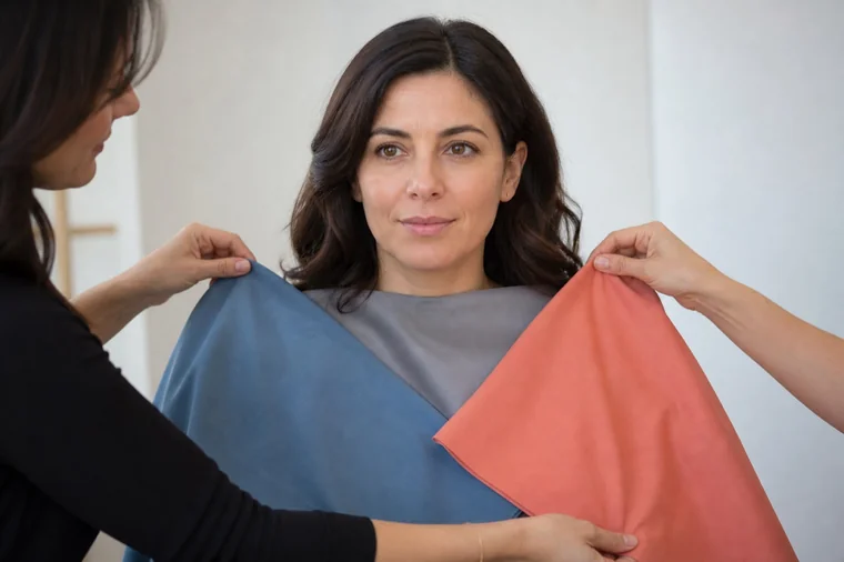
Alternate the fabrics over the same area, with their top edges at the same height. Look at A, then B, then A again while watching the same part of the face. Repeat the comparison with another color family. Returning to the first fabric helps you check whether the initial impression holds up.
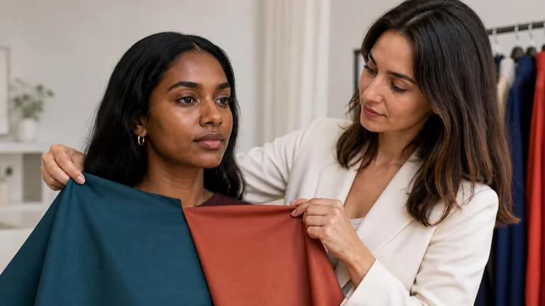
The side-by-side arrangement shows the two fabrics. To compare their effect, move each one to the center under the chin in turn. This photograph alone cannot establish a season.
Surface matters too. Sheen, weave, transparency, folds and distance from the face change reflected light. A shiny cloth and a matte cloth are not an equivalent pair even if their colors look similar. When a difference is hard to see, record the uncertainty and try another pair instead of forcing a verdict. The draping test guide covers setup and comparison sequences in more detail.
What happens at a color analysis appointment
Before booking, ask which system the analyst uses, whether the session is private or shared, and what you will receive. Confirm whether the price includes a physical or digital palette, written notes, makeup advice and follow-up. The consultation cost and inclusions guide explains what to compare in a quote.
The analyst prepares even, diffuse light, a neutral background and a mirror. Strongly colored clothing near the face is covered. Makeup that changes the complexion or contrast is removed for the initial assessment. Dyed hair may be covered at first and uncovered later to test combinations with your current look.
You discuss the colors you want help using and anything that may affect the comparison, such as self-tanner, a recent tan, tinted glasses or bright frames. Agree on photography and how any images will be used.
The analyst compares fabrics while keeping the other conditions steady, checks each color dimension and repeats the decisive pairs in a different order.
The analyst uses those repeated comparisons to choose a palette within the system. Ask which comparisons were uncertain and whether you sit near a boundary between groups.
You try combinations and review the palette. Before leaving, practice choosing a neutral, a color to wear near your face and a pairing with the amount of contrast you want.
You can ask to keep religious or cultural clothing in place and discuss an accessible setup. The analyst should explain how those choices affect the comparisons. Bring a garment or cosmetic you use often so that the recommendations connect to your actual wardrobe, preferences and budget.
What the analyst is observing
An observation might be: "With A, I notice the shadow under the eyes more; with B, the transition from cheek to under-eye area looks more even." This is an example of how to describe a comparison, not a report of a real client's result. Repeat the pair to see whether the impression remains consistent.
Open questions such as "What difference do you notice?" leave room for disagreement. Keep "I like this color" separate from "This fabric makes the shadow less noticeable." Both can be true, and your preference still belongs in the final recommendation. Describing the change before naming a season makes contradictions easier to spot.
The four seasons and their subgroups
Spring, Summer, Autumn and Winter are conventional names for palette families. Autumn is also called Fall in U.S. conversations, although many systems retain Autumn as the label. In the basic four-season model, Spring and Autumn are warm families; Summer and Winter are cool families. Warmth alone does not distinguish Spring from Autumn.
Seasonal family
Broad palette direction
Spring
Warm, with clearer, brighter colors.
Summer
Cool, with softer, more muted colors.
Autumn
Warm, with more muted, earthy colors.
Winter
Cool, with stronger color intensity and often pronounced contrast.
Seasonal family: Spring
Broad palette direction: Warm, with clearer, brighter colors.
Seasonal family: Summer
Broad palette direction: Cool, with softer, more muted colors.
Seasonal family: Autumn
Broad palette direction: Warm, with more muted, earthy colors.
Seasonal family: Winter
Broad palette direction: Cool, with stronger color intensity and often pronounced contrast.
These descriptions concern palettes, not a fixed combination of skin, hair and eye colors. House of Colour starts with four families and refines the result within them. True Colour International describes twelve groups, including warm-neutral and cool-neutral groups. Other systems use sixteen. Extra categories only help when the distinctions are clear enough to test and use.
Two consultants may place the same usable colors on different sides of a seasonal boundary. Compare their samples, definitions and observations before treating the names as incompatible. The guide to 4-, 12- and 16-season systems explains these differences.
Light, photos and screens can change the comparison
Color appearance depends on illumination, surrounding colors and the surface being viewed. Warm ceiling lights mixed with window light, a brightly painted wall or a strong shadow on one side of the face can distort a comparison. Use diffuse light that reaches both sides of the face evenly. If it changes during testing, repeat the pair under the new conditions.
A lamp's color-temperature number alone cannot tell you how it will render every fabric or skin tone. Glare, reflected color and the distribution of light also matter. Looking at a strong color for a long time can affect the appearance of the next one, so pause on a neutral surface and revisit close comparisons.
Photos add exposure, white balance, image processing and display settings. A camera may adjust automatically when the drape changes and alter the apparent color of the face too. Display calibration and profiles can improve consistency between devices, but they cannot recover a color altered during capture. Even managed displays have limits on the colors they can reproduce.
For an online service, ask for a photography protocol, guidance on reference materials and a way to resolve uncertain results. Multiple files taken under consistent conditions are more useful than one filtered selfie. The guide to online color analysis and its limits explains what to check before sending photos.
Color analysis across skin tones
Light skin does not imply a light palette, and deep skin does not automatically mean Winter. Every person needs comparisons that include light and dark, vivid and muted, warm and cool options. Testing only pale, soft fabrics on deep skin excludes alternatives before you have seen their effect.
"Olive" describes a visible cast; it does not establish a warm or cool undertone by itself. Tanning, lighting and camera processing can make that cast harder to assess. Test the fabrics instead of assigning a season from ethnicity, eye color or a skin-tone label. The guide to olive and deep skin tones develops those comparisons.
What a palette cannot tell you
Color analysis is not a medical or dermatologic test. If a drape makes redness more noticeable, that does not explain or treat the redness. It also cannot measure personality, competence, age or a person's worth. The recommendation concerns a visual effect that you can choose to seek or avoid.
A season cannot identify your foundation shade. Test foundation on your skin for depth, undertone, coverage and appearance after it dries. The guide to matching foundation depth and undertone explains how to compare the face, neck and upper chest. Pain, swelling or an unexplained skin change needs appropriate healthcare advice rather than a color recommendation.
Using your palette with clothes and makeup
Start with what you own. Choose a top and try two scarves from your palette: one close to the top in value, the other lighter or darker. Notice how the contrast changes. A swatch helps you recognize a family of colors. You don't need every garment to match a printed chip exactly.
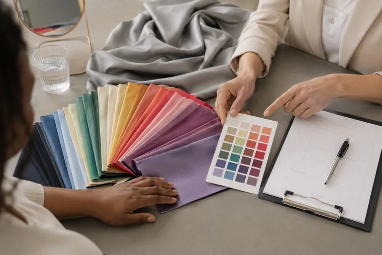
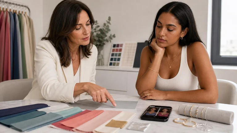
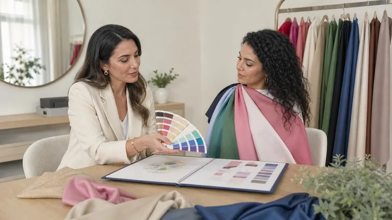
Compare palette samples with actual fabrics and record combinations you want to wear. The card and fabrics shown here illustrate the discussion, not a verified result for the person pictured.
Material and finish affect the result. Matte cotton, sheer fabric and glossy lipstick can make similar colors look different. For makeup, judge the applied product: a sheer lipstick allows your natural lip color to show through, while an opaque formula changes it more. Color theory for makeup explains mixing and color relationships beyond a seasonal label.
For accessories, compare finish and scale as well as color. Polished gold reflects light differently from satin gold. For hair, use the palette to discuss warmth, depth and contrast with your colorist, then consider your starting color and the maintenance you want.
You can keep wearing a favorite color outside the palette. To reduce its effect near your face, try it in pants or a bag; for a jacket, add a top from the palette underneath. You can also wear it without adjusting anything. The guide to wearing colors outside your palette gives more ways to work with pieces you already own.
Common shortcuts and when to recheck
Vein color and gold-versus-silver tests do not establish a season. Skin, lighting, jewelry finish and personal preference all affect what you see. Compare several fabric pairs before drawing a conclusion.
Hair or eye color alone cannot describe the whole relationship. Record those features, then test temperature, value, chroma and contrast.
Photos taken with different lighting, exposure or makeup cannot isolate the effect of a drape. Repeat them under consistent conditions.
If you already expect a particular season, revisit the pairs that contradict it. Record the difference you see before deciding what it means.
Recheck a result if the light kept changing, makeup or self-tanner obscured the comparison, the drape range was limited or decisive pairs gave conflicting impressions. Ask the analyst to repeat those pairs and explain which characteristics remained consistent.
Dyed hair, gray hair, tanning and changes in personal style can alter visible contrast and how you use a palette. They do not automatically require a completely new one. Keep the useful notes and any photos you agreed to share so you can compare the result with your current appearance. Age alone is not a reason to prescribe softer colors.
Frequently asked questions
Does a warm undertone always mean Spring or Autumn?
In the four-season model, Spring and Autumn are the warm families. Value and chroma help distinguish them. More detailed systems also include warm-neutral and cool-neutral groups, so a slight preference for warm colors in one comparison does not establish a subgroup.
Can I be between two seasons?
You may sit near a boundary defined by one system or receive different names from different schools. Ask which characteristics stayed consistent and which colors work in both suggested palettes. Those comparisons are easier to use than a label chosen despite mixed results.
How long does a color analysis take?
Check the specific service before booking. As one U.S. example, House of Colour Downtown Brooklyn describes a color analysis appointment as 2 to 3 hours. That is one provider's service, not a national standard. Confirm how much time covers draping, explanation and any makeup or wardrobe work, especially for a shared appointment.
What should I receive after the appointment?
The booking description should specify the deliverables. Ask for the name and meaning of your palette, samples you can use when shopping, notes on contrast and examples using your own clothes or cosmetics. Confirm whether the palette is physical or digital, whether photos are included and how you can ask follow-up questions.
Do I need to buy all the colors in my palette?
No. Try combinations with your existing clothes first. Buy a missing shade only when it helps complete something you want to wear. A palette is a comparison tool, not a shopping list.
Further study
For a structured introduction to color dimensions, draping and palette use, you can review the Complete Colour Analysis Course curriculum. The course page currently lists enrollment as unavailable.
Compare fabrics on olive and deep skin tones with steady light, matched pairs and repeatable observations. Keep useful results when a season remains uncertain.
Compare swatches with real fabrics, combine neutrals and accents, and use your personal color palette to plan outfits and shop for clothes you will wear.