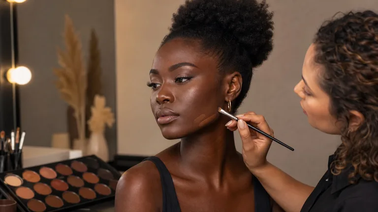
Makeup for deep skin tones demands the same individual assessment as makeup for every other complexion: accurate colour, compatible texture, controlled layers and review in the light where the result will be seen. Depth does not predict one undertone, one degree of saturation, one skin type or one technique. Two people at a similar depth can have very different relationships between face, neck and chest, different areas of visible pigmentation and different preferences for coverage and finish.
Quick answer: assess depth, undertone and saturation separately; compare several thin foundation swatches along the jaw; allow the formula to settle; correct only the colour that remains visible; then restore dimension without automatically brightening the centre of the face. The objective is faithful, dimensional skin—not lighter-looking skin.
This guide owns the technical decisions that become especially visible across deep foundation shades. The general skin undertone and foundation matching guide explains the universal shade-matching method, while foundation texture, coverage and finish owns formula selection. Here the focus is preventing an ashy cast, forced orange correction and erased facial variation without treating skin tone as a rigid category.
What deep skin tone means in professional makeup
Deep describes value: how light or dark the visible skin colour appears within the practical shade range. It does not define ethnicity, origin, skin type, sensitivity or undertone. Warm gold, warm red, neutral, olive, cool and intermediate directions can all occur within deep shade families. A professional range therefore needs meaningful changes in depth and undertone rather than one symbolic dark shade.
Avoid a generic ‘dark skin’ recipe. One face may be relatively even; another may show natural changes through the centre, perimeter, forehead, eye area, mouth, jaw and neck. These differences are not automatically defects. Agree whether the brief calls for sheer continuity, local coverage, bridal polish, editorial colour, corrective makeup or camera-ready control before deciding how much to alter.
Variable | Professional question | Mistake to avoid |
|---|---|---|
Depth | How light or deep is the overall skin value? | Choosing the darkest available bottle even when it is not a match |
Undertone | Which colour direction remains beneath surface variation? | Assuming that every deep complexion is warm |
Saturation | Does colour appear vivid, soft or muted? | Adding orange to every deep foundation |
Distribution | Where do colour and surface change across visible skin? | Covering the entire face at the same thickness |
Read depth, undertone and saturation as three separate dimensions
Depth does not predict undertone
Read value, colour direction and intensity separately
Depth
Overall light-to-deep value
Undertone
Underlying colour direction
Saturation
Vivid, soft or muted colour
Distribution
Variation across face and body
A foundation can match depth yet turn grey because its undertone is too cool or its colour too muted. It can match depth yet become orange because warmth or saturation is excessive. It can match face centre but disconnect from the neck because the chosen reference point ignored the visible body. Describe the mismatch precisely before reaching for bronzer, mixer or powder.
Observe bare skin in neutral diffused light and compare the face with the neck and any body area included in the final look. Veins, jewellery and a single photograph may offer clues but cannot replace testing the product. Use colour theory for makeup to keep hue, value and saturation distinct rather than reducing every complexion to warm, cool or neutral.
Grey or ashy: check depth, undertone, saturation, amount and powder before adding warmth.
Orange or red: verify that warmth was not used to compensate for a limited shade range.
Flat: identify whether natural variation and dimension were covered rather than simply adding darker contour.
Disconnected face and neck: review all visible skin in the final light instead of automatically lightening either area.
Use a repeatable foundation shade-matching protocol
Compare equal swatches, then wait
The shade name and fresh stripe are not final evidence
Select three useful candidates
Apply equal jaw swatches
Allow formula settling
Review face, neck and final light
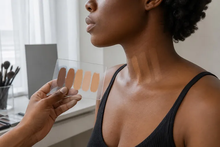
Select three shades close in depth but meaningfully different in undertone or saturation. Place equal narrow swatches along the jaw so face and neck can be compared. Blend only the outer edges, keep skincare and powder constant and allow each formula to settle for its relevant wear time. The bottle name, online image or freshly applied stripe is not the final evidence.
Observe face, jaw, neck and the body area that will remain visible.
Choose a central depth and two useful undertone or saturation alternatives.
Apply the same small amount to cleanly separated test areas.
Wait for the formula to settle without changing the layers beneath each swatch.
Review frontally, in side light and in the real service or camera environment.
Record shade, formula, preparation, amount, light and result so the decision can be repeated.
Published research on liquid-foundation colour change has observed different behaviour between formulas and shades over time. That does not produce one oxidation rule for every product; it supports a practical one: assess the colour after application and settling, not from the shade name alone.
When one foundation shade is not enough
Natural variation between face centre and perimeter can make a single opaque shade look artificial. Use one principal match for the largest coherent area and, when genuinely necessary, a second compatible shade where continuity changes. Keep both films thin and preserve the transitions that make the face dimensional; do not create a pale central mask and dark frame by habit.
If a formula needs adjustment, use pigments or mixers designed to work with it and document the ratio. Randomly mixing products with different film formers, phases or drying behaviour can change texture and wear. The guide to primer and foundation compatibility explains how to test the complete layers rather than judging by water or silicone in isolation.
Correct visible colour without forcing orange
Correct the observation, not the category
Orange is one possible direction, never an automatic rule
Observe
Name the visible colour precisely
Choose
Match direction and saturation
Localise
Feather a minimal film
Verify
Check through the intended base
Colour correction does not mean applying orange or red across every deep complexion. The useful corrector depends on the visible discolouration, its intensity, skin depth and the coverage placed above it. A corrector that is too bright, saturated or broad can show through foundation, alter the intended undertone and turn one local concern into an orange area.
Use the smallest amount on the precise area, feather the edge and check whether contrast has genuinely reduced before adding base. Peach, orange, terracotta or red-brown are possible directions—not automatic assignments. A lip product is not a universal substitute for corrector because its fragrance, pigments, texture and film may not be suited to the area or subsequent base. Review the corrective makeup method when proportion and placement become the next decision point.
Observation | Check first | Restrained response |
|---|---|---|
Blue-grey area | Light, depth and foundation undertone | Thin local warmth, then matched base |
Red-brown variation | Actual saturation and contrast | Minimal neutralisation without brightening |
Deeper eye area | Depth, hollow and anatomical shadow | Correct residual colour, not anatomy |
Variable mouth area | Movement, boundary and surrounding skin | A flexible local film with a thin edge |
Respect the limits of makeup around hyperpigmentation
A makeup artist can describe visible colour and agree a coverage preference but does not diagnose the cause of a patch, irritation or skin change. Hyperpigmentation has different possible causes and may require dermatological assessment. Makeup temporarily changes appearance; it does not treat the cause. New, changing, symptomatic or concerning marks belong with a qualified healthcare professional.
Do not apply makeup to broken, actively inflamed or reacting skin. Stop if the person reports burning, itching, swelling or worsening discomfort; remove gently and recommend appropriate healthcare support. Never claim that a corrector cures pigmentation and never use bleaching products or ingredients that are not intended for the cosmetic application.
Prepare skin without creating an ashy film
An ashy result can come from the wrong shade, insufficient saturation, excessive product, dehydration, pale residue or powder that is not invisible at this depth. Prepare according to present need, let layers settle and remove only excess. Skincare or sunscreen that leaves a visible cast has already changed the surface before foundation arrives.
Follow how to prepare skin before makeup for order, timing and zone assessment. Do not omit medically appropriate sun protection to improve a photograph; choose and test a suitable formula with the wearer and, when necessary, their healthcare professional.
Build a thin, faithful complexion
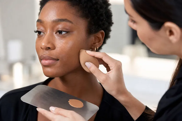
Start where continuity is needed and keep already balanced areas visible. Brush, sponge or fingers should be selected for formula, hygiene and finish; a tool cannot correct an inaccurate colour. Fade the base through the jaw, hairline and ears and compare every body area visible in the final frame. Increase coverage by location rather than laying another opaque film over the whole face.
If the first veil looks grey, do not hide it beneath bronzer. If it looks orange, do not cool it with an unrelated powder. Return to depth, undertone, saturation, preparation and settled formula. Practise this progressive sequence in the beginner makeup course rather than relying on one memorised face chart.
Test powder and setting products on the real base
A powder labelled translucent is not automatically invisible at every depth. Test it over the intended foundation, using the intended amount and light. Very pale powder may raise skin value; strongly yellow or orange powder may redirect undertone. Choose a coherent shade or a verified formula in the smallest useful quantity.
Press only where stability is needed and remove surplus. Extensive baking can introduce dryness, flatten dimension or create flashback. Use the long-wear makeup guide for powder, setting and touch-ups, then check reflection through the photographic makeup protocol when flash or HD capture is relevant.
Restore dimension with contour, bronzer, blush and highlight
Dimension does not require extreme light and dark bands. Contour creates depth, bronzer adds warmth and blush adds colour. A weakly pigmented product may disappear or look dusty on deeper skin, while a strong pale base can leave a grey veil. Test payoff, transparency and buildability on the face rather than only on the back of a hand.
Deep coral, terracotta, plum, berry, brick red and saturated pink are possibilities, not rules for every person. Placement, finish and strength belong to the individual face and brief. Highlight should transition into skin rather than forming a pale metallic stripe. The guide to contour, bronzer and blush keeps depth, warmth and colour as separate functions.
Keep eyes, brows and lips visible without whitening their base
A transparent eyeshadow may show less strongly against a deep lid, but a white base is not the automatic answer. Choose a compatible pigmented base when required, build colour in thin layers and preserve clean transitions. Start with low brush residue and add intensity only after the middle values are connected.
Brows and lips do not need to be lightened to become visible. Choose depth and saturation in relation to hair, features and the intended hierarchy. Deep, neutral, bright or light lip colours can work across skin depths when undertone, edge and texture support the complete face. Ethnic labels are not colour formulas; test the combination on the individual.
Preserve deep skin detail and colour on camera
Underexposure can close shadows and remove detail. Incorrect light, exposure, white balance or colour processing can make a correct foundation appear redder, greyer or more orange. The makeup artist should verify the recorded result but should not compensate for a capture error by making the person lighter. Share the test with the photographer or videographer and protect credible detail in both skin and wardrobe.
Review face, neck and hands in the same image, use the real flash when planned and inspect a suitable monitor rather than one automatically enhanced phone display. The separate camera-ready guide owns exposure collaboration, flashback, HD texture and image troubleshooting; this guide owns the colour and product decisions specific to deep complexion ranges.
Build a genuinely inclusive professional makeup kit
An inclusive kit is measured by useful range, not bottle count. Stock deep foundations with visible undertone and saturation differences, graduated correctors, tested powders, buildable blush and dimension products that remain clear rather than ashy. Record gaps revealed by real work and expand deliberately instead of improvising incompatible mixtures minutes before a service.
Foundations: several meaningful deep depths and undertones, not one token shade.
Mixers: compatible pigments for controlled, documented adjustments.
Correctors: useful depth and saturation for precise local application.
Powders: formulas and shades tested over several real bases and under flash.
Blush and dimension: readable pigment, buildable textures and several finishes.
Records: shade, mixture, preparation, amount, light and wearer feedback.
Develop product literacy through the professional makeup products course and practise local colour decisions through the corrective makeup course. The complete current catalogue is available under online makeup courses.
Diagnose common deep-complexion makeup problems
Rematch before concealing the mismatch
Grey, orange, flat and dusty results need different repairs
Grey
Check depth, undertone and pale residue
Orange
Reduce forced warmth or correction
Flat
Restore natural variation carefully
Dusty
Review pigment base and payoff
Result | Possible cause | First response |
|---|---|---|
Grey or dull base | Too light, cool or muted; pale powder or residue | Remove excess and rematch rather than covering with bronzer |
Orange or red face | Forced warmth or excessive correction | Reduce correction and compare a better-balanced shade |
Over-bright face centre | Concealer and highlight chosen for contrast, not continuity | Bring depth closer and preserve natural volume |
Dusty or invisible blush | Insufficient pigment or a pale product base | Choose a buildable texture with colour that reads on the face |
Lost detail in images | Underexposure, light, profile or display | Review capture before changing colour on the person |
A four-session practice plan
Session 1 — Match: compare depth, undertone and saturation with three equal swatches and document settling.
Session 2 — Correction: work on one visible colour area and compare minimal with excessive corrector.
Session 3 — Dimension: apply contour, bronzer, blush and highlight while keeping their four functions distinct.
Session 4 — Camera: review base and powder in diffused, side and flash light without changing several variables together.
Practise with consenting adults across varied depths, undertones, surface conditions and facial features. One model cannot represent an entire population. Request feedback on comfort, colour continuity and the agreed result, and record what the current kit could not supply. A complete makeup artist course can connect these exercises to broader base, colour and service workflows.
Sources, safety limits and editorial scope
For health boundaries and dark marks, review the American Academy of Dermatology guidance on dark spots in darker skin tones. For ingredient naming and regulatory context use the European Commission CosIng database; an ingredient appearing there does not by itself prove authorisation for every use. The FDA explains colour additives and cosmetics, while the study Discoloration of liquid foundation across shade colour diversity provides formula-specific evidence rather than a universal oxidation rule.
Frequently asked questions about makeup for deep skin tones
Do deep skin tones always have warm undertones?
No. Warm, neutral, cool, olive and intermediate undertones can all occur. Depth describes overall value and cannot determine undertone by itself.
Why does foundation look grey on deep skin?
It may be too light, cool or muted, or altered by pale skincare residue, powder, excess product or the light. Isolate variables and rematch instead of adding bronzer over the problem.
Is orange corrector always necessary?
No. Corrector colour follows the visible discolouration, its intensity, skin depth and the base placed above it. Excess orange can remain visible and redirect the foundation shade.
Can red lipstick be used as a corrector?
It is not a reliable professional rule. Lip products and correctors can differ in fragrance, pigment, texture and film. Choose a product intended for the area and compatible with the base.
Where should foundation be shade-matched?
Compare thin swatches along the jaw with the face, neck and visible body. Apply equal amounts, allow settling and review in the real light before selecting.
How do I choose powder without an ashy cast?
Test it over the actual foundation with the intended amount, light and flash. ‘Translucent’ does not guarantee invisibility at every depth, so compare formula and shade on the complete base.
Should the face be exactly the same colour as the neck?
The visible result should be coherent, but natural variation can exist between face, neck and chest. Choose a balanced reference for the final framing rather than automatically lightening the face.
Which blush colours work on deep skin tones?
There is no universal list. Undertone, saturation, finish and the complete look matter. Berry, plum, brick, deep coral and saturated pink are useful possibilities to test, not compulsory assignments.
How can highlighter avoid looking grey?
Choose a base colour that integrates with skin, apply a small amount and inspect several angles. A very pale or cool reflective base may form a separate stripe.
Can two foundations be mixed?
Yes when formulas are compatible and the mixture is tested for colour, finish and wear. Record the ratio, but do not let mixing excuse a professional range that lacks meaningful deep shades.
How can hyperpigmentation be covered?
Use precise local correction and thin foundation after agreeing the desired coverage. Makeup neither diagnoses nor treats the cause; new, changing, persistent or symptomatic marks require healthcare assessment.
Why can deep skin lose detail in photographs?
Underexposure, unsuitable light, colour processing or display settings can close shadows. Review the capture workflow before changing correct makeup to compensate for a camera error.
How many deep foundation shades should a professional kit include?
There is no universal number. The kit must meaningfully cover the depths, undertones and saturation of people served, with compatible correctors, powders and dimension products.
When should a makeup service stop?
Stop for broken or inflamed skin, burning, itching, swelling or another unexpected reaction. Remove gently and recommend appropriate healthcare assistance when needed.
Continue learning without narrowing people to one recipe
Use the complete English makeup guide library to connect complexion work with colour, hygiene, eyes, lips and professional practice. Editorial review: 5 September 2026. This guide retains the intent for deep-complexion shade range, ash prevention and colour correction; universal foundation matching, formula selection, camera technique and dermatological assessment remain separate.
Protect depth and undertone across the image chain
Prevent grey lifting and colour shifts with the professional makeup photography workflow.
Prevent pale correctors from turning ashy
Apply the corrector depth and saturation method.
For the broader distinction between colour matching in makeup and a personal palette, read what personal colour analysis is and what it really assesses before applying colour relationships to a product or look.
To translate a personal palette into complexion, cheek, eye and lip decisions, use personal colour analysis and make-up by season. It separates foundation matching, colour correction, iris, placement and cosmetic safety from the broad seasonal colour direction.
For an inclusive method that separates depth, olive appearance, ethnicity and season, continue with personal colour analysis for olive and deep skin tones. The guide audits light, exposure, drape representation, four dimensions, photography, language and bias before assigning a family.