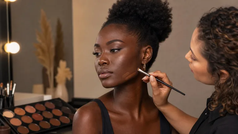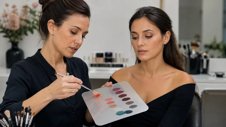
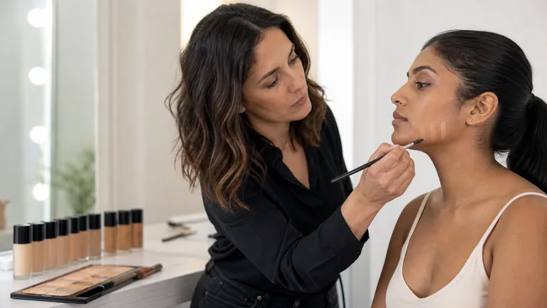
A believable foundation match requires two colour decisions at once: depth and direction. Depth describes how light or deep the shade appears. Undertone is the relatively stable warm, cool, neutral or olive direction used to organise many commercial ranges. A base can sit at the right depth and still look too pink, yellow, peach, orange or grey. The goal is not to colour the whole face; it is to create a convincing transition across face, jaw, neck and visible chest.
Quick answer: place two or three thin, comparable swatches from the lower cheek across the jaw towards the neck on prepared but uncovered skin. Inspect them in even neutral-looking light, allow the formula to settle for about 10–15 minutes or the manufacturer’s stated time, then test the best candidate over a larger area. Choose the shade that connects with the visible body without making the face look lighter, deeper, pinker, yellower, more orange or more ashy.
This guide owns the foundation-colour matching intent in the BeautyLearn makeup library. Texture, coverage and finish will have their own page; primer and formula compatibility require a separate wear test. For a technique sequence use learn makeup from scratch; for a restrained product plan use the beginner makeup kit guide. Here the outcome is deliberately narrower: select, test and explain the colour of a complexion base.
Depth, undertone and surface colour are different layers
Three colour layers, three different decisions
Do not match the whole foundation to one local colour
Depth
Light-to-deep continuity
Undertone
Warm, cool, neutral or olive
Surface
Redness, tan and pigmentation
Visible skin colour is not one label. Melanin contributes substantially to overall depth, while blood flow, tanning, local redness, pigmentation, shadows, hydration and optical properties change what appears in one place and moment. For makeup, separate three working layers: overall depth, underlying colour direction and local surface variation. This prevents matching foundation to a red cheek, a dark mark or a neck sitting in shadow.
Layer | What to compare | Frequent error |
|---|---|---|
Depth | Light-to-deep continuity across face and body | Habitually lightening or tanning the face |
Undertone | Warm, cool, neutral or olive direction | Deducing it from one clue |
Surface variation | Redness, tan, shadows and local pigmentation | Matching the whole base to one local colour |
Instrumental skin-colour research uses continuous coordinates such as CIELAB rather than four hard biological boxes. There is substantial variation and overlap within every population. Warm, cool, neutral and olive are therefore practical shopping and artistry families, not diagnoses, ethnic identities or proof of how every product will behave. Treat them as a shortlist, then verify the actual formula on skin.
Warm, cool, neutral and olive without stereotypes
Useful families on a continuous range
The label creates a shortlist; the skin test makes the decision
Warm
Yellow, golden or peach direction
Cool
Pink, red or blue-red direction
Neutral
Balance between directions
Olive
Yellow-green or grey-green direction
A warm undertone often integrates with yellow, golden or peach-leaning bases; a cool one may integrate with pink, red or blue-red directions; neutral sits between the dominant warm and cool directions. Olive often describes a yellow-green or grey-green component that can occur at very fair, light, medium, deep and very deep depths. It is not a synonym for Mediterranean, tanned or medium skin.
On an olive complexion, a pink base may turn peach, a strongly yellow base may look orange and a highly saturated neutral may float above the skin. On a deep complexion, an ashy result may come from insufficient depth, an unsuitable undertone, low saturation, flash or a combination—not from depth alone. On very fair skin, a base can be pale enough but still too saturated or yellow. Describe what changes instead of forcing the person into a stereotype.
Shade labels are not standardised across brands. Warm can mean yellow in one range and pink in another; C, W, N, golden, beige and olive cannot be compared as measurements. Use the name to select candidates within that formula, never as the final result. Even two products carrying the same shade name can differ in pigments, opacity, finish and colour after settling.
Veins, jewellery and tanning are weak clues
Blue or green-looking veins, preference for gold or silver, natural hair colour and ease of tanning can suggest a first hypothesis, but none directly measures the match between foundation and the visible face. Veins look different with skin depth, thickness and illumination. Jewellery may be chosen for contrast, style or clothing. Tanning changes visible depth and surface colour. The decisive test is still a controlled comparison of product candidates where face meets neck and body.
When clues disagree, do not average them into a forced label. Select nearby shades at the same depth and compare which requires the least visible correction. Sheer formulas may tolerate several directions because more skin shows through, while high coverage makes small undertone and saturation differences more obvious. Always interpret the label together with opacity.
Choose depth first, then compare undertone
Ten unrelated swatches create noise. Begin with three adjacent depths in one formula and find the closest light-to-deep relationship with the visible body. Within the most promising depth, compare two or three undertone directions. If no exact shade exists, decide whether the main error is value, undertone or saturation before changing anything. Each problem needs a different move.
Too light: the face looks detached, chalky or ashy even when the colour direction seems close.
Too deep: the jaw boundary remains visible or the face looks artificially tanned beside the neck and chest.
Too yellow or orange: depth may be correct while the swatch becomes obvious next to uncovered skin.
Too pink or red: the base can amplify surface redness or separate from a more neutral body colour.
Too grey: check insufficient depth, low saturation, an olive mismatch, product settling and lighting.
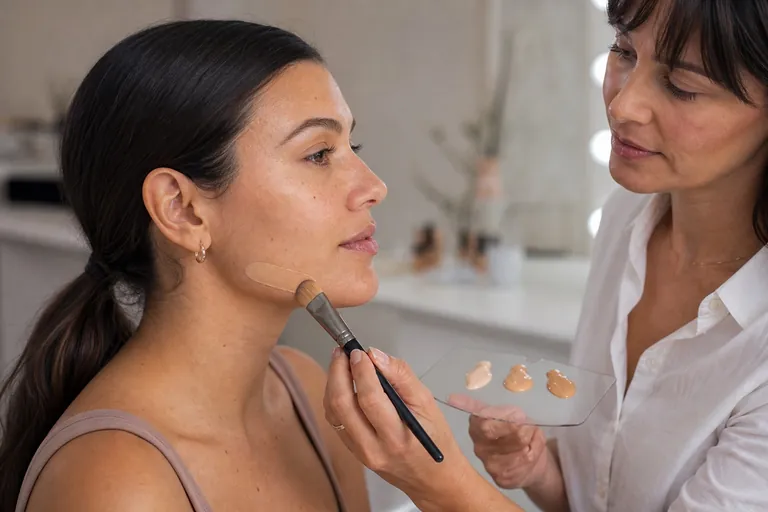
A professional jawline shade test, step by step
Compare before you decide
Equal swatches and stable light reveal the most credible bridge
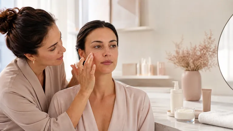
Prepare skin and neutral light
Apply two or three candidates
Wait and inspect at distance
Confirm over a larger area
The hand and wrist do not replace the face. They may differ in sun exposure, blood flow, depth and texture. On clean prepared skin, apply two or three thin parallel bands from the lower cheek across the jaw towards the neck. Keep quantity and tool consistent. Avoid placing every option in the centre of a flushed cheek, where local colour may pull the decision away from the body.
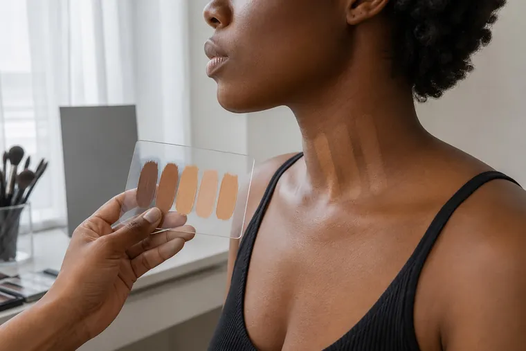
Prepare the skin simply and allow skincare or primer to settle.
Remove any previous base completely from the comparison area.
Choose two or three candidates within the same formula.
Apply comparable amounts with clean, controlled tools.
Read them immediately, then after the stated settling period.
Check front and profile at normal conversation distance.
Use a consistent unfiltered photograph only as secondary evidence.
Apply the best candidate over a larger area before purchase or service.
Look at the person, not only the swatches. The match should support their preference and identity rather than imposing lightening or bronzing. Ask how much neck and chest will be visible and what lighting the makeup will enter. Document the selected shade, formula, preparation, date and result so the next appointment starts with evidence rather than memory.
Light can change the apparent winner
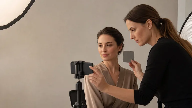
Perceived colour depends on the illuminant. Very warm lamps can hide yellow or orange; cool LEDs can exaggerate pink and grey; saturated walls, clothing and curtains can reflect colour onto the face. Research on automated skin-tone estimation also shows that illumination variation reduces reliability and that calibration improves consistency. Use diffused daylight or an even neutral-looking source for the main decision and avoid direct sun.
For bridal, stage or photography work, also inspect the destination light after establishing a sound match. Do not select foundation solely from a phone display. Automatic white balance, HDR, exposure, beauty modes, screen brightness and colour profiles can change the result. If the image disagrees with direct observation, control the capture before changing the foundation.
Why foundation colour can change after application
Every darkening is casually called oxidation, but the visible shift can involve evaporation of volatile components, redistribution of pigment, interaction with sebum or skincare, layer thickness, powder and environment. A 2025 study of liquid foundations measured changes in lightness, chroma and hue angle over time, while another investigation examined sebum-related darkening in some formulas. An immediate counter swatch may therefore be insufficient.
Wait for the manufacturer’s stated period or use about 10–15 minutes as a practical comparison when no period is given. Keep preparation, quantity and position controlled. If the product changes, repeat the test under realistic wear conditions. Do not automatically buy a shade that starts too light in the hope that it will darken to the right colour; the size and direction of change may not stay consistent across the face.
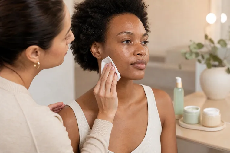
Face, neck or chest: decide what must connect
There is no useful rule that always copies the neck. The face may be redder, the neck lighter because it is shaded from sun and the chest deeper. The objective is continuity across what will be visible, without covering the entire body in a heavy base. Compare the frontal face, side jaw, neck and upper chest, then select the shade that forms the most credible bridge. Correct local redness or pigmentation with a small targeted step.
Seasonal sun exposure can change depth, and surface contrast can make undertone look more or less obvious. Retest instead of assuming the same shade or a predetermined summer number. A professional record should include shade, mix, formula, date, skin preparation, light and wear observations. That history also tells you when the gap is colour and when it is texture or product compatibility.
Olive undertones, redness and local pigmentation
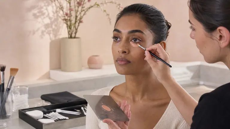
Diffuse redness, under-eye shadows, hyperpigmentation and lighter areas can pull the eye towards the wrong base. Foundation should create a thin overall relationship; it need not act as a strongly saturated colour corrector everywhere. Select colour on representative areas and use local correction where appropriate. A yellow base used to cancel all redness can dull the face, while a very light base over a dark area can make it grey.
For an olive undertone, compare less-pink or specifically olive candidates at the same depth and focus on the jaw relationship. If a correct-depth shade turns peach, excessive red direction may be the issue. If it looks ashy, reassess depth and saturation before adding warmth. Never add random pigments directly to a bottle. Any controlled mix belongs on a clean palette and requires compatibility and wear testing.
Correct a nearly right shade without hiding the error
Name the mismatch before changing the product
Depth, colour direction and formula behaviour need different corrections
Too light/deep
Compare adjacent depth
Too yellow/pink
Compare undertone
Ashy
Check depth and saturation
Shifts later
Repeat controlled wear test
For personal use, two shades from the same formula can sometimes create a repeatable match. Record the ratio on a palette and retest finish and wear. A professional kit may eventually use strategic depths and compatible colour adjusters, but every addition can change coverage, setting, stability and the manufacturer’s claimed performance. Do not experiment with unfamiliar mixtures during an important service.
Visible result | Check first | Controlled next step |
|---|---|---|
Too light or deep | Depth after settling | Compare adjacent depth |
Too yellow or pink | Same depth, different undertone | Compare formula variants |
Changes with time | Preparation, sebum, amount and light | Repeat a controlled wear test |
Patches or separates | Formula and preparation | Do not correct only colour |
Inclusive matching needs range, not assumptions
A matching method is only useful when the available shades actually reach the person’s depth, undertone and saturation. If every candidate is too light or too red, technique cannot manufacture a fair comparison. Do not describe the nearest inadequate shade as universal, adaptive or good enough. Record the missing direction and look for a formula with a relevant range rather than forcing a thick correction across the whole face.
Very deep complexions may show several visible depths across centre, perimeter, neck and chest; very fair complexions can make small jumps in depth and saturation conspicuous. Neither situation is solved by a fixed rule such as always matching the lightest area or always warming the face. Use thin comparisons, view the whole person at distance and decide whether one base plus local adjustment or a controlled mixture produces the most coherent bridge.
Never infer shade from ethnicity, nationality, age or a seasonal colour category. Two relatives can need different depth and undertone; the same person can show changing surface colour through the year. Inclusive practice means maintaining curiosity, asking preference, testing respectfully and acknowledging when the kit cannot make a good match. That limitation should trigger preparation and purchasing, not pressure on the wearer to accept a visibly poor result.
Sampling and online shade tools: use them as a shortlist
A shade finder based on a previous product, questionnaire or photograph can reduce the number of candidates, but it cannot control every difference in formula, batch, camera, light and screen. Treat its output as a starting hypothesis. When possible, obtain sealed samples or suitable trial sizes, read return and hygiene conditions before opening, and test the exact formula on the face rather than relying on a digital patch.
If you compare with a foundation already owned, first confirm that the old shade still matches and has not changed in storage. Note whether the reference is sheer or full coverage, matte or luminous, because skin show-through alters the apparent tolerance. A numerical cross-brand match is not a colour measurement unless the service explains how current shades and formulas are verified. Keep the receipt and do not buy several uncertain full sizes merely to recreate an in-person test.
A repeatable foundation shade-matching protocol
Observe face, neck and chest in even light without diagnosing skin conditions.
Identify a depth band and select three adjacent candidates.
Compare undertones within the strongest depth candidate.
Apply equal thin amounts across lower cheek, jaw and neck.
Inspect immediately, after settling and in destination light.
Spread the winner and assess texture, coverage and finish separately.
Record formula, shade, mix, preparation, date and result.
Confirm the result respects the wearer’s preference and identity.
Practising this process across varied consenting adults is more valuable than memorising one brand chart. Use the course-selection checklist to ask whether a programme includes varied complexions, readable demonstrations, model practice and feedback. The current beginner makeup course and corrective makeup course are bounded English-market pages whose live curricula and availability must be checked directly.
Foundation shade-matching mistakes to avoid
Testing colour only on the hand or wrist.
Buying a shade from an uncalibrated photograph or screen match alone.
Choosing a lighter base to brighten the entire face.
Treating cheek redness as the whole undertone.
Trusting equivalent shade names across different brands.
Judging under one warm, cool or coloured light.
Skipping the formula’s settling and realistic wear check.
Trying to repair texture incompatibility with extra pigment.
Frequently asked questions about undertone and foundation
How can I identify my skin undertone?
Use personal clues only to shortlist. Compare products at the same depth but in different undertone directions across lower cheek, jaw and neck in even neutral-looking light. The shade that integrates with the visible body after settling is more useful evidence than a vein or jewellery test.
What are the main skin undertones?
Makeup ranges commonly use warm, cool, neutral and olive families. They are practical points on a continuum, not rigid biological groups. Many people sit between labels, and each brand may use the names differently.
Does the vein test really work?
It can suggest a hypothesis but is not decisive. Apparent vein colour changes with depth, skin thickness and illumination. A direct comparison of foundation candidates on the face-to-neck boundary is more relevant to the purchasing decision.
Where should foundation be swatched?
Use the lower cheek across the jaw towards the neck, then test the winner over a larger area. This zone shows continuity with the body more effectively than the hand, wrist or centre of a locally red cheek.
How long should foundation settle before choosing?
Follow the product’s directions. When no time is stated, comparing immediately and again after roughly 10–15 minutes is a practical check. Keep skincare, amount and light constant so the result remains interpretable.
Should foundation match the face, neck or chest?
It should create a credible transition across what will be visible. When the areas differ, choose a bridge rather than copying one automatically, then correct local redness or pigmentation with targeted thin layers.
How can I recognise an olive undertone?
At the same depth, pink bases may look peach and strongly yellow ones orange, while some saturated neutrals appear separate. Compare less-red or olive candidates directly. Do not infer olive undertone from ethnicity, tanning or depth.
Why does foundation turn orange?
The starting undertone may be too warm, or the formula may change with settling, sebum, skincare, amount and environment. Repeat a controlled wear test before calling every shift oxidation or purchasing an intentionally pale shade.
Why does foundation look ashy on deep skin?
Check insufficient depth, unsuitable undertone, low saturation, excessive powder, reflective ingredients and flash or cool lighting. Change one variable at a time. Adding orange without diagnosing the mismatch can create a second visible error.
Can two foundations be mixed?
Often, especially within one formula, but confirm directions and test compatibility. Mix on a clean palette, record the ratio and evaluate texture, coverage, setting and wear as well as colour. Do not alter the original bottle.
Does foundation shade change between summer and winter?
Visible depth may change with sun exposure and behaviour, while surface contrast can make undertone appear different. Retest face, neck and chest rather than automatically moving to a memorised seasonal shade.
How can I choose foundation online?
Use shade tools and images to create a shortlist, not a guarantee. Prefer samples or trial sizes and check the seller’s return conditions. Screen colour, exposure, image processing and formula differences limit remote matching.
Are coverage and undertone the same decision?
No. Undertone and depth describe colour matching; coverage, texture and finish describe how the formula behaves and looks. A sheer base may tolerate a wider colour range than an opaque one, but both decisions should be tested separately.
Can one universal shade match every skin tone?
A transparent tint may adapt visually within a limited range, but no single pigmented foundation can match every depth and undertone. Evaluate the actual product claim, opacity and result rather than assuming adaptive language replaces shade testing.
Should I match foundation while the skin is red?
Avoid using one temporarily red area as the whole match. Compare representative zones and the visible body, then address local colour with a thin targeted step if appropriate. Unexpected irritation, heat, swelling or pain requires stopping rather than covering.
Research references and editorial scope
The method is informed by research on skin-colour diversity and cosmetic strategies, illumination and skin-tone estimation, time-dependent colour change in liquid foundation and sebum-related foundation darkening. The FDA makeup overview provides regulatory context rather than a matching method.
Editorial review: 5 September 2026. The categories and 10–15 minute comparison are practical artistry tools, not biological diagnosis or a promise that every formula changes identically. Product directions take priority. This inclusive guide avoids brand rankings and competitor links. Unexpected skin or eye symptoms require stopping and appropriate qualified advice.
Connect complexion colour to whole-face design with the corrective makeup and visagism method. It separates structure, proportion, colour and texture, then plans brows, blush, light and shadow around an agreed priority instead of a standard face map.
After matching colour, compare foundation texture, coverage and finish: this guide separates formula performance from undertone and tests thin layers, tools, setting, texture and wear.
Before selecting foundation and concealer, check how to prep skin before makeup: this guide orders cleansing, moisturiser, daytime sunscreen, targeted primer and settling without overloading the surface.
For a focused process on lip proportion, liner, layering and wear, continue with the corrective lip makeup guide. It keeps temporary lip makeup distinct from permanent and medical procedures.
To separate hue, value, saturation, contrast and controlled neutralisation, continue with the makeup colour theory guide. It treats colour as a testable design decision rather than an automatic pairing.
To adapt these product and placement decisions to moving lines and mature texture, continue with the makeup for mature skin guide. It uses zone-based preparation, thin layers and selective setting without age-based rules.
To test how skincare, sunscreen, primer and foundation behave as one film, continue with the primer and foundation compatibility guide. It replaces water-versus-silicone myths with measured layering and A/B wear tests.
For a controlled comparison of depth, warmth and cheek colour, continue with the contour, bronzer and blush guide. It covers colour, film order, anatomical placement and troubleshooting without one-size-fits-all maps.
Validate complexion colour in the actual camera
After live shade matching, compare face, neck, white balance and flash through the photographic makeup guide.
Apply shade matching across deep foundation ranges
For undertone, saturation, natural facial variation and ash prevention, continue with makeup for deep skin tones.
Check foundation matching under controlled capture
Document depth and undertone without a photographic cast through the makeup photography guide.
Separate sunscreen cast from shade mismatch
Use the sunscreen-and-makeup wear test.
Keep corrector depth compatible with the complexion
Use the dark-circle colour-correction guide.
Use undertone to adapt, not prohibit, eye colours
Continue with the iris-colour palette guide.
Match surrounding skin before building camouflage coverage
Continue with the cosmetic camouflage colour-match protocol.
For the broader distinction between colour matching in makeup and a personal palette, read what personal colour analysis is and what it really assesses before applying colour relationships to a product or look.
To separate the variables behind a personal palette, continue with undertone, value, chroma and contrast in personal colour analysis and test balanced drape pairs before combining the evidence.
When you are ready to turn colour dimensions into a repeatable method, use the professional personal colour analysis draping test for controlled light, client preparation, A–B–A sequencing, observation records and error checks.
To translate a personal palette into complexion, cheek, eye and lip decisions, use personal colour analysis and make-up by season. It separates foundation matching, colour correction, iris, placement and cosmetic safety from the broad seasonal colour direction.