Choose a corrector by the colour of your dark circles
Look at the area in diffused light, without filters. Separate the visible hue from a shadow caused by a hollow or an under-eye bag: makeup can even out colour, but it does not remove volume or stop skin moving. One under-eye area can contain several hues; assess the specific patch you want to correct rather than relying only on the label blue, purple or brown.
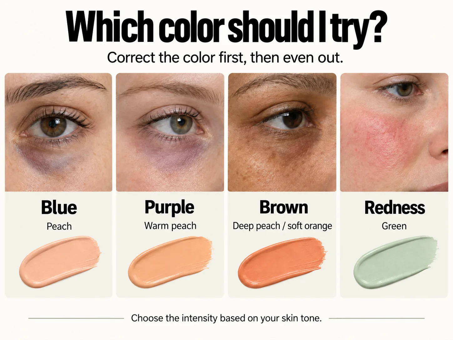
Blue dark circles: which corrector to try
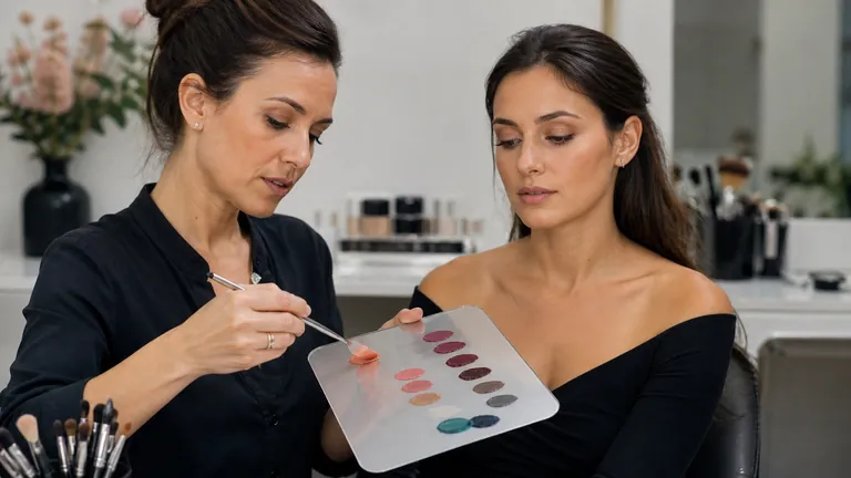
Peach is a useful starting point. On fair skin, begin with soft peach; on medium skin, compare a stronger peach; on deep skin, try a deeper peach or muted orange. These are alternatives, not products to apply together. Choose the swatch that reduces the blue without leaving either a pale stripe or a warm patch.
Purple dark circles: how to choose a shade
Compare warm peach or apricot, possibly leaning more yellow if the visible hue calls for it. Bluish purple and a purple area with redness do not respond identically. Match the depth of the swatch to your skin: a very pale corrector can lighten an area too much on deep skin even when its colour family seems suitable.
Brown dark circles: colour and coverage
Brown alone does not tell you which complementary colour to apply. First try coverage with a shade close to your complexion. If a cool or greyish cast remains, compare peach, deep peach or muted orange at an appropriate depth. Orange is not essential for every brown under-eye area: if it remains visible, the correction may be excessive or unsuitable.
Facial redness: where to try green
For localised facial redness on intact skin, you can compare a muted green. Keep its intensity proportionate to the redness and check that it does not leave a grey or green cast. Green is not a universal dark-circle corrector. If the area is irritated, do not cover it; follow the precautions below.
Adapting makeup for redness and sensitive skin
Three swatches, one choice
 Open the full-size image (new tab)
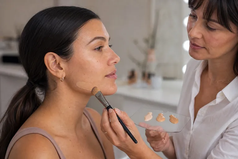
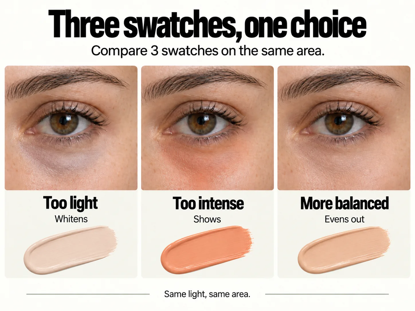
The more balanced swatch blends into the surrounding skin while reducing the unwanted hue. The first may look bright close up but leaves a pale patch; the second introduces another colour you would need to cover. Use these differences to guide a choice, then confirm it with a trial on your own area.
These panels are a teaching comparison. They are not accompanied by a record of products, commercial shade names or later checks, so they cannot establish which product produced a result or how long it lasted.
How to make your trials comparable
Label the swatches A, B and C. Record the brand, product, shade, texture, preparation and approximate amount; photograph the swatches on your palette too.
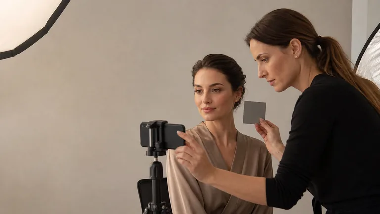
Keep lighting, distance, framing and exposure the same, without filters or beauty modes. Three small adjacent swatches help you narrow the choice, but they may sit over slightly different underlying hues.
To compare the finished result on exactly the same area, repeat the application under the same conditions, in separate sessions if appropriate. Do not keep removing and reapplying products if the skin becomes irritated.
Photograph placement close up, the finished detail and the whole face. Write down why you choose a swatch: less visible colour, a closer depth match or a smoother transition into the surrounding skin.
Check again, for example after 15 minutes and later, recording the actual elapsed time. Note only what you observe: build-up, separation, a colour change or no visible change. A brief check does not demonstrate all-day wear.
Trial | What to record | Observed result |
|---|---|---|
A / B / C | Exact product and shade; amount, tools and preparation | Remaining hue, visible correction and transition into the skin |
Later check | Elapsed time and lighting conditions | What changed and the single adjustment you tried |
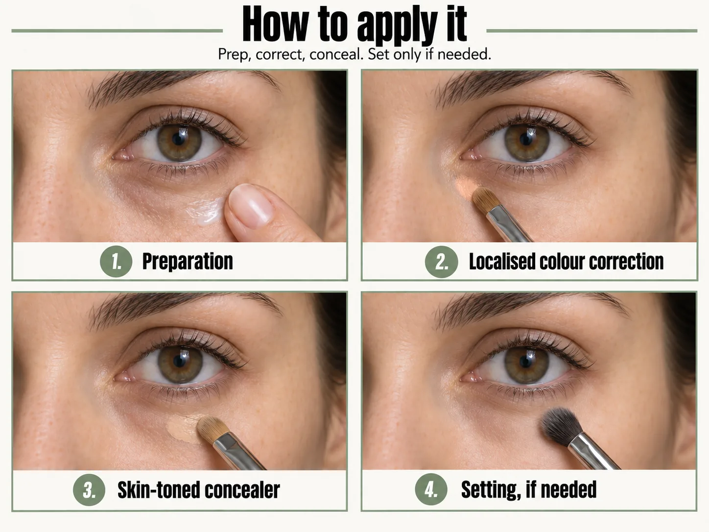
How to apply concealer: four steps
Step | What to do |
|---|---|
1. Preparation | Prepare the area and let the products settle. |
2. Colour correction | Apply locally and blend the edges, only when needed. |
3. Coverage | Add skin-toned concealer only where coverage is still needed. |
4. Setting | Decide whether setting is needed; it is not compulsory. |
 Open the full-size image (new tab)
1. Preparation
Wash your hands and use clean tools. On intact skin, apply a light preparation suitable for the eye area if needed. Let it settle and blot away any excess: a slippery surface makes precise placement harder.
2. Colour correction
Decant a tiny amount onto a clean palette. Use a small brush to place the corrector only where you see the unwanted hue, avoiding contact with the eye. With very little product left on the brush, soften the edges without dragging pigment across the whole area. Stop once the hue is reduced; skip this step if skin-toned coverage is already enough.
3. Coverage
Press a thin layer of concealer close to your skin tone onto the remaining discolouration. Blend the boundary into your base without rubbing off the layer underneath. Check your face at a normal viewing distance: you do not need a solid triangle of product under the eye.
4. Setting
Let the product settle and move your face. If it has collected in a crease, first lift away the excess with a clean tool. Only if the formula and area need it, apply a very small amount of powder where product tends to move. If the result is stable or powder emphasises dryness, do not add it automatically.
Should concealer be lighter than your skin?
Not necessarily. To cover discolouration, start with a concealer close to your skin’s depth and consistent with your base: a much lighter shade can leave a pale or grey stripe. Separate three goals before choosing.
Colour correction: peach, apricot, muted orange or green adjust an unwanted hue. They are not chosen to lighten the whole area.
Coverage: skin-toned concealer evens out what remains visible and should blend into your complexion.
Brightening: a slightly lighter shade can be an optional, localised finishing choice. It does not replace colour correction and should not be applied automatically across under-eye bags or raised areas.
In the three-swatch comparison, focus on the difference between the first and third panels: lighter does not mean more even. For a specific photographic trial, compare a skin-matching concealer with a slightly lighter version, keeping formula and amount consistent; assess both the close-up and the whole face.
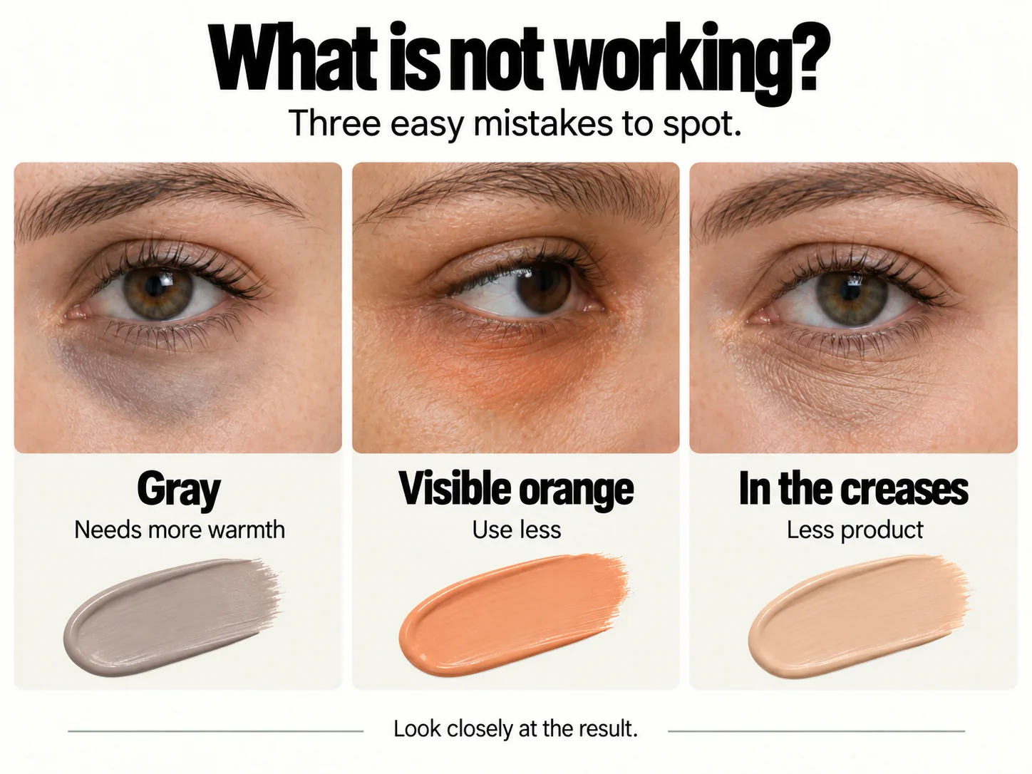
What is not working?
 Open the full-size image (new tab)
Grey or orange concealer: what to adjust
What you see | What to check | Adjustment to try |
|---|---|---|
A grey result | Concealer or powder too light; a remaining cool hue; excess product or dryness | First try a depth closer to your skin. If a cool cast remains, compare warmer, localised correction. |
Orange still visible | Amount, intensity, depth and area covered | Lift away the excess and retry with less product; choose a less intense shade if needed. Avoid hiding the patch under thick layers. |
Product in creases | Preparation too rich, too much product or an unsuitable formula | Remove the build-up, lighten the application and consider a more flexible formula. Set only where needed: more powder is not always the answer. |
Photograph the result again after your adjustment with the same light and framing. These suggestions are changes to test: the panel does not show a documented before-and-after correction or a later wear check. Natural creases and movement remain visible even with careful application.
Eye-area precautions
Do not apply to broken, swollen, very irritated or painful skin, or during an active reaction. Stop if burning, itching, watering or eye discomfort develops. If irritation persists, consult a healthcare professional. Do not diagnose a condition or conceal a sign to disguise a problem that needs assessment.
Check the label, intended area of use, expiry or period after opening, product condition and cleanliness. Use only cosmetics intended for the eye area: peach or orange lipstick is not a substitute for corrector. Do not share applicators or put a tool back into the container after it has touched someone’s skin.
Frequently asked questions
Does colour corrector go before or after foundation?
When colour correction is needed, apply it before localised skin-toned coverage. If foundation has already evened out the area, assess only what remains visible rather than adding corrector out of habit.
Is green corrector suitable for dark circles?
Green is a starting point for redness, not for blue, purple or brown hues in themselves. Without a red component to reduce, it can leave a greenish or grey area.
Do I always need to set concealer with powder?
No. It depends on the formula, preparation and behaviour of the area. Check the result once it settles and set only if needed, avoiding extra dryness or more visible creases.
Can lighter concealer cover under-eye bags?
Concealer changes colour and brightness but does not remove the volume of a bag. Lightening the whole raised area can make it more noticeable. Assess discolouration, highlights and shadows separately.
How can I cover a brown mark on the face?
On intact skin, consider coverage close to your complexion and correct an underlying hue only if needed. For larger areas or more structured coverage, explore the products and limits of cosmetic camouflage.
Explore facial discolouration
To develop your approach beyond the under-eye area, the Corrective Makeup Course also covers facial discolouration and imperfections.
View the Corrective Makeup Course curriculum
Sources and references
NYX Professional Makeup — Color Corrector Guide: shade examples for different skin tones
FDA — Eye Cosmetic Safety: hygiene, intended use and precautions
Last substantive update: 24 September 2026. The illustrations help you choose what to compare; assess the result on the individual rather than treating the panels as evidence of a product test or wear time.