Contour, bronzer and blush are not three versions of the same step. Contour suggests depth, bronzer introduces warmth and blush adds colour and direction. A professional result comes from assigning one clear job to each product, applying only the layers the brief needs and checking the whole face from the front, side and normal conversation distance.
Quick answer: place contour close to believable anatomical depth, diffuse bronzer over the areas that benefit from warmth and position blush where colour supports the expression and visual direction. Cream and liquid products usually sit before substantial powder, but formula behaviour matters more than a rigid social-media order. There is no universal map for every face.
This guide owns product differences, colour, texture, order and placement. Whole-face observation and design remain in the corrective makeup and visagism guide. Foundation depth and undertone have their own shade-matching method. Keeping those intents separate prevents contouring from becoming a promise to correct natural features. Practise the complete complexion sequence through the corrective makeup course.
Contour, bronzer, blush and highlighter do different jobs
Four products, four different jobs
Depth, warmth, colour and reflection should remain distinguishable
Contour
Believable depth
Bronzer
Broad, controlled warmth
Blush
Colour and direction
Highlight
Selected reflection
Product | Primary job | Colour and finish | Typical failure |
|---|---|---|---|
Contour | Suggest depth and change the reading of volume | Close to a plausible shadow; usually matte or low-reflective | A grey or brown stripe unrelated to anatomy |
Bronzer | Add warmth and chromatic continuity | Warmer than the complexion; matte or softly reflective | An orange band used as contour |
Blush | Add colour, vitality and direction | Pink, peach, red, mauve, berry or brick suited to the look | An isolated patch or overly pale, ashy colour |
Highlighter | Increase reflection at selected points | Sheen compatible with depth, surface and lighting | A metallic stripe that exaggerates texture |
A commercial product may sit between categories. A neutral bronzer can create gentle structure; a brown-rose blush can warm and colour together. Look beyond the label at hue, value, saturation, opacity and reflection. If one product performs two useful jobs, adding two more merely because a routine lists them can make the complexion heavy and visually divided.
Choose contour colour from believable depth
Contour should read as receding volume rather than visible grey pigment. Observe natural depth below the cheekbone, at the temple or along the jaw in neutral diffused light and then in side light. Depending on the complexion, that depth may appear taupe-beige, brown, olive, reddish or very deep. A colour that is too cool can look ashy; one that is too warm reads as bronzer; one that is too dark creates a hard edge that blending only spreads.
Begin with a modest value difference and increase only when the whole face and destination lighting require it. Undertone does not mean choosing one universal ‘cool contour’. Separate hue, value, saturation and temperature using the makeup colour-theory guide. Swatch beside the face and over the intended foundation because base colour and opacity change the final mixture.
Choose bronzer and blush across varied complexions
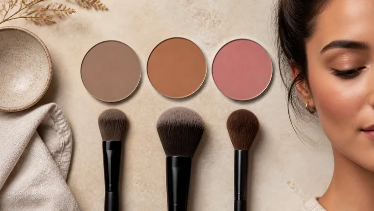
Bronzer must have enough depth to remain visible without turning into an orange or grey film. A light complexion may need a transparent warm beige or soft brown. Medium and deep complexions often need richer caramel, terracotta, red-brown or deep neutral-warm pigments rather than a pale, milky pan. The same compact can look intense in the package yet disappear on skin, or look neutral and become orange over foundation, so test the real layer.
For blush, establish sufficient depth first, then adjust saturation and temperature. Peach, coral, rose, red, mauve, berry and brick do not belong to one complexion category. On deep skin, a very pale opaque base can become chalky; on light skin, a highly saturated colour needs a tiny load and a clean edge. Consider lips, eyes, wardrobe, lighting and camera response before deciding that one blush is universally flattering.
Cream, liquid, balm or powder: choose by film behaviour
Cream can merge into a flexible base and build transparency. It may drag or patch over a heavily powdered or unstable surface.
Liquid often needs very little product and a controlled open time. Work one area at a time if its edge sets quickly.
Balm or stick is not automatically easier. Warm or decant it onto a palette or tool instead of drawing a thick stripe directly on the face.
Powder is useful for refinement and modulation, but can grip immediately on a wet film. Set only where the surface requires it before loading colour.
Cream and powder do not have to be doubled. Use a second texture only when it adds measurable wear, precision or finish without visible thickness. Check the complete base with the primer and foundation compatibility method. If the first colour layer is already even and stable, more product is not a professional upgrade.
Order contour, bronzer and blush without rigid rules
Build dimension without disturbing the base
Film behaviour decides the order
Thin complexion
Cream or liquid colour
Selective setting
Powder refinement
Prepare the skin and build a thin complexion, adding coverage only where the brief needs it.
Apply liquid or cream dimension: contour for depth, bronzer for warmth and blush for colour. Omit any step that lacks a job.
Merge contact edges into the surrounding base without erasing the useful centre. Check face, profile, neck and expression.
Allow the films to settle, then use powder selectively rather than coating the whole complexion by default.
Add powder colour only to strengthen or refine. Remove excess from the brush and work from the intended high-concentration area outwards.
Review in neutral light and destination light; photograph at a consistent distance before correcting a supposed asymmetry.
The order can change with the brief. Blush cream may go before a transparent contour so its colour stays dominant; powder blush may finish a look after bronzer. The useful principle is to avoid rubbing a mobile cream across a powder-heavy surface and to preserve the separate role of each colour. Sequence follows film and hierarchy, not a memorised number.
Place contour from anatomy, not face-shape templates
Placement follows the real face
Observe depth, projection, movement and the destination light
Depth
Cheekbone, temple and jaw relationship
Warmth
Face, neck and chest continuity
Colour
Central, lateral or diffused direction
Review
Front, profile and expression
Observe the zygomatic arch, temple, hairline, jaw angle and the relationship between jaw and neck. Start contour at plausible depth and let it disappear before reaching an area that naturally projects. Below the cheekbone, the highest concentration commonly stays towards the outer face. Extending a dark line towards the mouth can lower and harden the expression, especially when viewed in motion.
Use forehead, temple or jaw contour only when it serves continuity and the agreed design. Do not draw a frame around the jaw; turn the head and blend towards the neck without leaving a stripe. Nose contour needs minimal, symmetrical product and several viewing angles. A close phone camera can distort width and projection, so never design solely from a wide-angle selfie.
Labels such as round, square, heart or oval collapse many different anatomical relationships into one diagram. Two people placed in the same category may have different cheekbone height, jaw projection and priorities. Return to whole-face corrective observation when the objective is design rather than simply learning product control.
Place bronzer as warmth, not a fixed number three
Bronzer is usually broader and softer than contour. It may warm the upper forehead, temples, cheek area and a restrained part of the perimeter, but a stamped figure-three pattern does not respond to every face. Look for colour continuity between face, neck and exposed chest. If the face looks orange while the neck remains neutral, the cause may be hue, saturation, amount or an area that is simply too large.
Day makeup generally benefits from transparency and normal-distance review. Evening work may support greater depth or glow, but artificial light and photography can amplify both texture and saturation. Compare the full professional day-makeup sequence with the professional evening-makeup sequence instead of using more bronzer as the only distinction.
Place blush for colour and direction
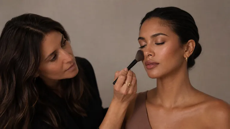
Observe the cheek at rest and during a natural smile because the volume moves. More central placement concentrates freshness; lateral placement creates direction towards temple and cheekbone; a broader transparent wash connects colour to the complexion. None of these positions guarantees a ‘lift’, and a placement that looks balanced in a frozen smile can sit differently when the expression relaxes.
Keep strong pigment away from a fold or under-eye texture when movement would break the film, but adapt that distance to the real face. Blush and bronzer can overlap slightly so they do not read as separate bands. If contour, bronzer and blush form three stripes, use the nearly clean complexion brush only at their contact edges. Do not sweep over the centre until every colour becomes one muddy area.
Brush, sponge and finger technique changes placement
A small dense brush deposits more colour over a narrow area; a wide flexible head diffuses but may expand product beyond the design. An angled brush is not compulsory for contour—the contact surface, load and pressure matter more. A sponge presses liquid and cream into the base; fingers add warmth but require clean hands and deliberate edge control. Use the professional makeup-brush guide to connect fibre, density and head shape to movement.
Load little product, work it through part of the brush or onto a clean palette and remove excess. Touch down first where intensity belongs, then decrease pressure as the edge opens. Alternate sides rather than completing one side far in advance. Repeated blending without stopping to observe spreads pigment, loses direction and can disturb the complexion underneath.
Adapt dimension to mature, dry, oily and textured skin
On mature or visibly textured skin, reduce the number of layers, coarse reflection and friction. Flexible creams and fine powders can both work; neither format is universally superior. Judge the prepared surface, dose and movement. Position blush while the face is relaxed and review expression instead of relying on a forced smile. The separate mature-skin makeup guide covers preparation, complexion and selective setting.
On dry areas, avoid absorbing all flexibility before adding colour. On oily zones, let the base settle and set only where control is needed. A patchy colour layer is rarely repaired by adding more pigment. Check preparation, amount, residual moisture, pressure and formula compatibility. Stop cosmetic application when irritation, broken skin or an unexpected reaction makes the service unsuitable and recommend appropriate healthcare advice where needed.
Review in real light, photography and video
A face is perceived as a complete contrast system. Published studies show that cosmetics can alter facial contrast and perceived skin evenness, but they do not establish a universal contour or blush map. Those findings support checking relationships between complexion and features; they do not turn one beauty preference into an anatomical law. Professional placement remains a controlled decision tested on the individual.
Inspect at conversation distance, close up and in profile. Use consistent camera distance and perspective because portrait focal length can change depicted facial proportions. Check neutral light, venue light and flash when relevant. A phone screen, automatic exposure or beauty filter may mute or intensify colour. Do not add product simply because a display makes the first photograph look flat.
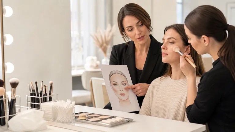
Practise with three face charts and one A/B test
Face chart one: use contour only and record centre, edge, direction and value difference.
Face chart two: remove contour and use bronzer alone to see how warmth already changes perceived structure.
Face chart three: compare central, lateral and diffused blush while keeping hue, value and amount constant.
On a consenting adult model, compare cream on one side with powder on the other using comparable colours and the same light.
Photograph immediately and after wear; record evenness, border, transfer, comfort and touch-up response.
Change one variable at a time. If colour, brush, position and formula all change together, the useful cause remains unknown. Build the observation-to-application workflow in the corrective makeup course, establish the wider sequence in the beginner makeup course or connect all modules through the complete makeup artist course.
Troubleshoot muddy contour, orange bronzer and patchy blush
Name the failure before adding product
Colour, dose, surface and pressure produce different faults
Muddy
Review depth, temperature and overworking
Orange
Lower saturation or increase useful depth
Patchy
Check wetness, load and first contact
Striped
Merge contact edges, not every centre
Visible problem | Likely variables | Controlled correction |
|---|---|---|
Muddy contour | Too dark, too cool, excess layers or an overworked edge | Reduce dose, adjust colour and lift only the outer edge |
Orange bronzer | Excess warmth, saturation or coverage | Choose more depth or neutrality and apply a transparent veil |
Patchy blush | Wet base, heavy first contact or a saturated tool | Stabilise the base, unload the brush and deposit from the edge |
Three separate bands | Products applied as parallel stripes | Overlap contact edges and remove one unnecessary layer |
Asymmetrical sides | One side completed before comparison | Alternate passes and review from a fixed distance |
Texture looks stronger | Excess film, coarse reflection or friction | Reduce product and use targeted setting |
Frequently asked questions about contour, bronzer and blush
What is the difference between contour and bronzer?
Contour suggests depth with a shadow-like colour; bronzer adds broader warmth. A neutral bronzer may create soft structure, but an orange or reflective bronzer cannot convincingly replace every contour.
Does bronzer go before or after blush?
Either order can work. Warmth often comes first and blush follows, but placing blush first may preserve its direction. Formula, amount and visual hierarchy matter more than an absolute sequence.
Should cream products go before powder?
Usually, because cream and liquid move more evenly on a flexible surface. Set selectively afterwards. A specific formula may require a different method, so follow its instructions and test the complete stack.
Can blush go before contour?
Yes, especially when blush is the focus and contour is transparent. Keep the useful centre of each colour visible; mixing both completely can produce a dull brown area.
Can one product work as contour and bronzer?
Only if its colour and finish perform both jobs on that complexion. A neutral, transparent brown may add restrained depth and warmth, while an orange or sparkling bronzer will not imitate shadow.
Where should cheek contour begin?
Find plausible depth near the ear and beneath the cheekbone. Place the greatest intensity there and diffuse towards the centre without extending a dark line to the mouth. Length follows anatomy.
Where should blush go on a round face?
The label round is insufficient. Observe cheek volume, cheekbone, expression and objective. Lateral placement creates direction; central placement concentrates colour. Compare both with the same blush and amount.
Should contour be grey?
No. It should resemble believable depth on the specific skin. Pure grey looks ashy on many complexions. Balance value, neutrality and undertone by observing natural shadows in neutral light.
How do I stop bronzer looking orange?
Test it on the face over the intended base, choose enough depth with lower saturation and apply a thin veil. Compare face, neck and exposed chest in neutral light.
Is nose contour necessary?
No. It is optional and easily visible at close range. If the design calls for it, use minimal product, check several angles and remember that close phone photography changes proportions.
When should highlighter be applied?
After structure and colour are established, at selected points that benefit from reflection. Cream may sit before powder or a powder highlight may finish the look. It cannot repair poor blending.
How should these products be adapted to mature skin?
Reduce thickness, friction and coarse reflection, use flexible layers and review the relaxed face in side light. Adapt to the individual surface rather than applying an anti-age placement rule.
Can cream and powder be layered?
Yes, when the second layer adds wear or precision and the first is thin and settled. It is not compulsory. If thickness or patchiness appears, simplify to one texture and improve placement.
How can excessive contour or blush be corrected?
First use a clean tool to lift or soften excess. Press a minimal amount of the complexion product only over the edge. If the film is thick, remove locally and rebuild instead of burying it.
Sources and next steps
For evidence on cosmetics, facial contrast and perceived evenness, review the open-access studies on facial contrast changes with cosmetics, regional contrast and asymmetry and perceived and measured skin evenness. The study of portrait focal length and depicted face shape explains why close photographs cannot serve as neutral anatomical maps. These sources describe perception and imaging; they do not prescribe one contour pattern.
Continue through the English makeup guide library or compare the current online makeup courses. Editorial review: 5 September 2026. This educational guide does not define an ideal face, diagnose skin conditions or turn perceptual research into a universal placement rule. It deliberately owns contour, bronzer and blush product technique; whole-face visagism, foundation matching and complete day or evening services retain separate search intents.
Keep dimension clear across deep complexions
For pigment payoff, ash prevention and coherent highlight, use makeup for deep skin tones.
Compare cheek placement on a consistent template
Continue with the face-chart comparison exercise.